A Control Chart monitors, assesses, and improves the stability and performance of a process over time. It visually represents how a process behaves by distinguishing between two types of variations—common cause variation and special cause variation—which can help identify the root causes of process deviations.
In essence, a control chart helps to understand whether the variations in a process are natural and consistent, or if they are due to anomalies that require corrective actions.
Table of contents
What is a Control Chart?
A control chart serves as a fundamental statistical tool in quality control and process management. It visually represents how a process behaves over time by plotting data points against a centerline (which represents the average or target value) along with upper and lower control limits.
Control charts help to differentiate between the natural variation (common cause variation) that is inherent in any process and unusual or abnormal variations (special cause variation) that suggest something has gone wrong or changed in the process.
First introduced by W.A. Shewhart in the 1930s, control charts have since become essential in maintaining consistent product quality and process efficiency. By tracking process data over time, control charts allow teams to detect problems early, identify potential causes of variation, and ensure that processes are stable and performing within acceptable limits.
Key Features of a Control Chart
Control charts typically have several features that contribute to their usefulness in process monitoring:
a. Control Limits
Statistical formulas calculate control limits based on the process data. These limits typically correspond to ±3 sigma from the centerline, which means that 99.73% of the data points in a stable process should fall within these limits.
b. Centerline
The centerline represents the expected average value of the process. It is drawn at the mean of the data points.
c. Data Points
Data points represent the actual measurements or counts taken from the process. These points are plotted on the chart over time.
d. Patterns or Trends
One of the key aspects of control charts is identifying trends or patterns in the data. Unusual patterns, such as sustained upward or downward trends, cycles, or outliers, may signal a problem that requires attention.
Key Elements of a Control Chart
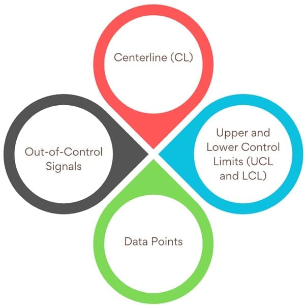
A control chart consists of several critical components that help visualize process performance:
Centerline (CL): The green horizontal line represents the average or expected value of a stable process. The centerline is calculated using historical data from when the process is in control.
Upper and Lower Control Limits (UCL and LCL): These red horizontal lines define the acceptable range of variation in the process. Set at ±3 standard deviations (3 sigma) from the centerline, they indicate that if the process is in control, most data points (99.7%) should fall within these limits.
Data Points: Each data point represents a measurement or statistic (e.g., the average of a sample, the range of values, or the proportion of defectives) collected over time from the process.
Out-of-Control Signals: When a data point falls outside the control limits, it signals an unusual occurrence, likely due to special cause variation, which requires investigation to identify and address the issue.
Importance of Control Charts
Control charts play a critical role in process management across a wide range of industries, from manufacturing to service sectors. Their primary purpose is to assess whether a process is stable and operating within acceptable limits. A stable process is predictable, with variation that can be understood and controlled. In contrast, an unstable process produces unpredictable results, potentially leading to defects, inefficiencies, or failures.
Understanding a control chart hinges on the concept of variation. Every process naturally produces some level of variation. Some variation is expected and caused by factors inherent to the process (common causes), while other variation arises from special, unforeseen events (special causes). Control charts help differentiate between these two types of variation, allowing managers and process engineers to take appropriate action.
How Control Charts Work?

Control charts plot data points over time and compare them to predefined control limits, which are calculated based on the standard deviation of the process data. The primary steps for using a control chart are:
- Data Collection: Collect a set of process data. Depending on the chart type, this could include sample averages (X-bar chart), ranges (R chart), or proportions of defectives (P chart).
- Calculate the Centerline and Control Limits: Calculate the centerline, typically the average of the data when the process is stable. Then, calculate the upper and lower control limits, usually set at three standard deviations (±3 sigma) from the centerline.
- Plot Data Points: Plot the data points on the control chart. For each new sample or data point, plot its corresponding value. Mark the centerline and control limits on the chart.
- Interpret the Chart: Monitor the chart for any points outside the control limits or any patterns, such as runs of consecutive points above or below the centerline. These indicate that the process may be out of control, requiring further investigation.
Why Use Control Charts?
Control charts serve several purposes, all of which contribute to the improvement and monitoring of a process’s stability and performance:
a. Monitor Process Variation
Control charts allow teams to visualize the performance of a process over time. By tracking how data points vary, it becomes possible to identify trends, cycles, or shifts that may indicate underlying issues. For example, if data points consistently fall outside the control limits, it may suggest that the process is unstable or that special causes are affecting its performance.
b. Differentiate Between Special Cause and Common Cause Variation
Understanding the source of variation is crucial for effective decision-making. Special cause variation occurs when an external factor disrupts the process (e.g., machinery breakdown, human error), and corrective action is necessary. Common cause variation is the inherent variability in the process, and typically no action is needed unless it is excessive.
c. Assess Effectiveness of Process Changes
Control charts are an excellent tool for evaluating the impact of process changes. If a change (such as a new machine or process adjustment) is implemented, the chart can be used to monitor whether the process is improving and whether any new issues arise.
d. Communicate Process Performance
Control charts provide a simple and effective way to communicate the performance of a process to stakeholders. Whether you’re reporting to a team, a manager, or a client, control charts help convey the state of the process in a clear, graphical format.
Types of Control Charts
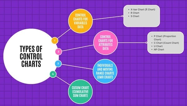
Control charts can be categorized based on the type of data they handle. Broadly, they fall into two types: Control Charts for Variables and Control Charts for Attributes.
1. Control Charts for Variables Data
These charts are used to monitor data that are continuous and measurable, such as the length, weight, temperature, or time.
- X-bar Chart (X̄ Chart): This chart tracks the average of a sample or subgroup over time. It’s commonly used when you have multiple data points for each sample, and it shows whether the mean of the process is stable or fluctuating. The X-bar chart helps monitor the between-sample variability.
- R Chart: The range chart is used alongside the X-bar chart. It monitors the within-sample variability by showing the range (difference between the maximum and minimum values) of each sample. This chart helps detect changes in the dispersion or spread of the process.
- S Chart: Similar to the R chart, the S chart tracks within-sample variability but uses the standard deviation instead of the range. It is more accurate when the sample size is greater than 10 and is useful when you expect variability in the sample size.
2. Control Charts for Attributes Data
These charts are used when the data are count-based and typically involve defective units or occurrences of specific events. They focus on monitoring the frequency or proportion of occurrences of certain attributes.
- P Chart (Proportion Chart): Used to monitor the proportion of defective items in a sample. This chart is appropriate when you are looking at pass/fail data, where each item is classified as either conforming or non-conforming.
- C Chart (Count Chart): This chart is used to monitor the number of defects or non-conformities per unit in a sample. It is useful when you want to track the total number of defects found in each sample, assuming the sample size is constant.
- U Chart: The U chart is similar to the C chart but is used when the sample size is variable. It monitors the average number of defects per unit across samples of varying sizes.
- NP Chart: This chart monitors the number of defective items in a sample, similar to the P chart, but specifically tracks the count of defectives rather than the proportion.
3. Individuals and Moving Range Charts (XmR Chart)
For smaller sample sizes, or when you only have individual measurements, an Individual X and Moving Range Chart (XmR chart) is used. The chart plots individual measurements over time, and the moving range represents the difference between consecutive data points. This chart is useful when you cannot take multiple samples or when only individual measurements are available.
4. CUSUM Chart (Cumulative Sum Chart)
CUSUM charts are used to detect small shifts or trends in a process over time. Unlike traditional control charts, which focus on individual sample points, the CUSUM chart accumulates deviations from a target value over time, making it more sensitive to small changes. It is particularly useful for early detection of small shifts in the mean of a process that might otherwise go unnoticed.
Interpreting Control Charts
The interpretation of control charts depends on the data and the purpose of the chart. Here are some guidelines for interpreting control charts:
- In-Control Process: When data points stay within the control limits and show no unusual patterns, the process remains in control. This indicates that common factors cause any variation, and the process is stable.
- Out-of-Control Process: When a data point falls outside the control limits, it suggests that the process is affected by special cause variation. Immediate investigation is necessary to identify the cause.
- Trends and Shifts: Even if data points remain within the control limits, a trend or shift (e.g., six consecutive points increasing or decreasing) may signal a potential problem that requires attention.
Steps for Constructing a Control Chart
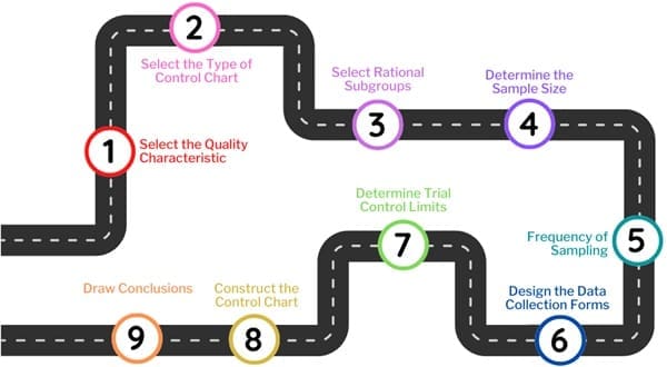
Creating a control chart involves several key steps. Here’s a simplified breakdown:
Select the Quality Characteristic
Choose the most critical quality characteristic to monitor. For example, in a cricket ball factory, you might focus on weight, diameter, or surface texture. Prioritize based on factors like defect frequency, impact on cost, and customer satisfaction, using a Pareto analysis to identify the most significant issues.
Select the Type of Control Chart
Choose the control chart type based on the quality characteristic. Use a variable control chart (e.g., X-bar chart) for measurable characteristics like weight, and an attribute control chart (e.g., P-chart) for categorical traits like color or surface defects.
Select Rational Subgroups
Group items produced under similar conditions, called rational subgroups. These subgroups help distinguish between random process variation and systematic issues, such as machine malfunctions.
Determine the Sample Size
Choose a sample size that’s large enough for reliable data but small enough for homogeneity. Typically, sample sizes of 4-5 units are used to ensure normal distribution.
Frequency of Sampling
In the early stages of process monitoring, sample frequently (e.g., hourly). As the process stabilizes, you can reduce sampling frequency (e.g., every few hours).
Design Data Collection Forms
Create forms to record process data consistently. These should capture product details, sample measurements, and any anomalies.
Determine Trial Control Limits
Set control limits, typically ±3 standard deviations (3σ) from the mean, based on expected process variation.
Construct the Chart
Plot the data over time, marking the centerline (mean) and control limits.
Analyze the Results
Investigate any data points outside the control limits or abnormal patterns. If the process is in control, it should show consistent performance within the limits.
Advantages
- Real-Time Monitoring: Control charts allow real-time monitoring of processes, making it easier to detect problems early.
- Preventive Action: By identifying issues before they lead to defects, control charts help implement preventive measures.
- Improved Process Efficiency: Regular use of control charts leads to more consistent processes, improved quality, and reduced waste.
Limitations
- Requires Sufficient Data: Control charts rely on a sufficient amount of data for accurate analysis, making them less effective in small sample sizes.
- Not Useful for Dynamic Systems: Control charts are not always suitable for processes that change rapidly over time, such as systems with high variability.
- Needs Regular Updates: The control limits may need to be recalculated periodically as the process improves or as more data becomes available.
Final Words
Control charts are an indispensable tool for monitoring process performance and maintaining process stability. By distinguishing between common cause and special cause variation, they help identify when processes are operating normally and when they require intervention.
Whether used in manufacturing, service industries, or any other field, control charts provide valuable insights into how well a process is performing and where improvements can be made. With proper implementation, they serve as a powerful tool for continuous improvement and quality control.

About Six Sigma Development Solutions, Inc.
Six Sigma Development Solutions, Inc. offers onsite, public, and virtual Lean Six Sigma certification training. We are an Accredited Training Organization by the IASSC (International Association of Six Sigma Certification). We offer Lean Six Sigma Green Belt, Black Belt, and Yellow Belt, as well as LEAN certifications.
Book a Call and Let us know how we can help meet your training needs.

