
Creating an effective Six Sigma performance dashboard requires more than just displaying colorful charts and metrics. The most successful dashboards transform complex process data into actionable insights that drive strategic decision-making across your organization.
When you design a dashboard that truly aligns with strategic goals, you create a powerful communication tool that bridges the gap between operational activities and executive vision. This alignment ensures every improvement initiative directly contributes to organizational success while maintaining the statistical rigor that defines Six Sigma methodology.
The fundamental challenge lies in translating high-level strategic objectives into measurable, trackable performance indicators that teams can influence through their daily work. This translation requires careful consideration of your organization’s unique context, improvement priorities, and stakeholder needs.
Table of contents
What is a Six Sigma Performance Dashboard?
A Six Sigma performance dashboard is a visual tool that tracks key performance indicators (KPIs), metrics, and data points critical to Six Sigma projects.
Rooted in the DMAIC framework (Define, Measure, Analyze, Improve, Control), it provides real-time insights into process performance, helping teams monitor progress, identify bottlenecks, and sustain improvements. Unlike generic dashboards, a Six Sigma dashboard is laser-focused on quality, variability, and defect reduction, aligning closely with strategic business objectives.
Think of it as a control tower for a bustling airport. Just as air traffic controllers monitor flights to ensure safety and efficiency, a Six Sigma dashboard keeps your processes on track, ensuring they align with your company’s broader goals, whether that’s boosting customer satisfaction or cutting costs.
Why Aligning with Strategic Goals Matters?
A dashboard that doesn’t reflect your organization’s priorities is like a compass pointing in the wrong direction. Strategic alignment ensures your Six Sigma efforts contribute to overarching objectives, such as increasing profitability, improving customer experience, or enhancing operational efficiency.
By tying metrics to goals, you create a unified focus, rallying teams around shared outcomes and maximizing the impact of your process improvements.
For example, a manufacturing firm aiming to reduce production costs might design a dashboard that tracks defect rates and cycle times, directly linking Six Sigma metrics to cost-saving goals. This alignment transforms data into actionable insights, driving tangible business results.

Public, Onsite, Virtual, and Online Six Sigma Certification Training!
- We are accredited by the IASSC.
- Live Public Training at 52 Sites.
- Live Virtual Training.
- Onsite Training (at your organization).
- Interactive Online (self-paced) training,
How to Design a Six Sigma Performance Dashboard Aligned with Strategic Goals?
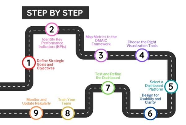
Creating a Six Sigma performance dashboard requires careful planning and a deep understanding of both Six Sigma principles and your organization’s priorities. Follow these steps to build a dashboard that delivers value.
1. Define Strategic Goals and Objectives
Start by clarifying your organization’s strategic goals. Are you aiming to improve product quality, reduce delivery times, or enhance customer satisfaction? Engage stakeholders—executives, department heads, and Six Sigma teams—to identify priorities. Use frameworks like SMART (Specific, Measurable, Achievable, Relevant, Time-bound) to refine these goals.
For instance, a healthcare provider might set a goal to “reduce patient wait times by 20% within six months.” This goal becomes the foundation for selecting relevant metrics, ensuring the dashboard serves a clear purpose.
2. Identify Key Performance Indicators (KPIs)
Next, select KPIs that reflect both Six Sigma principles and your strategic goals. Six Sigma focuses on metrics like defect rates, process capability (Cp/Cpk), and sigma levels, but these must tie to broader objectives. Common KPIs include:
- Defect Rate: Measures errors or failures per million opportunities (DPMO).
- Cycle Time: Tracks the time taken to complete a process.
- Process Capability: Assesses how well a process meets specifications (Cp/Cpk).
- Customer Satisfaction: Gauges customer feedback or Net Promoter Score (NPS).
- Cost of Poor Quality (COPQ): Quantifies financial losses due to defects.
For example, a retailer aiming to improve customer satisfaction might track return rates and complaint resolution times alongside defect metrics, ensuring the dashboard reflects both quality and customer-centric goals.
3. Map Metrics to the DMAIC Framework
The DMAIC framework is the backbone of Six Sigma. Ensure your dashboard supports each phase:
- Define: Display goals, project scope, and customer requirements.
- Measure: Show baseline metrics like current defect rates or cycle times.
- Analyze: Include tools like control charts or Pareto diagrams to identify root causes.
- Improve: Track progress on implemented solutions, such as reduced variability.
- Control: Monitor ongoing performance to sustain improvements, using metrics like sigma levels.
By aligning metrics with DMAIC, your dashboard becomes a dynamic tool that guides teams through the entire Six Sigma process.
4. Choose the Right Visualization Tools
Effective dashboards are visually intuitive, turning complex data into clear insights. Select visualization tools that suit your metrics and audience. Common options include:
- Control Charts: Monitor process stability and variability over time.
- Pareto Charts: Highlight the most significant causes of defects.
- Histograms: Show the distribution of process outcomes.
- Gauge Charts: Display performance against targets, like sigma levels.
- Trend Lines: Track progress toward strategic goals over time.
For example, a logistics company might use a control chart to monitor delivery times, instantly spotting deviations from the norm. Choose tools that are easy to interpret, ensuring stakeholders from executives to frontline workers can understand the data.
5. Select a Dashboard Platform
The right platform brings your dashboard to life. Popular options include:
- Tableau: Offers robust visualization and data integration capabilities.
- Power BI: Integrates seamlessly with Microsoft tools and provides real-time updates.
- Excel: A cost-effective option for smaller teams with basic needs.
- Minitab: Tailored for Six Sigma with built-in statistical tools.
Consider factors like ease of use, scalability, and integration with existing systems. For instance, a global corporation might choose Tableau for its ability to handle large datasets, while a small business might opt for Excel’s simplicity.
6. Design for Usability and Clarity
A cluttered dashboard confuses users and dilutes impact. Follow these design principles:
- Keep It Simple: Focus on 5–10 key metrics to avoid information overload.
- Use Clear Labels: Ensure metrics and charts are easy to understand.
- Prioritize Real-Time Data: Enable quick decision-making with live updates.
- Customize for Users: Tailor views for different audiences, like executives (high-level summaries) or Black Belts (detailed analytics).
Imagine a dashboard as a car’s instrument panel—only the most critical gauges, like speed and fuel, are front and center. Similarly, your Six Sigma dashboard should highlight the metrics that matter most.
7. Test and Refine the Dashboard
Before rolling out your dashboard, test it with a pilot group. Gather feedback from stakeholders to ensure it meets their needs. Ask questions like:
- Are the metrics relevant to our strategic goals?
- Is the dashboard easy to navigate?
- Do the visualizations clearly convey insights?
Iterate based on feedback, adding or removing metrics as needed. For example, if users find a histogram confusing, replace it with a simpler bar chart. Continuous refinement ensures the dashboard remains a valuable tool.
8. Train Your Team
A dashboard is only as effective as the people using it. Train your team—especially Green Belts and Black Belts—on how to interpret and act on the data. Provide training on:
- Understanding KPIs and their link to strategic goals.
- Using the dashboard platform (e.g., Tableau or Power BI).
- Applying Six Sigma tools like control charts or Pareto analysis.
For instance, a manufacturing team might need training on interpreting Cp/Cpk metrics to ensure processes meet quality standards. Empowered teams drive better outcomes.
9. Monitor and Update Regularly
A Six Sigma dashboard isn’t static. Regularly review its performance to ensure it aligns with evolving goals. Update metrics, visualizations, or data sources as priorities shift. For example, if your company pivots from cost reduction to customer retention, add NPS or customer complaint metrics to the dashboard.
Strategic Alignment Through Balanced Scorecard Integration
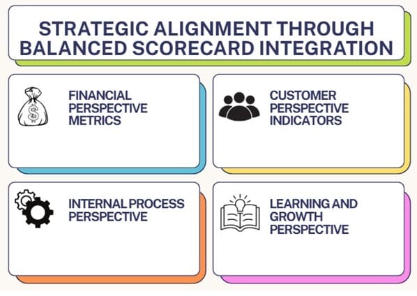
Financial Perspective Metrics
Integrate financial performance indicators that demonstrate the monetary impact of Six Sigma initiatives. These metrics might include cost savings, revenue improvements, return on investment, and cost avoidance calculations.
Present financial data in contexts that clearly link quality improvements to business results. This connection helps executives understand the strategic value of Six Sigma investments and supports continued program funding.
Use trending analysis to show how financial performance correlates with quality improvements over time. This longitudinal view strengthens the business case for sustained Six Sigma commitment.
Customer Perspective Indicators
Incorporate customer-focused metrics that demonstrate how internal process improvements translate into enhanced customer value. Customer satisfaction scores, Net Promoter Scores, complaint reduction rates, and delivery performance metrics provide this customer-centric view.
Design visualizations that show the customer journey and highlight how Six Sigma improvements enhance customer experiences at each touchpoint. This customer perspective helps maintain focus on value creation rather than just internal efficiency.
Internal Process Perspective
Highlight internal process efficiency and effectiveness metrics that support strategic objectives. Cycle time reduction, first-pass yield improvements, process capability enhancements, and defect rate reductions fall into this category.
Organize process metrics according to value stream flows or organizational functions to provide meaningful context for improvement efforts. This organization helps stakeholders understand how individual process improvements contribute to overall strategic success.
Learning and Growth Perspective
Include metrics that track organizational capability development and employee engagement in Six Sigma initiatives. Training completion rates, certification achievements, suggestion implementation rates, and employee satisfaction scores demonstrate organizational learning progress.
These human capital indicators help ensure your Six Sigma program builds sustainable improvement capabilities rather than just delivering short-term results.
Also Read: Online Lean Six Sigma Yellow Belt Certification
Advanced Dashboard Design Principles
Visual Hierarchy and Information Architecture
Create clear visual hierarchies that guide viewer attention to the most critical information first. Use size, color, and positioning to emphasize strategic KPIs while providing supporting detail for deeper analysis.
Implement consistent design standards across all dashboard elements to reduce cognitive load and improve user experience. Consistent color coding, typography, and layout patterns help users navigate complex information efficiently.
Design for multiple viewing contexts, including executive briefings, team meetings, and individual analysis sessions. Each context may require different levels of detail and different emphasis on specific metrics.
Real-Time Data Integration and Automation
Incorporate real-time or near-real-time data feeds to ensure your dashboard reflects current performance levels. Automated data updates reduce manual effort while improving data accuracy and timeliness.
Design alert systems that notify stakeholders when performance deviates from acceptable ranges or when improvement opportunities emerge. These proactive notifications enable rapid response to changing conditions.
Implement data validation checks to ensure dashboard accuracy and reliability. Six Sigma practitioners expect high-quality data, and dashboard credibility depends on maintaining rigorous data standards.
Interactive Analytics and Drill-Down Capabilities
Enable users to explore data relationships through interactive features that support root cause analysis and improvement planning. Click-through capabilities that reveal underlying data support the analytical mindset central to Six Sigma methodology.
Provide filtering and segmentation options that allow users to analyze performance across different dimensions such as time periods, product lines, geographic regions, or customer segments.
Include comparative analysis features that enable benchmarking against historical performance, industry standards, or organizational targets. These comparisons provide context for interpreting current performance levels.
FAQs on Designing a Six Sigma Performance Dashboard
What is a Six Sigma performance dashboard?
A Six Sigma performance dashboard is a visual tool that tracks KPIs and metrics to monitor process performance, reduce defects, and align with strategic goals.
How do I choose KPIs for a Six Sigma dashboard?
Select KPIs that reflect your strategic goals and Six Sigma principles, such as defect rates, cycle times, process capability, or customer satisfaction metrics.
What tools are best for creating a Six Sigma dashboard?
Popular tools include Tableau, Power BI, Minitab, and Excel, chosen based on your team’s needs, data complexity, and budget.
How often should I update my Six Sigma dashboard?
Review and update the dashboard regularly—quarterly or when strategic goals shift—to ensure it remains relevant and effective.
Can a Six Sigma dashboard be used across industries?
Yes, industries like manufacturing, healthcare, and finance can use Six Sigma dashboards to track quality, efficiency, and compliance metrics.
Also Read: Risk Response Plan
Final Words
Designing a Six Sigma performance dashboard that aligns with your strategic goals is a game-changer for process improvement. By defining clear objectives, selecting relevant KPIs, and leveraging the DMAIC framework, you create a tool that transforms data into actionable insights. With the right visualizations, platform, and team training, your dashboard becomes a beacon of clarity, guiding your organization toward operational excellence.
Whether you’re reducing defects, cutting costs, or boosting customer satisfaction, a well-designed Six Sigma dashboard ensures your efforts stay on track. Start today—build a dashboard that drives success and aligns with your vision.

About Six Sigma Development Solutions, Inc.
Six Sigma Development Solutions, Inc. offers onsite, public, and virtual Lean Six Sigma certification training. We are an Accredited Training Organization by the IASSC (International Association of Six Sigma Certification). We offer Lean Six Sigma Green Belt, Black Belt, and Yellow Belt, as well as LEAN certifications.
Book a Call and Let us know how we can help meet your training needs.