

Box plots, also known as box-and-whisker plots, represent the cornerstone of statistical analysis within Six Sigma projects. These graphical tools let you easily visually compare variation between the data sets evaluated and serve multiple purposes throughout the DMAIC (Define, Measure, Analyze, Improve, Control) process.
The fundamental structure of a box plot reveals five key statistical measures: minimum value, first quartile (Q1), median, third quartile (Q3), and maximum value. Additionally, outliers appear as individual points beyond the whiskers, providing immediate visibility into process anomalies that require investigation.
Within Six Sigma frameworks, box plots excel at identifying variation patterns, comparing different process conditions, and tracking improvements over time. Furthermore, they complement other statistical tools like control charts and Pareto analysis, creating a comprehensive view of process performance.
Table of contents
Why Box Plots Matter in Six Sigma?
Box plots are a cornerstone of Six Sigma because they distill complex datasets into five key metrics: the minimum, first quartile (Q1), median, third quartile (Q3), and maximum. These elements reveal the spread, central tendency, and potential outliers in your data, making them invaluable for identifying process variations and driving improvements.
Whether you’re in the Measure, Analyze, or Improve phase of the DMAIC framework, box plots help you visualize how your process behaves and pinpoint areas for optimization.
However, as you collect more data—say, from ongoing process monitoring or new experiments—your box plots need to evolve. Static visuals won’t cut it in a dynamic Six Sigma environment. Updating and refining these plots ensures they reflect the latest process performance, helping you spot trends, validate improvements, or detect new issues.

Public, Onsite, Virtual, and Online Six Sigma Certification Training!
- We are accredited by the IASSC.
- Live Public Training at 52 Sites.
- Live Virtual Training.
- Onsite Training (at your organization).
- Interactive Online (self-paced) training,
Basics of Updating Box Plots
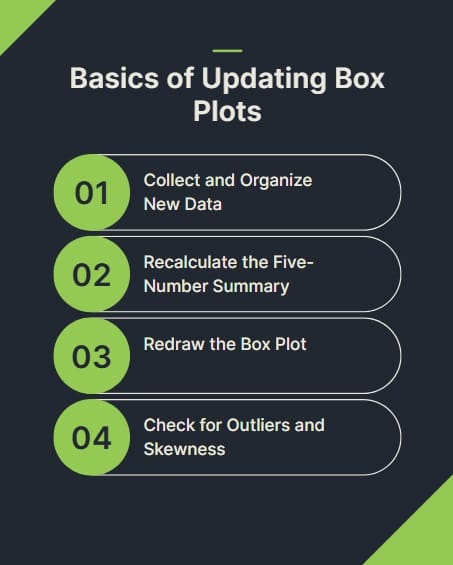
When new data enters the picture, updating a box plot is more than just plugging in numbers. It’s about ensuring the plot remains a reliable reflection of your process. Here’s how to approach it:
Step 1: Collect and Organize New Data
Before you touch your box plot, ensure your new data is clean and organized. In Six Sigma, data integrity is non-negotiable. Verify that your new measurements align with the same metrics (e.g., cycle time, defect rates) and are free from errors. Use tools like Excel, Minitab, or Python to store and structure your data for easy integration.
For example, if you’re tracking production cycle times across multiple machines, append the new data to your existing dataset, ensuring consistency in units and categories. This step sets the foundation for accurate updates.
Step 2: Recalculate the Five-Number Summary
A box plot hinges on its five-number summary: minimum, Q1, median, Q3, and maximum. As new data comes in, these values may shift. Recalculate them to reflect the updated dataset:
- Minimum and Maximum: Identify the smallest and largest non-outlier values. In Six Sigma, outliers are typically points beyond 1.5 times the interquartile range (IQR) from Q1 or Q3.
- First Quartile (Q1): Find the 25th percentile of the combined dataset.
- Median (Q2): Determine the 50th percentile, or the middle value.
- Third Quartile (Q3): Calculate the 75th percentile.
- IQR: Compute the difference between Q3 and Q1 to redefine the whiskers and identify outliers.
Software like Minitab or Excel can automate these calculations, but understanding the logic ensures you catch any anomalies.
Step 3: Redraw the Box Plot
With the updated five-number summary, redraw your box plot. Most statistical software makes this straightforward:
- Excel: Use the built-in box plot feature (available in newer versions) or create a custom plot using stacked bar charts for older versions. Update your data range to include the new values.
- Minitab: Import the new dataset and regenerate the plot via the “Graph” menu.
- Python: Libraries like Matplotlib or Seaborn allow you to update plots programmatically. For instance, a simple Seaborn command like sns.boxplot(data=updated_dataset) can refresh your visual.
Ensure the plot’s scale and labels remain consistent with previous versions for easy comparison.
Step 4: Check for Outliers and Skewness
New data can introduce outliers or change the distribution’s shape. Reassess the plot for:
- Outliers: Points beyond 1.5 × IQR from Q1 or Q3. Investigate these for special causes, such as equipment malfunctions or data entry errors.
- Skewness: If the median is off-center within the box or the whiskers are uneven, your data may be skewed. This could signal process instability or non-normal distribution, which is critical in Six Sigma analysis.
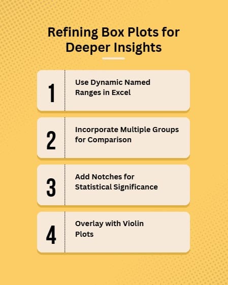
Refining Box Plots for Deeper Insights
Updating a box plot is just the start. Refining it means enhancing its clarity, comparability, and relevance to your Six Sigma goals. Here are advanced techniques to elevate your box plots:
Use Dynamic Named Ranges in Excel
Manually updating data ranges in Excel can be tedious, especially with large datasets. Instead, use dynamic named ranges to automatically include new data. Here’s how:
- Create a named range (e.g., “CycleTimes”) using the OFFSET function: =OFFSET(Sheet1!$A$1,0,0,COUNTA(Sheet1!$A:$A),1).
- Reference this range in your box plot. As you add new data to the column, the plot updates automatically.
This approach saves time and reduces errors, especially in ongoing Six Sigma projects.
Incorporate Multiple Groups for Comparison
Six Sigma often involves comparing processes, such as before and after improvements or across different teams. Refine your box plot by including multiple groups side by side. For instance, if you’re analyzing defect rates across three production lines, plot all three in a single graph. This visual comparison highlights differences in variation or central tendency, guiding your root cause analysis.
In Minitab, select “Multiple Y’s” in the box plot dialog to display grouped data. In Python, use sns.boxplot(x=’Group’, y=’Value’, data=dataset) to achieve the same effect.
Add Notches for Statistical Significance
Notched box plots add a visual cue for comparing medians across groups. The notch represents a confidence interval around the median—non-overlapping notches suggest statistically significant differences. This is particularly useful in the Analyze phase of DMAIC to confirm whether process changes have a meaningful impact.
Minitab and R support notched box plots natively, while in Python, you can enable notches with sns.boxplot(notch=True).
Overlay with Violin Plots
For a richer view of data distribution, combine box plots with violin plots. Violin plots show the density of data points, revealing multimodal distributions that a standard box plot might miss. This is especially helpful when new data suggests complex process behavior. In Python, Seaborn’s violinplot function can overlay a box plot for enhanced visualization.
Also Read: Time Series Plot
Best Practices for Updating and Refining Box Plots
To ensure your box plots remain effective as you collect more data, follow these best practices:
- Maintain Consistency: Use the same scale, colors, and labels across all versions of the plot to facilitate comparisons.
- Validate Data Quality: Double-check new data for accuracy and completeness to avoid skewed results.
- Document Changes: Note when and why new data was added to maintain a clear audit trail.
- Focus on Actionable Insights: Highlight outliers or shifts in the plot that point to specific process issues or improvement opportunities.
- Engage Stakeholders: Use clear, annotated plots to communicate findings to team members or leadership.
Common Pitfalls and How to Avoid Them
Even seasoned Six Sigma practitioners can stumble when updating box plots. Watch out for these pitfalls:
- Ignoring Outliers: Outliers may indicate special causes that need investigation. Don’t dismiss them as noise.
- Overcomplicating Visuals: Adding too many groups or annotations can clutter the plot. Keep it simple and focused.
- Inconsistent Scales: Changing scales between plots can mislead comparisons. Stick to a fixed scale unless the data range shifts dramatically.
- Neglecting Context: A box plot is a tool, not a conclusion. Always interpret it within the context of your Six Sigma project goals.
Advanced Refinement Techniques
Dynamic Segmentation Strategies
As data volumes increase, consider implementing dynamic segmentation based on process characteristics or temporal patterns. For instance, segment data by shift patterns, seasonal variations, or operational conditions to reveal hidden sources of variation. This approach often uncovers improvement opportunities that aggregate analysis might miss.
Stratified box plots enable deeper process understanding by revealing how different conditions affect outcome distributions. Consequently, you can target specific improvement efforts more effectively and measure their impact with greater precision. Additionally, stratification helps identify interaction effects between process variables.
Statistical Process Control Integration
SPC isn’t just about maintaining the status quo; it’s a tool for ongoing process enhancement, and integrating box plots with control charts creates comprehensive process monitoring systems. While control charts track process stability over time, box plots provide detailed distribution information at specific intervals.
Combine these tools by updating box plots at regular intervals corresponding to control chart subgroup periods. This integration reveals whether process improvements affect only central tendency or also reduce variation. Furthermore, it helps distinguish between special cause variations and fundamental process changes.
Automated Update Protocols
Establish systematic protocols for box plot updates to ensure consistency and reduce manual effort. Define update frequencies based on data collection rates, process stability, and project phases. For example, rapidly changing processes may require weekly updates, while stable processes might need only monthly refreshments.
Implement validation checkpoints within automated systems to catch data quality issues before they affect analysis. These checkpoints should verify data completeness, detect unusual patterns, and flag potential measurement system problems. Additionally, maintain audit trails documenting all updates and modifications.
Also Read: Frequency Plot for Data Visualization
Tools for Updating Box Plots
Several tools make updating and refining box plots a breeze:
- Excel: Ideal for quick updates and dynamic ranges, though limited for advanced features like notches.
- Minitab: A Six Sigma favorite for its robust statistical capabilities and ease of use.
- Python (Matplotlib/Seaborn): Offers flexibility for automation and customization, perfect for data-heavy projects.
- R: Great for statistical rigor and notched plots, especially in academic or research-driven Six Sigma projects.
FAQs on Updating & Refining Box Plots in Six Sigma
What is a box plot in Six Sigma?
A box plot, or box-and-whisker plot, is a graphical tool that displays a dataset’s minimum, first quartile, median, third quartile, and maximum, highlighting variation and outliers.
How often should I update box plots in Six Sigma?
Update box plots whenever new data is collected, such as after a process change, new shift, or regular monitoring interval, to ensure they reflect current performance.
Can I automate box plot updates?
Yes, use dynamic named ranges in Excel, macros, or Python scripts with libraries like Seaborn to automate updates as new data is added.
What tools are best for creating and updating box plots?
Excel, Minitab, Python (Matplotlib/Seaborn), and R are popular choices, each offering unique strengths for Six Sigma data analysis.
How do I handle outliers in updated box plots?
Investigate outliers to identify special causes, such as process errors or anomalies, and decide whether to address them or exclude them from analysis.
Final Words
In Six Sigma, box plots are more than just visuals—they’re windows into your process’s soul. Updating and refining them as you collect more data ensures they remain powerful tools for spotting variation, identifying outliers, and driving improvements.
By recalculating the five-number summary, leveraging automation, and applying best practices, you can keep your box plots relevant and actionable. Whether you’re in manufacturing, healthcare, or services, refined box plots empower you to make data-driven decisions with confidence.

About Six Sigma Development Solutions, Inc.
Six Sigma Development Solutions, Inc. offers onsite, public, and virtual Lean Six Sigma certification training. We are an Accredited Training Organization by the IASSC (International Association of Six Sigma Certification). We offer Lean Six Sigma Green Belt, Black Belt, and Yellow Belt, as well as LEAN certifications.
Book a Call and Let us know how we can help meet your training needs.