
Data visualization stands at the heart of modern statistical analysis, transforming complex numerical information into digestible visual formats. Among the most fundamental and powerful tools in this arsenal is the frequency plot – a versatile visualization technique that reveals patterns, trends, and distributions within datasets that might otherwise remain hidden in raw numbers.
Whether you’re a student grappling with statistics homework, a researcher analyzing survey results, or a business analyst interpreting market data, mastering frequency plots will significantly enhance your ability to communicate insights effectively.
Table of contents
What is a Frequency Plot?
A frequency plot, also known as a frequency chart or frequency graph, is a visual representation of how often values occur in a dataset. It’s like a snapshot that shows the distribution of data points across categories or intervals. In statistics, the number of items in a particular category is called the frequency, and a frequency plot brings these numbers to life.
Frequency plots come in various forms, such as histograms, bar graphs, or line plots, each suited to different types of data. For example, a frequency bar graph displays categorical data, while a frequency distribution graph (like a histogram) is ideal for continuous data. By showing how data is spread, frequency plots help identify patterns, outliers, and trends at a glance.

Public, Onsite, Virtual, and Online Six Sigma Certification Training!
- We are accredited by the IASSC.
- Live Public Training at 52 Sites.
- Live Virtual Training.
- Onsite Training (at your organization).
- Interactive Online (self-paced) training,
Frequency in Statistics
Frequency statistics encompass several related concepts that work together to provide comprehensive data understanding. At its core, frequency analysis involves counting occurrences and organizing these counts in meaningful ways.
Consider a simple example: if you surveyed 100 people about their favorite colors and found that 30 chose blue, 25 chose red, 20 chose green, 15 chose yellow, and 10 chose other colors, these numbers represent the frequency distribution of color preferences. Each count tells a story about the dataset’s characteristics.
Why Frequency Plots Matter?
In a world drowning in data, clarity is king. Frequency plots simplify complex datasets, making it easier to spot trends or anomalies. For instance, a retailer might use a frequency distribution graph to see which products sell most frequently, while a teacher might use a frequency table to analyze student test scores.
According to a 2023 study, visualizations like frequency plots improve data comprehension by up to 70% compared to raw numbers. With such impact, mastering frequency plots is a must for anyone working with data.
Understanding Frequency Distributions
Before diving into frequency plots, let’s break down the foundation: frequency distributions. A frequency distribution shows how often each value or range of values occurs in a dataset. It’s typically presented in a frequency distribution table, which organizes data into categories or intervals and lists their frequencies.
Types of Frequency Distributions
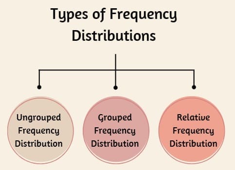
- Ungrouped Frequency Distribution: Lists individual values and their frequencies. Best for small datasets with distinct values, like survey responses (e.g., “Yes,” “No,” “Maybe”).
- Grouped Frequency Distribution: Groups data into intervals for continuous or large datasets, such as test scores or ages. A grouped frequency table makes it easier to manage large datasets.
- Relative Frequency Distribution: Shows the proportion of each category’s frequency relative to the total. A relative frequency table expresses frequencies as percentages or decimals, offering a normalized view of the data.
Also Read: Dot Plots Explained: How They Simplify Complex Data
What is a Frequency Table?
A frequency table is a tabular summary of how often each value or range appears in a dataset. For example, if you’re analyzing test scores, a frequency table might look like this:
| Score Range | Frequency |
| 0–20 | 5 |
| 21–40 | 8 |
| 41–60 | 12 |
| 61–80 | 10 |
| 81–100 | 5 |
This frequency table example shows how scores are distributed, making it easy to see that most students scored between 41 and 80. A relative frequency table would convert these counts into percentages, such as 30% for the 41–60 range.
How to Create a Frequency Plot?

Creating a frequency plot is straightforward once you understand your data and goals. Here’s a step-by-step guide to crafting one, whether you’re using a frequency bar graph, histogram, or another type of plot.
Step 1: Collect and Organize Your Data
Start with a clear dataset. For example, imagine you’re analyzing the number of daily customer visits to a coffee shop over a month. Your data might include the number of visits each day (e.g., 50, 45, 60, etc.).
Step 2: Construct a Frequency Distribution
Create a frequency distribution table to summarize your data. For continuous data, use a grouped frequency distribution table with intervals (e.g., 0–20 visits, 21–40 visits). For categorical data, list each category and its count. Here’s an example for the coffee shop data:
| Visits (Daily) | Frequency |
| 0–20 | 3 |
| 21–40 | 8 |
| 41–60 | 12 |
| 61–80 | 5 |
| 81–100 | 2 |
Step 3: Choose the Right Plot Type
Select a plot type based on your data:
- Histogram: Ideal for continuous data, showing frequency with bars that touch to indicate intervals (e.g., a frequency distribution graph for customer visits).
- Bar Graph: Best for categorical data, with gaps between bars to show distinct categories (e.g., a frequency bar graph for product types sold).
- Line Plot: Useful for showing trends over time or across ordered categories.
Step 4: Create the Plot
Use software like Excel, Python (Matplotlib/Seaborn), R, or Tableau to generate your plot. For example, in Python, you can create a histogram with Matplotlib:
import matplotlib.pyplot as plt
data = [50, 45, 60, 30, 25, 55, 70, 65, 40, 35, 50, 60, 45, 80, 90]
plt.hist(data, bins=5, edgecolor=’black’)
plt.xlabel(‘Daily Visits’)
plt.ylabel(‘Frequency’)
plt.title(‘Frequency Plot of Coffee Shop Visits’)
plt.show()
This code produces a frequency plot showing how visits are distributed across intervals.
Step 5: Interpret the Plot
Analyze your plot to uncover insights. For the coffee shop, a histogram might reveal that most days see 41–60 visits, suggesting stable customer traffic. If you notice outliers (e.g., a few days with 81–100 visits), investigate potential causes, like promotions or events.
Relative Frequency vs. Frequency Plots
A relative frequency graph is similar to a standard frequency plot but shows proportions instead of raw counts. For example, a relative frequency bar graph might show that 40% of days had 41–60 visits, making it easier to compare datasets of different sizes. To create a relative frequency plot, divide each frequency by the total number of observations and multiply by 100 for percentages.
When to Use Relative Frequency?
Use relative frequency statistics when comparing datasets with different sample sizes or when you want to emphasize proportions. For instance, comparing customer visits across two coffee shops with different total days requires a relative frequency table to normalize the data.
Also Read: Using Box Plots to Understand Variability and Outliers in Data
Tools for Creating Frequency Plots
Modern technology makes creating frequency plots a breeze. Here are some popular tools:
- Excel: Simple for beginners, with built-in histogram and bar chart options.
- Python (Matplotlib/Seaborn): Highly customizable for advanced users, ideal for frequency charts.
- R: Great for statistical analysis, with packages like ggplot2 for stunning visuals.
- Tableau: User-friendly for interactive dashboards and professional-grade plots.
- Google Sheets: Accessible for quick, cloud-based frequency plots.
These tools streamline the process, letting you focus on interpreting results rather than wrestling with calculations.
How to Find Frequency in Statistics?
To calculate frequency in statistics, count how often each value or range appears in your dataset. For example, to find frequency in statistics for test scores:
- List all unique values or create intervals for continuous data.
- Count occurrences for each value or interval.
- Summarize in a frequency table in statistics.
For grouped data, use intervals to make the data manageable. To find relative frequency, divide each frequency by the total number of observations.
Real-World Applications of Frequency Plots
Frequency plots shine in diverse fields:
- Business: Retailers use frequency distributions to analyze sales patterns, optimizing inventory.
- Education: Teachers create frequency tables to assess student performance and identify gaps.
- Healthcare: Researchers use frequency graphs to study disease prevalence or treatment outcomes.
- Marketing: Analysts track campaign performance with frequency charts to measure engagement.
For example, a 2024 retail study used a frequency plot to show that 60% of sales occurred on weekends, prompting a shift in staffing schedules.
Challenges and Solutions
Creating effective frequency plots isn’t without hurdles:
- Choosing Intervals: Too few or too many intervals can distort a histogram. Solution: Use Sturges’ or Scott’s rule to determine optimal bin sizes.
- Data Overload: Large datasets can be overwhelming. Solution: Use grouped frequency tables to simplify.
- Misinterpretation: Plots can mislead if not labeled clearly. Solution: Include clear titles, labels, and legends.
FAQs About Frequency Plots
What is a frequency plot?
A frequency plot is a visual representation of how often values occur in a dataset, using formats like histograms or bar graphs to show frequency distributions.
How do you create a frequency table?
To create a frequency table, list unique values or intervals, count occurrences for each, and summarize in a table. For continuous data, use a grouped frequency table.
What’s the difference between frequency and relative frequency?
Frequency counts how often a value occurs, while relative frequency shows the proportion of occurrences relative to the total, often as a percentage.
What tools can I use for frequency plots?
Popular tools include Excel, Python (Matplotlib/Seaborn), R (ggplot2), Tableau, and Google Sheets, all of which support frequency charts and frequency graphs.
Why are frequency plots useful?
Frequency plots simplify data analysis by visualizing distributions, helping identify patterns, trends, and outliers in fields like business, education, and healthcare.
Final Words
Frequency plots are indispensable tools for anyone seeking to understand data. By transforming raw numbers into clear visuals, they reveal patterns and insights that drive better decisions. From frequency distribution tables to relative frequency graphs, these tools offer flexibility for any dataset.
Whether you’re a beginner or a seasoned analyst, mastering frequency in math and statistics will empower you to tackle complex data with confidence.


