
Descriptive statistics is a branch of statistics that focuses on summarizing, organizing, and interpreting data in a way that makes it easy to understand and communicate.
Unlike inferential statistics, which is concerned with making predictions or generalizations about a population based on a sample, descriptive statistics deals with the data at hand and helps in understanding its key features.
This process involves the use of both numerical and graphical tools to provide insights into the characteristics of the data.
Table of contents
What is Descriptive Statistics?
Descriptive statistics is a statistical method used to organize, summarize, and present data in a clear and informative way. It focuses on describing the basic features of a dataset, offering a simple overview of the sample and its measures.
This includes calculating central tendencies (mean, median, mode), dispersion (range, variance, standard deviation), and the shape of the distribution (skewness, kurtosis).
Tables, graphs, or charts often present descriptive statistics. They make it easier to understand the data’s structure without inferring or predicting about the larger population. It is a fundamental tool for data analysis.
Features of Descriptive Statistics
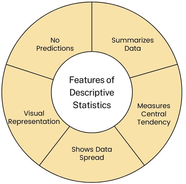
- Summarizes Data: Descriptive statistics help simplify and summarize large amounts of data into understandable forms, like averages or totals.
- Measures Central Tendency: It includes methods like finding the average (mean), middle value (median), or most common value (mode) in a data set.
- Shows Data Spread: Descriptive statistics also show how data is spread out, using tools like range (difference between highest and lowest values) or standard deviation (how much data varies from the average).
- Visual Representation: It often uses graphs, charts, and tables to present data visually, making it easier to see patterns and trends.
- No Predictions: Unlike other types of statistics, descriptive statistics do not make predictions or infer anything beyond the data presented. They just describe what the data shows.
Key Concepts in Descriptive Statistics
Types of Data
It’s crucial to understand the type of data you’re dealing with in descriptive statistics. This understanding influences how you should analyze and present the data.
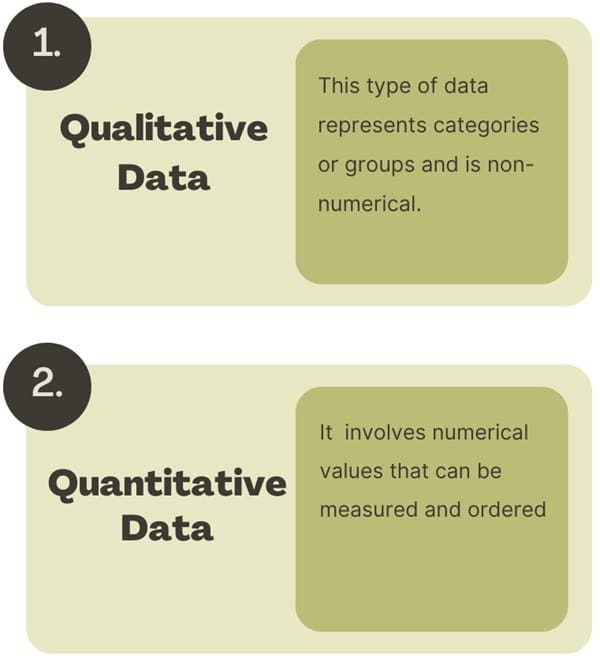
- Qualitative Data: This type of data represents categories or groups and is non-numerical. Examples include marital status, eye color, and education level. We often summarize qualitative data by counting the number of observations in each category. This process leads to a frequency distribution. Common graphical representations for qualitative data include pie charts and bar graphs.
- Quantitative Data: Quantitative data involves numerical values that can be measured and ordered. This type of data can be further divided into two categories:
- Discrete Data: This refers to data that can take on a finite or countable number of values. For example, the number of students in a class or the number of accidents in a year.
- Continuous Data: Continuous data can take on any value within a range. Examples include height, weight, or time.
Graphical Representation of Data
Visualizing data through graphs and charts is a powerful way to convey information effectively. Various types of graphical representations are used depending on the nature of the data.
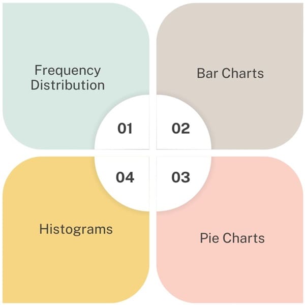
Frequency Distribution
A frequency distribution is a table that displays the frequency or count, of different outcomes in a data set. For qualitative data, this involves listing the categories and the number of occurrences in each.
For quantitative data, particularly when dealing with a large number of values, the data can be grouped into classes or intervals, creating a frequency distribution that shows how many values fall into each interval.
Bar Charts
Bar charts are particularly useful for displaying frequency distributions of qualitative data. Each bar represents a category, and the height of the bar corresponds to the frequency of that category.
Pie Charts
Pie charts are another way to represent qualitative data, where each slice of the pie corresponds to a category, and the size of each slice represents the proportion of observations in that category.
Histograms
Histograms are used to represent the frequency distribution of continuous quantitative data. Unlike bar charts, histograms group data into intervals, and each bar represents the frequency of data within that interval. The bars are contiguous, reflecting the continuous nature of the data.
Measures of Central Tendency
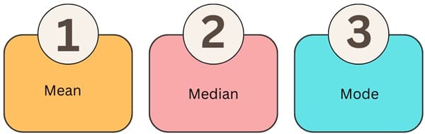
Central tendency refers to the measure that represents the centre or typical value in a dataset. The most common measures of central tendency are:
- Mean: The mean, often called the average, divides the sum of all data values by the number of observations. People widely use the mean for its simplicity. However, outliers (extremely high or low values) can heavily influence it.
- Median: The middle value in a dataset, when arranged in ascending or descending order, is the median. If there is an even number of observations, the median is the average of the two middle numbers. The median is less sensitive to outliers than the mean.
- Mode: The mode is the value that occurs most frequently in a dataset. A dataset can have more than one mode if multiple values occur with the same maximum frequency. The mode is the only measure of central tendency that can be used with qualitative data.
Measures of Spread (Variability)
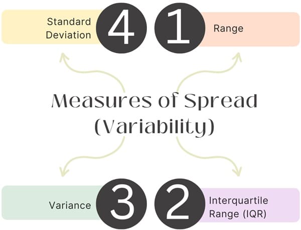
While measures of central tendency summarize the center of a dataset, measures of spread describe the variability or dispersion of the data.
- Range: The range is the difference between the maximum and minimum values in a dataset. It provides a simple measure of spread but does not account for the distribution of values between the extremes.
- Interquartile Range (IQR): The IQR measures the spread of the middle 50% of the data. It is calculated as the difference between the third quartile (Q3) and the first quartile (Q1) and is less affected by outliers.
- Variance: Variance measures the average squared deviation from the mean. It indicates how much the data values vary around the mean.
- Standard Deviation: The standard deviation is the square root of the variance and provides a measure of spread in the same units as the data. It is widely used to summarize the dispersion of a dataset.
Measures of Shape
The shape of the distribution of data is also an important characteristic. Common measures include:
- Skewness: Skewness indicates the degree of asymmetry of the data distribution. If the distribution is symmetric, the skewness is zero. A positive skew indicates that the right tail (higher values) is longer than the left tail, while a negative skew indicates the opposite.
- Kurtosis: Kurtosis measures the “tailedness” of the distribution. High kurtosis indicates heavy tails, or outliers, while low kurtosis indicates light tails.
Analyzing Graphical Displays
When analyzing data presented in graphical form, it is essential to consider several aspects:
- Center: Identify the approximate center or middle of the distribution. This can give a sense of where the majority of data points lie.
- Spread: Determine how spread out the data values are. A wide spread indicates greater variability, while a narrow spread suggests less variability.
- Shape: Examine the overall shape of the graph. Is it symmetric, skewed, or does it have any peaks? Understanding the shape can provide insights into the nature of the data.
- Patterns: Look for any interesting patterns or anomalies in the data. For example, are there any clusters, gaps, or outliers that stand out?
Also See: Lean Six Sigma Certification Programs, Long Beach, California
Practical Example: Frequency Distribution and Histograms
To better understand these concepts, consider an example where a researcher collects data on the number of accidents experienced by 80 machinists in a year. The data could be represented as follows:
Frequency Distribution Table
| Number of Accidents | Frequency |
| 0 | 55 |
| 1 | 14 |
| 2 | 5 |
| 3 | 2 |
| 4 | 0 |
| 5 | 2 |
| 6 | 1 |
| 7 | 0 |
| 8 | 1 |
This table provides a clear summary of how many machinists experienced each number of accidents.
Histogram
A histogram can be constructed based on the frequency distribution. In this histogram, the x-axis represents the number of accidents, and the y-axis represents the frequency of each class. The histogram allows for easy visualization of the distribution of accidents among the machinists.
Continuous Data: Histograms and Frequency Tables
You can effectively summarize continuous data, such as the left ventricular ejection fractions (LVEF) for heart transplant patients, using histograms. Group the data into intervals. Then, construct a frequency table and histogram to represent the distribution of LVEF values.
Example of Frequency Table for Continuous Data
| LVEF Interval | Frequency |
| 24.5 – 34.5 | 1 |
| 34.5 – 44.5 | 1 |
| 44.5 – 54.5 | 3 |
| 54.5 – 64.5 | 13 |
| 64.5 – 74.5 | 41 |
| 74.5 – 84.5 | 40 |
Importance of Descriptive Statistics
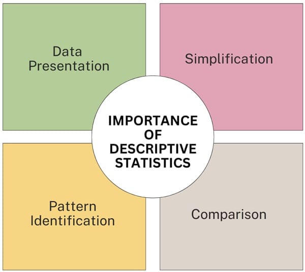
- Simplification: Descriptive statistics simplify large datasets into manageable summaries, making it easier to understand and communicate key findings.
- Comparison: It enables comparison between different datasets or subgroups within a dataset by providing standardized measures such as the mean, median, and standard deviation.
- Pattern Identification: Descriptive statistics help in identifying patterns, trends, and anomalies within the data, which can guide further analysis and decision-making.
- Data Presentation: The use of graphical tools such as histograms, bar charts, and pie charts enhances the presentation of data, making it more accessible to a broader audience.
Difference Between Descriptive Statistics and Inferential Statistics
| Basis | Descriptive Statistics | Inferential Statistics |
| Definition | Describes and summarizes data collected from a sample or population | Makes inferences or predictions about a population based on a sample |
| Focus | Central tendencies, distribution, and variability within the data | Relationships, differences, and predictions beyond the observed data |
| Data Analysis | Limited to the data on hand | Extends analysis to make predictions about a broader group |
| Use of Probability | Generally does not involve probability | Relies heavily on probability to draw conclusions |
| Population vs. Sample | Typically involves the entire population (if accessible) | Always involves a sample to represent a population |
| Visualization | Graphs, charts, and tables to display data | Uses the results of statistical tests and models to inform decisions |
| Examples of Techniques | Frequency distributions, histograms, pie charts | t-tests, chi-square tests, ANOVA, regression analysis |
| Application | Reporting average income of a city’s residents | Estimating the average income of the entire country based on city samples |
| Scope | Narrow focus, limited to the collected data | Broad focus, applying conclusions to a larger group |
| Objective | To describe what the data shows | To predict or infer trends, behaviors, or patterns |
Final Words
In summary, descriptive statistics provide essential tools for summarizing and interpreting data. By employing measures of central tendency, variability, and shape, along with effective graphical representation, descriptive statistics offer a comprehensive way to understand and communicate the characteristics of a dataset.
Whether dealing with qualitative or quantitative data, the principles and techniques of descriptive statistics are fundamental to the field of data analysis.

About Six Sigma Development Solutions, Inc.
Six Sigma Development Solutions, Inc. offers onsite, public, and virtual Lean Six Sigma certification training. We are an Accredited Training Organization by the IASSC (International Association of Six Sigma Certification). We offer Lean Six Sigma Green Belt, Black Belt, and Yellow Belt, as well as LEAN certifications.
Book a Call and Let us know how we can help meet your training needs.