In statistical process control (SPC), X-bar control charts are essential tools for monitoring the performance of a process over time. These charts track the mean or average of a process based on samples (subgroups) collected at regular intervals. The primary aim is to determine whether a process is stable, consistent, and operating within acceptable limits.
Table of contents
What is the X-bar in Statistics?
The X-Bar chart specifically focuses on changes in the process mean, helping businesses identify variations that could impact product quality.
A control chart visually represents how a process behaves over time. It consists of a central line (usually the average or mean), upper and lower control limits (UCL and LCL), and data points that represent the observed values from subgroups.
When the data points fall within the control limits, the process is considered in statistical control. If points fall outside the control limits, it suggests the process is out of control, prompting further investigation.
X-bar control charts often accompany other charts, like R (range) charts, to monitor both the mean and the variation within the process. This paired approach provides a comprehensive view of the process behavior.
Purpose
The primary purpose of X-Bar control charts is to detect shifts or changes in the process mean. In a stable process, the mean should remain consistent over time. If it deviates significantly, it might indicate that the process is no longer stable and may require corrective action. By setting control limits based on past data, these charts help track when the process is moving out of control.
X-Bar control charts typically monitor continuous data, such as weight, temperature, length, or time measurements, and group them into subgroups. A process remains stable when the mean of each subgroup stays consistent, and variations within subgroups follow predictable patterns.
Key Components
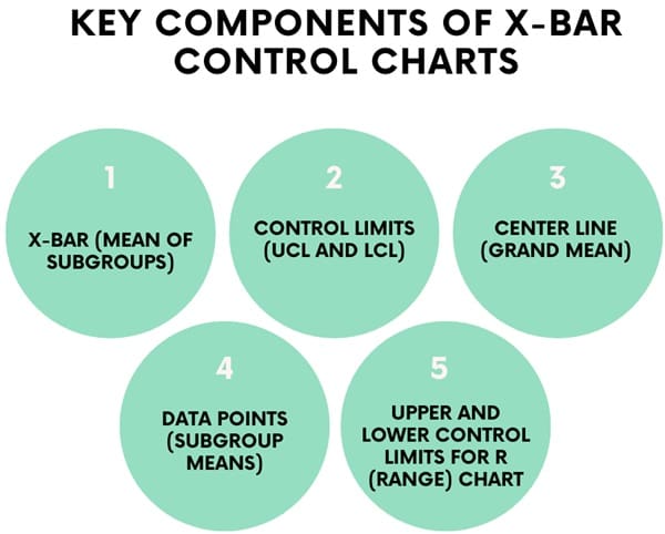
An X-bar control chart consists of several key components:
- X-Bar (Mean of Subgroups): The primary data point on the chart. It represents the mean value of each sample (subgroup) taken from the process. For example, if you are measuring the weight of a product, each subgroup’s X-bar would represent the average weight of the items in that subgroup.
- Control Limits (UCL and LCL): These are boundaries that help define the expected variation in the process. Any data point outside these limits indicates that the process may be out of control. The control limits are calculated using historical data from the process.
- Center Line (Grand Mean): The center line represents the overall average (or grand mean) of the process. It is calculated by averaging all subgroup means. This line helps visually assess how the process is performing relative to its typical behavior.
- Data Points (Subgroup Means): These represent the average measurements for each subgroup. They are plotted over time to assess the behavior of the process.
- Upper and Lower Control Limits for R (Range) Chart: In addition to the X-Bar chart, a range (R) chart is often used to monitor the variation within subgroups. The R chart tracks the spread or variability of the data within each subgroup.
How X-Bar Control Charts Work?
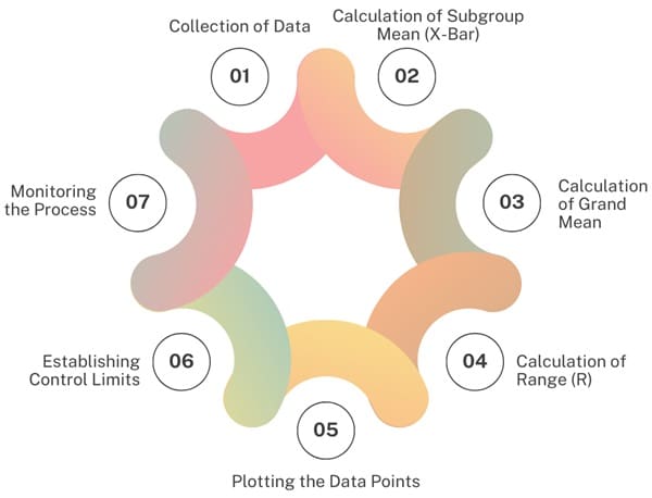
We divide the process into subgroups and take measurements from each subgroup. The following steps outline how the chart functions:
- Collection of Data: The process collects data at regular intervals. Each subgroup typically contains 2 to 15 measurements, and you enter the data into the chart in chronological order.
- Calculation of Subgroup Mean (X-Bar): For each subgroup, calculate the mean (average) of the measurements. This will be the X-Bar value for that subgroup. Its value represents the central tendency of the data within the subgroup.
- Calculation of Grand Mean: We calculate the grand mean, also known as the overall mean, by averaging all the subgroup means. This becomes the center line of the X-bar chart.
- Calculation of Range (R): In addition to calculating the X-Bar, it is important to calculate the range (R) of each subgroup. The range is the difference between the largest and smallest values in the subgroup. The range helps to measure the variation within the subgroup.
- Plotting the Data Points: After calculating the X-bar and range values, you plot them on the chart. Plot the X-bar values on the upper chart and the range values on the lower chart.
- Establishing Control Limits: The next step is to calculate the control limits for both the X-bar and range charts. The process collects data to establish these limits, which help assess whether the process remains in control.
- Monitoring the Process: Once you establish the control limits, use the chart to monitor the process over time.Data points that fall within the control limits indicate that the process is stable. Points outside the control limits suggest the process is out of control.
Control Limits and Their Calculation
We use control limits to determine whether the process is in control or out of control. We typically set these limits at ±3 standard deviations from the mean, which includes 99.73% of all data points in a normally distributed process. And, We calculate control limits using historical data, and they are essential for interpreting the X-bar chart.
To calculate the control limits for the X-bar chart, you use the following formula:
- UCL (X-Bar) = X-Bar-bar + A2 * R-bar
- LCL (X-Bar) = X-Bar-bar – A2 * R-bar
Where:
X-Bar-bar is the grand mean (average of all subgroup means).
A2 is a constant derived from statistical tables based on subgroup size (n).
R-bar is the average range across all subgroups.
For the range chart, the control limits are calculated as:
- UCL (R) = R-bar * D4
- LCL (R) = R-bar * D3
Where:
R-bar is the average range for all subgroups.
D3 and D4 are constants derived from statistical tables based on subgroup size (n).
These control limits help define the acceptable variation in the process. Any data point outside these limits signals the need for investigation and corrective action.
Steps to Construct an X-Bar and R Control Chart
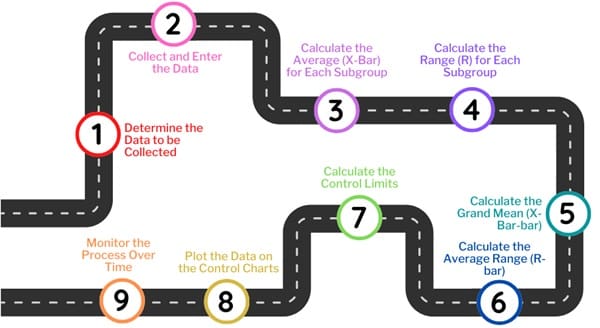
Constructing an X-bar and R control chart involves several steps. We typically use these charts when collecting data in subgroups, with the subgroup size ranging from 2 to 15. Here is a step-by-step guide:
Step 1: Determine the Data to be Collected
Before constructing the chart, decide which data will be collected. Identify the process you want to monitor and determine the key characteristics to measure. For example, if you are monitoring the quality of a product, you may measure attributes like weight, length, or temperature.
Step 2: Collect and Enter the Data
After determining the data collection method, gather measurements for each subgroup. Ensure the subgroup size remains consistent, and take measurements at regular intervals. Record the data in a time sequence to monitor the process over time.
Step 3: Calculate the Average (X-Bar) for Each Subgroup
For each subgroup, calculate the mean or average (X-Bar). This represents the central tendency of the measurements in that subgroup. For example, if a subgroup contains five measurements, sum them up and divide by five to get the average.
Step 4: Calculate the Range (R) for Each Subgroup
Next, calculate the range for each subgroup. The range is the difference between the highest and lowest values within the subgroup. This measure indicates the variation or spread of the data.
Step 5: Calculate the Grand Mean (X-Bar-bar)
We calculate the grand mean, or X-Bar-bar, by averaging all the subgroup means (X-Bar). This value represents the overall average of the process and becomes the center line of the X-Bar chart.
Step 6: Calculate the Average Range (R-bar)
The average range, or R-bar, is calculated by averaging all the subgroup ranges. This value represents the typical variation within the process and helps establish control limits.
Step 7: Calculate the Control Limits
Using the appropriate formulas and constants, calculate the control limits for both the X-bar and range charts. The constants A2, D3, and D4 depend on the subgroup size and are available in statistical tables.
Step 8: Plot the Data on the Control Charts
Plot the X-bar values on the upper chart and the R values on the lower chart. We plot the control limits, grand mean, and average range as horizontal lines to guide data interpretation.
Step 9: Monitor the Process Over Time
Once you construct the chart, use it to monitor the process. Data points outside the control limits indicate that the process is out of control, requiring further investigation to identify the cause and take corrective action.
Also See: Lean Six Sigma Certification Programs, St. Petersburg, Florida
Interpreting the X-bar and R Control Charts
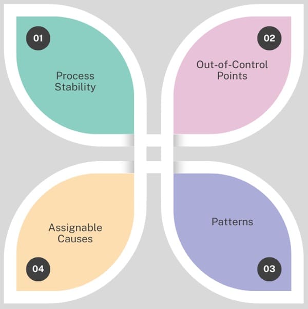
When interpreting X-Bar and R control charts, focus on the following:
- Process Stability: Check if the data points fall within the control limits. If most of the points fall within the limits, the process is stable.
- Out-of-Control Points: If any points fall outside the control limits, the process is out-of-control. Investigate the cause of the variation.
- Patterns: Look for patterns in the data. For example, a run of consecutive points on one side of the center line could indicate a trend.
- Assignable Causes: Identify any assignable causes when the process is out of control. These are factors that are not part of the normal variation and can be fixed.
Alternative Control Charts for Process Monitoring
While we widely use X-bar and R charts, other control charts may better suit the data type and analysis goals. Some alternatives include:
- X-Bar and S Charts: Used when the subgroup size exceeds 10, the X-Bar and S chart replaces the range chart with a standard deviation chart.
- CUSUM and EWMA Charts: These charts are more sensitive to small shifts in the process mean and are suitable for detecting subtle changes in process behavior.
- Individuals and Moving Range (I-MR) Charts: These charts are used when only one measurement is available at each time point. They are useful in the early phases of process monitoring.
Advantages
- Simplicity: Easy to construct and interpret, making them accessible to individuals with basic statistical knowledge.
- Early Detection: Provide early warnings of process instability, enabling timely corrective actions.
- Versatility: Applicable to various industries and types of continuous data.
- Process Insights: Help identify trends, shifts, and cycles in processes.
Limitations
- Assumes Normality: These charts assume that data is normally distributed, which may not always be the case.
- Sensitivity to Sample Size: Accuracy depends on the sample size and frequency of data collection.
- Limited Scope: Do not provide insights into individual data points or variations within a sample.
- Dependency on Accurate Data: Require accurate and reliable data to produce meaningful results.
Enhancing X-Bar Charts with Additional Tools
While X bar charts are effective, combining them with other tools can enhance their utility:
R-Chart: Used alongside X bar charts to monitor the range of variation within samples.
Histogram: Provides a visual representation of data distribution.
Pareto Chart: Identifies the most significant factors contributing to variations.
Cause-and-effect Diagram: Helps identify potential causes of process instability.
Final Words
X-Bar control charts are powerful tools for monitoring the mean of a process and ensuring that it remains stable over time. By calculating control limits and plotting data points, these charts help identify any variations that may indicate a problem with the process.
When used correctly, X-Bar control charts, along with their paired range charts, provide valuable insights into process behavior, helping businesses improve quality and efficiency.

About Six Sigma Development Solutions, Inc.
Six Sigma Development Solutions, Inc. offers onsite, public, and virtual Lean Six Sigma certification training. We are an Accredited Training Organization by the IASSC (International Association of Six Sigma Certification). We offer Lean Six Sigma Green Belt, Black Belt, and Yellow Belt, as well as LEAN certifications.
Book a Call and Let us know how we can help meet your training needs.

