

The Defect Concentration Diagram serves as a powerful visual tool that helps teams pinpoint exactly where flaws occur on a physical product. Have you ever wondered why a specific corner of a smartphone screen cracks more often than others? Or why a specific seam on a car door consistently shows paint chips?
When we look at raw data in a spreadsheet, these patterns stay hidden. However, once you map those errors onto a picture of the product, the “where” becomes crystal clear.
In the world of Lean Six Sigma (LSS), we often focus on the “when” and the “how.” But the “where” is just as vital. This diagram is essentially a map for your quality journey. It transforms boring tally marks into a geographic story of your manufacturing struggles. To be honest, it is one of the most underused tools in the Six Sigma shed, yet it offers some of the quickest wins for process improvement.
Table of contents
- What is a Defect Concentration Diagram?
- Why You Should Use a Defect Concentration Diagram Today
- How to Create a Defect Concentration Diagram?
- Real-World Examples of Spatial Mapping
- Comparison: Defect Concentration Diagram vs. Pareto Chart
- Best Practices for Better Results
- Common Challenges and How to Overcome Them
- Integrating the Diagram into Your DMAIC Workflow
- The Future of Visual Defect Tracking
- Key Takeaways
- Frequently Asked Questions About Defect Concentration Diagram
- Final Words
- Related Articles
What is a Defect Concentration Diagram?
A Defect Concentration Diagram is a visual representation, usually a drawing or map of a part, where you mark every defect found during inspection. Think of it as a “heat map” for physical problems. If you’re making a glass bottle and notice bubbles, you don’t just count them. You mark their exact location on a sketch of the bottle.
Over time, you’ll see clusters. If 90% of the bubbles appear near the base, you don’t need to fix the whole machine. You just need to look at the part of the process that forms the base. We call this spatial data analysis. It’s much more intuitive than looking at a bar chart.

Public, Onsite, Virtual, and Online Six Sigma Certification Training!
- We are accredited by the IASSC.
- Live Public Training at 52 Sites.
- Live Virtual Training.
- Onsite Training (at your organization).
- Interactive Online (self-paced) training,
The Role of LSS in Visual Tracking
In Lean Six Sigma, we aim to reduce variation. A Defect Concentration Diagram helps us see if variation is random or localized. If defects are scattered everywhere, the process is likely unstable. If they are all in one spot, you have a specific “hot spot” to investigate.
This tool belongs to the “Measure” and “Analyze” phases of the DMAIC (Define, Measure, Analyze, Improve, Control) roadmap.
Why You Should Use a Defect Concentration Diagram Today
Using a Defect Concentration Diagram simplifies communication across your team. Picture this: you are in a meeting with engineers and floor operators. You show them a spreadsheet with 50 rows of data. Half the room falls asleep. Now, show them a picture of the product covered in red dots in one specific area. Suddenly, everyone is leaning in.
Here are a few reasons why this tool is a game-changer:
- It bridges the gap between data and reality. It turns numbers into something you can touch and see.
- It identifies “hidden” causes. Sometimes a machine part is worn out on one side. You wouldn’t know that from a total count, but the diagram will show defects clustering on that side.
- It’s cheap and easy. You don’t need expensive software. A piece of paper and a pen will do.
Do you find yourself constantly fixing the same issues without knowing the source? That is exactly where this mapping technique shines.
Also Read: What is Defect Management?
How to Create a Defect Concentration Diagram?
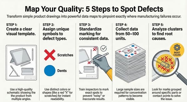
Creating a Defect Concentration Diagram doesn’t require a PhD in statistics. In my experience, the simpler you keep it, the more likely your team will actually use it. We’ve all been there—starting a complex project only to have it fail because the data collection was too hard. Let’s avoid that.
Step 1: Create a Clear Visual Template
Find or draw a high-quality schematic of the product. It should show multiple angles (front, back, top, side) if the product is three-dimensional. Ensure the drawing is uncluttered so the marks you add later are easy to see.
Step 2: Define Your Defect Types
What are you looking for? Scratches? Dents? Discoloration? Give each type of defect a specific symbol or color. For instance, use a red “X” for scratches and a blue “O” for dents. This makes the Defect Concentration Diagram readable at a glance.
Step 3: Train the Inspectors
The people on the front lines need to know exactly how to mark the diagram. If one person marks the general area and another marks the exact spot, your data becomes “noisy.” Consistency is key here.
Step 4: Collect Data Over Time
One or two products won’t tell you much. You need a significant sample size—perhaps 50 to 100 units. As the marks pile up, the “concentration” starts to appear.
Step 5: Analyze the Patterns
Once the collection period ends, look for clusters. Are the marks grouped around a specific bolt? Are they all on the surface that touches the conveyor belt? This is where the “Aha!” moment happens.
Real-World Examples of Spatial Mapping
Let’s look at a case study involving a furniture manufacturer. They were producing wooden tables and noticed a high rate of surface scratches. The data showed that 15% of tables were defective. By using a Defect Concentration Diagram, they mapped the scratches.
They found that 80% of the scratches occurred on the back-right corner of the tabletop. Upon investigation, they discovered a small metal burr on the packing station’s guide rail. To be honest, they had inspected the assembly line for weeks and found nothing. It was the “where” on the product that led them to the “what” in the process.
Another example is in the textile industry. If a fabric has tears, a Defect Concentration Diagram can show if the tears happen at the edges or in the middle. Edge tears might mean the tension on the loom is too high, while middle tears could suggest a needle issue.
Also Read: Defects Per Unit (DPU)
Comparison: Defect Concentration Diagram vs. Pareto Chart
We often get asked: “Can’t I just use a Pareto Chart?” While both are Six Sigma staples, they serve different purposes.
| Feature | Defect Concentration Diagram | Pareto Chart |
| Focus | Spatial location (Where?) | Frequency/Category (What/How many?) |
| Visual Type | Map/Picture | Bar Graph |
| Best For | Physical products/Surfaces | Categorizing types of errors |
| Data Type | Location data | Attribute data |
In many cases, we use them together. The Pareto Chart tells us that “scratches” are our biggest problem. Then, the Defect Concentration Diagram tells us that those scratches are all happening on the bottom left corner.
Best Practices for Better Results
To get the most out of your Defect Concentration Diagram, keep these tips in mind. First, don’t overcomplicate the symbols. If you have 20 different types of defects, the map becomes a mess. Focus on the top 3 or 4 issues identified by your initial data.
Second, consider the environment. If you are tracking defects on a large piece of equipment, a physical paper taped to the wall near the station works best. It serves as a constant visual reminder for the operators.
Third, use digital tools if you have them. There are apps today where an inspector can tap a tablet screen on a 3D model. This allows for real-time data or “digital heat maps.” However, don’t feel pressured to go high-tech if a paper sketch works for your team.
Common Challenges and How to Overcome Them
One common issue is “observer bias.” This happens when an inspector expects to find a defect in a certain spot, so they look there more closely. To fix this, rotate your inspectors or perform blind audits.
Another hurdle is the “busy” diagram. If your product is complex, a single Defect Concentration Diagram might get too crowded. In this case, break the product down into sub-assemblies. Create one map for the circuit board and another for the outer casing.
Lastly, remember that the diagram shows correlation, not necessarily causation. Just because defects are concentrated in one spot doesn’t mean the nearest machine is the culprit. It is a starting point for a deeper “5 Whys” analysis.
Integrating the Diagram into Your DMAIC Workflow
As we have already discussed, this tool is vital during the “Analyze” phase. But how does it fit into the bigger picture?
- Define: You identify that the yield is too low.
- Measure: You start a check sheet to count defects.
- Analyze: You use the Defect Concentration Diagram to see the physical pattern of those defects.
- Improve: You fix the specific part of the process causing that pattern.
- Control: You continue using a simplified version of the diagram to ensure the “hot spot” doesn’t return.
By following this flow, you ensure that your improvements are based on cold, hard (and visual) facts.
The Future of Visual Defect Tracking
We are seeing a shift toward AI-powered visual inspection. Cameras can now scan products and automatically generate a Defect Concentration Diagram in real-time. This is exciting because it removes human error. However, the logic remains the same. Whether a human marks it with a red pen or a computer marks it with a pixel, the goal is to find the spatial pattern.
What would happen if you started mapping your errors today? You might find that your “complex” problem has a very simple, localized solution.
Key Takeaways
- A Defect Concentration Diagram maps flaws onto a physical representation of a product.
- It identifies spatial patterns that standard charts might miss.
- This tool is essential for root cause analysis in the manufacturing and service industries.
- Keeping the diagram simple ensures better data collection and team engagement.
- It works best when paired with other LSS tools like Pareto Charts and the 5 Whys.
Frequently Asked Questions About Defect Concentration Diagram
Can I use this for non-physical products?
Yes! You can use it for digital interfaces. Map where users click the “wrong” button on a website or where errors occur on a digital form. It’s essentially a UI heat map.
How many defects do I need to see a pattern?
Usually, you start seeing trends after 30 to 50 samples. However, the more complex the product, the more data you’ll need.
Is this the same as a Check Sheet?
It is a type of check sheet. A standard check sheet might just be a tally list, while this is a spatial check sheet.
Who should create the diagram?
The project lead or quality engineer usually creates the template, but the operators or inspectors should be the ones marking it.
Does this replace a Root Cause Analysis?
No, it is a tool used within Root Cause Analysis. It points you to where you should look, but you still need to ask “why” the defect is happening there.
Final Words
The Defect Concentration Diagram is more than just a drawing; it is a lens that brings process issues into focus. By mapping defects spatially, we move away from guessing and toward precision. We’ve all seen how much time is wasted fixing parts of a process that aren’t actually broken. This tool prevents that waste by showing us exactly where the trouble lies.
At our core, we believe that quality should be visible and manageable for everyone on the shop floor. Our mission is to provide you with the practical skills to transform your data into action. If you’re ready to stop the guesswork and start solving problems with surgical accuracy, we are here to guide you every step of the way. Let’s work together to make your processes leaner, smarter, and defect-free.

About Six Sigma Development Solutions, Inc.
Six Sigma Development Solutions, Inc. offers onsite, public, and virtual Lean Six Sigma certification training. We are an Accredited Training Organization by the IASSC (International Association of Six Sigma Certification). We offer Lean Six Sigma Green Belt, Black Belt, and Yellow Belt, as well as LEAN certifications.
Book a Call and Let us know how we can help meet your training needs.