Quality control tools are essential techniques used by organizations to maintain and improve the quality of their products, services, and processes. These tools help in identifying problems, analyzing them, and implementing effective solutions. The foundation of these tools lies in the idea that consistent quality leads to better performance, customer satisfaction, and profitability.
Table of contents
What Are Quality Control Tools?
Quality control tools are simple but powerful techniques used to collect data, analyze patterns, identify problems, and monitor process performance. These tools allow teams to focus their quality improvement efforts on the most valuable areas. Instead of guessing what’s wrong, they rely on data-driven insights to make changes that really matter.
Kaoru Ishikawa, a pioneer in quality management, introduced seven basic QC tools that can solve most quality-related issues. These tools were originally developed for manufacturing but are now used across industries, including software development, healthcare, education, and more.

Public, Onsite, Virtual, and Online Six Sigma Certification Training!
- We are accredited by the IASSC.
- Live Public Training at 52 Sites.
- Live Virtual Training.
- Onsite Training (at your organization).
- Interactive Online (self-paced) training,
Why Use QC Tools?
Organizations use QC tools to:
- Track performance trends
- Spot quality issues early
- Understand what’s causing problems
- Prioritize issues that need fixing
- Prevent defects, not just correct them
Now, let’s explore each of the seven basic tools in detail.
Origin of Quality Control Tools
The concept of using structured tools for quality management was introduced by Dr. Kaoru Ishikawa in 1968. He published a book called “Gemba no QC Shuho”, which emphasized the importance of quality control techniques in Japanese businesses.
His goal was to provide practical tools that even front-line workers could use to solve problems and improve processes. Ishikawa’s contributions laid the groundwork for what we now call the “Seven Basic Quality Tools.”
Seven Quality Control Tools
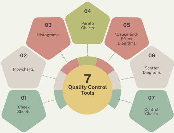
These seven tools are:
- Check Sheets
- Flowcharts
- Histograms
- Pareto Charts
- Cause-and-Effect Diagrams
- Scatter Diagrams
- Control Charts
Each tool serves a specific purpose, from collecting and displaying data to identifying trends, root causes, and patterns.
1. Check Sheets
Check sheets are simple but powerful tools used to collect and organize data systematically. They are typically pre-designed forms used to record how often a particular event or defect occurs during a specific period.
How They Work:
Workers mark each occurrence of a problem directly onto the sheet. For example, if a production line has frequent machine malfunctions, a check sheet allows workers to tally every time the issue appears.
Types of Check Sheets:
- Defect Location Check Sheet: Shows where defects occur on a product.
- Tally Check Sheet: Counts how often specific problems happen.
- Defect Cause Check Sheet: Identifies causes by tracking variables like time, machine, or operator.
- Checklist (Confirmation Sheet): Ensures that all necessary steps in a process are completed.
Benefits:
- Easy to use and interpret
- Helps spot recurring issues
- Supports further analysis using other tools
Read the complete article here
2. Flowcharts
A flowchart is a diagram that visually maps out a process step-by-step. It uses symbols like arrows, rectangles, and diamonds to represent actions, decisions, and outcomes.
Purpose:
Flowcharts help in understanding the workflow, spotting inefficiencies, and identifying where problems might occur. For instance, a flowchart can show the steps of a customer service request, highlighting delays or redundant actions.
Benefits:
- Makes complex processes easier to understand
- Highlights decision points and process bottlenecks
- Supports training and process documentation
Read the complete article here
3. Histograms
A histogram is a type of bar graph that displays the distribution of numerical data. It shows how often each value or range of values appears in a data set.
Usage:
Histograms are particularly useful when measuring product dimensions, weights, or other variables that can vary within a range. They help visualize whether data follows a normal distribution or has abnormalities.
Benefits:
- Reveals data patterns and variations
- Shows the central tendency and spread of data
- Helps determine if a process is stable or needs adjustments
Also Read: What is Bimodal Histogram?
4. Pareto Charts
A Pareto chart is a specialized bar graph based on the Pareto Principle, which suggests that roughly 80% of problems come from 20% of causes.
How It Works:
Problems are arranged in descending order of frequency or impact. A line graph runs above the bars to show the cumulative percentage.
Example:
If a shirt manufacturing line has 10 types of defects, a Pareto chart might reveal that three of them account for 80% of the total issues. Focusing on these three can lead to significant improvements.
Benefits:
- Helps prioritize problems based on impact
- Aids decision-making on where to focus improvement efforts
- Easy to interpret and present to management
Read the complete article here
5. Cause-and-Effect Diagrams (Fishbone Diagrams)
This diagram helps identify the root causes of a problem by breaking it down into categories. It’s also known as the Ishikawa or Fishbone diagram due to its shape.
Structure:
The “head” of the fish represents the problem. The “bones” branch out to show potential causes grouped under common categories such as:
- Man (people)
- Machine
- Method
- Material
- Measurement
- Environment
Use:
Teams brainstorm possible causes under each category and visually map them. This structured approach encourages thorough investigation.
Benefits:
- Encourages team collaboration
- Helps get to the root of a problem
- Provides a clear visual of contributing factors
Read the complete article here
6. Scatter Diagrams
Scatter diagrams are used to analyze relationships between two numerical variables. One variable is plotted on the X-axis and the other on the Y-axis.
Use:
They help determine whether there is a correlation between the two variables. For instance, a company may explore if there’s a link between machine temperature and product defects.
Types of Correlations:
- Positive: As one value increases, the other also increases.
- Negative: As one value increases, the other decreases.
- No Correlation: No visible relationship.
Benefits:
- Highlights connections between variables
- Aids in root cause analysis
- Supports statistical modeling and regression
Also Read: What is Scatter Pot?
7. Control Charts
Control charts, also known as Shewhart charts, are used to track a process over time and determine if it remains consistent.
Features:
A control chart displays:
- Upper Control Limit (UCL)
- Lower Control Limit (LCL)
- Central Line (Average)
If the data points stay within the control limits, the process is considered stable. If they fall outside the limits, it signals that something unusual is affecting the process.
Example:
In a factory, a control chart could track the weight of packaged goods. If weights start drifting beyond control limits, it suggests a problem in the packaging machine.
Benefits:
- Monitors ongoing processes in real time
- Detects unusual variations quickly
- Helps prevent defects before they occur
Read the complete article here
Quality Circles
Alongside these seven tools, many organizations also use Quality Circles (QCCs)—small groups of employees who voluntarily meet to discuss and solve workplace problems.
Key Principles:
- Participative Management: Employees are involved in decision-making.
- Humanistic Approach: Recognizes the value of people in problem-solving.
Goals of QCC:
- Boost motivation and teamwork
- Solve problems through collaboration
- Improve productivity and quality
- Encourage a sense of responsibility
QCCs usually include 6–10 people who share ideas, analyze problems, and present suggestions to management.
Why QC Tools Matter?
Each of the seven quality control tools offers a different way to understand and improve a process. Here’s how they work together:
| Tool | Function |
| Check Sheets | Collect consistent, real-time data |
| Flowcharts | Map and analyze processes visually |
| Histograms | Show data distribution and variability |
| Pareto Charts | Identify the most significant issues |
| Fishbone Diagrams | Discover root causes of problems |
| Scatter Diagrams | Reveal relationships between variables |
| Control Charts | Monitor process stability over time |
By using these tools, businesses can take a proactive approach to quality. They reduce errors, improve efficiency, and better meet customer expectations.
Final Words
The Seven Basic Quality Tools introduced by Dr. Ishikawa remain relevant and valuable in modern industries. They are simple enough for anyone to learn and powerful enough to drive meaningful improvements.
When combined with team-based efforts like Quality Circles, these tools create a culture of continuous improvement. Organizations that embrace these techniques are better equipped to face competition, reduce costs, and deliver high-quality outcomes.
Using quality control tools isn’t just about solving problems—it’s about preventing them and making better decisions at every level of the business.

About Six Sigma Development Solutions, Inc.
Six Sigma Development Solutions, Inc. offers onsite, public, and virtual Lean Six Sigma certification training. We are an Accredited Training Organization by the IASSC (International Association of Six Sigma Certification). We offer Lean Six Sigma Green Belt, Black Belt, and Yellow Belt, as well as LEAN certifications.
Book a Call and Let us know how we can help meet your training needs.