
Run Chart is an essential visual tool for tracking performance. This chart helps teams understand if the changes they make are truly successful. Often, people see better numbers and think they have improved the process. However, without a Run Chart, you cannot tell if that progress is real or simply random chance.
The Run Chart plots data points in the order they happen and includes a centerline. This allows you to quickly analyze data over time. Understanding this simple chart lets you find hidden patterns and drive lasting quality improvement. We must look closely at the data to see the truth.
Table of contents
What is a Run Chart?
A Run Chart is a simple and powerful tool used to display data over time. This kind of chart helps you see trends and shifts in any process. If you want to understand how a system is performing, the Run Chart provides a clear visual picture.
The Run Chart refers to a basic line graph that plots data points in the order they happen. It always includes a centerline. This centerline shows the average or median value of the data being tracked. By showing performance over time, the Run Chart helps people see if a change they made actually led to improvement.
In simple words, the Run Chart is an easy way to track process performance. It lets you know if the variations you see are normal or if something important changed.
Importance of the Run Chart in Quality Improvement
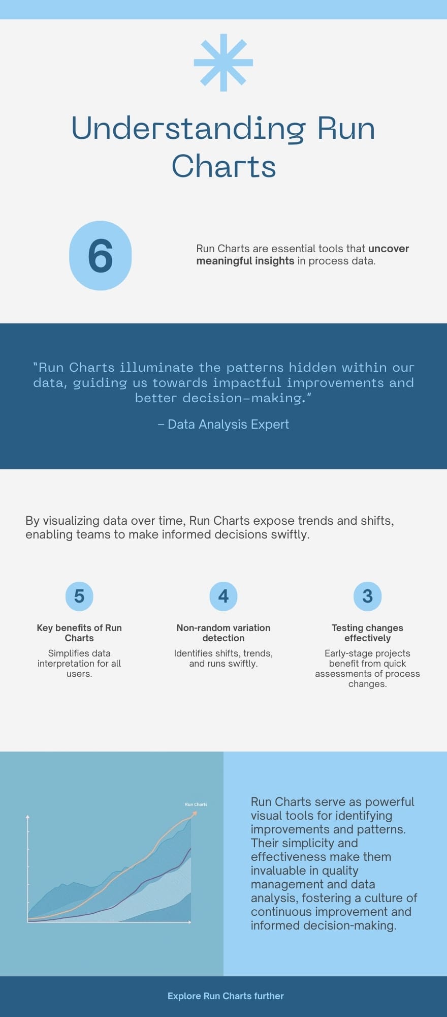
The Run Chart is a critical starting point for any quality improvement project. This long-tail keyword relates directly to how people use the chart in the real world. Many teams need to know if their actions are making a difference.
A Run Chart helps separate normal, expected variations from the unusual variations that point to real process change. Normal variation is just random noise, like the slight differences in commute time each day. Unusual variation shows that the process itself has changed. This change is what quality teams must look for.
A Run Chart gives everyone a shared, objective way to look at data. When you plot your data on a Run Chart, you immediately build curiosity about your process. For instance, are those improvements real, or are they just chance? We must understand the answer before we celebrate too early.
Components of a Basic Run Chart
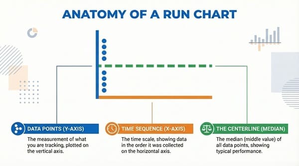
To build a useful Run Chart, you must include three key parts. These parts make sure the chart provides a proper context for the data. Without all these components, the Run Chart is simply a line graph.
Run Chart components are the essential building blocks for data analysis.
- Data Points (Y-axis): The Run Chart shows the measurement of what you are tracking. This is plotted on the vertical, or Y-axis. For example, it might be the time it takes to process a patient, or the number of errors found.
- Time Sequence (X-axis): The horizontal, or X-axis, displays the time scale. The Run Chart must always show the data in the order it was collected. This allows you to visualize performance chronologically.
- The Centerline (Median): The most critical element of the Run Chart is the centerline. This line is typically the median of all the data points. The median is the middle value when all your data is lined up from smallest to largest. It helps us see if points fall consistently above or below the typical performance.

Public, Onsite, Virtual, and Online Six Sigma Certification Training!
- We are accredited by the IASSC.
- Live Public Training at 52 Sites.
- Live Virtual Training.
- Onsite Training (at your organization).
- Interactive Online (self-paced) training,
How to Create a Run Chart
Creating a Run Chart is straightforward. You only need the data you have collected and a way to plot it. The Run Chart process helps organize your data visually.
Run Chart creation involves these key steps:
- Collect Your Data: Gather at least 10 to 12 data points. The Run Chart becomes more reliable as you add more data over time. Make sure you collect the data in the right order.
- Define the Axes: Draw your graph with the Y-axis for the measurement and the X-axis for the time. Label both axes clearly.
- Plot the Points: Carefully plot each data point onto your Run Chart. Connect the points with a line to show the flow of the process.
- Calculate the Median: Find the median value of all your plotted data. This means finding the middle number.
- Draw the Centerline: Draw a solid horizontal line across your Run Chart at the median value. This is your centerline, and it is the reference point for interpreting process variation.
Also Read: How to Integrate Control Charts with Six Sigma Tools
Interpreting the Run Chart: Rules for Non-Random Variation
Once you have your Run Chart, the real work begins. You must analyze the data points against the centerline. The goal is to detect non-random variation. Non-random variation means something caused the change. These rules tell you when the process is behaving unusually.
Run Chart analysis uses specific rules to find special causes. These special causes are what you want to investigate.
The Rule of a Shift
A Run Chart shows a shift when a large number of data points fall consecutively on the same side of the median.
The Run Chart rule for a shift is: Eight or more consecutive data points are either all above the median or all below the median. The point that falls on the median does not count. This pattern suggests a fundamental change in the process.
Run Chart shifts often show a new level of performance. Did a new system start? Did a new team member join? The shift is a signal that your change worked, or maybe it made things worse.
The Rule of a Trend
A Run Chart shows a trend when data points consistently move up or consistently move down.
The Run Chart rule for a trend is: Six or more consecutive increases or six or more consecutive decreases. If two values are the same, they do not break the trend. A trend shows a gradual change, either improving or declining.
Run Chart trends reveal momentum in the process. For example, maybe staff are slowly becoming more efficient over time, or equipment is slowly wearing out. A trend is a slow, steady signal.
The Rule of Too Many/Too Few Runs
The concept of a “run” is important for the Run Chart. A run is a sequence of one or more data points on the same side of the median. When the data crosses the median, a new run begins.
The Run Chart rule for runs is complex, but it looks at the total number of times the line crosses the median. If you have too many or too few runs, the pattern is unusual.
A Run Chart with too few runs means the data is grouping together. Too many runs means the process is rapidly bouncing back and forth. Both patterns show a non-random process that needs investigation.
The Rule of Astronomical Points
An astronomical point is simply a data point that appears far away from the others. These points are not common in most Run Chart interpretations, but they are easy to spot visually.
The Run Chart points out data that is far from the normal range. While they may not meet a specific statistical rule like the others, these single, extreme points still signal unusual events.
Run Chart analysis requires you to look for these signals. When you see one of these patterns—a shift, a trend, or too few runs—you know the process is not random. This finding is the reason we use the Run Chart. It helps you learn about your process.
Also Read: Impact Effort Chart
Advantages and Disadvantages
We must weigh the good points and the challenging points of using a Run Chart. The Run Chart is a tool, and like any tool, it has strengths and weaknesses.
| Basis for Comparison | Concept A: Run Chart Advantages | Concept B: Run Chart Disadvantages |
| Meaning | Simple, clear visual of data over time to track performance. | Does not define the exact limits of process stability. |
| Nature | Easy to create by hand or with basic software. No complex math is needed. | Less powerful than a control chart (which uses statistical limits). |
| Examples | Tracking monthly patient wait times, or daily production errors. | May lead to false alarms if the median line is not calculated correctly. |
| Functions | Identifies shifts, trends, and non-random patterns quickly. | Cannot distinguish between two different sources of random variation. |
| Key characteristics | Requires only a median line, not upper/lower control limits. | Gives a general view but may miss subtle process variation. |
Key Differences Between Run Charts and Control Charts
The Run Chart is often compared to the Control Chart. Both charts show data over time. However, a Control Chart adds statistical Upper and Lower Control Limits. These limits are based on mathematics, not just the median.
- Run Chart only uses the median. This makes the Run Chart simpler and faster to start using. The Control Chart uses calculated limits, which takes more time.
- Run Chart is great for early, quick analysis during improvement projects. The Control Chart is better for long-term monitoring once a process is stable.
- Run Chart analysis is visual and uses simple rules (like the rule of 8 points for a shift). The Control Chart uses more complex statistics for stronger evidence of special cause variation.
Final Words
In a nutshell, the Run Chart is an accessible and essential tool for anyone working to improve a system. It takes data out of tables and puts it into a format your eye can understand. By plotting data points against the median, the Run Chart quickly signals when a process has truly changed. This knowledge is power. It lets you focus your efforts on real problems and real wins. Use the Run Chart to guide your next steps.
Key Takeaways
- A run chart is a visual tool that tracks performance over time, helping to identify real improvements versus random chance.
- Components of a run chart include data points, a time sequence, and a centerline that shows the median value.
- Create a run chart by collecting data, defining axes, plotting points, calculating the median, and drawing the centerline.
- Interpreting a run chart involves rules for identifying non-random variation, such as shifts, trends, and runs.
- Run charts differ from control charts as they use the median and are simpler, but they lack statistical limits for a more in-depth analysis.
Frequently Asked Questions (FAQs)
1. Why is the median used instead of the mean (average) in a Run Chart?
The Run Chart uses the median because it is less sensitive to extreme, one-time data points (outliers). This means the median gives a more stable and representative centerline for tracking typical performance. The Run Chart needs a centerline that is not easily skewed.
2. How many data points are needed before a Run Chart can be interpreted?
It is generally recommended to have at least 10 to 12 data points. The rules for detecting non-random variation, like the rule of eight for a shift, cannot be used reliably with fewer points. A solid Run Chart relies on enough data to show a pattern.
3. What does it mean when a Run Chart shows a shift?
When a Run Chart shows a shift, it means your process has found a new level of performance. This is often the result of a specific change, or “special cause,” that was introduced. This is the moment to investigate the change to see if it was positive or negative.
4. Can a Run Chart be used for predictive purposes?
A Run Chart is primarily a historical tool. It shows you how the process has behaved. While trends might suggest where the process is going, the Run Chart is not a formal predictive model. It helps you understand the past, which in turn informs your plans for the future.
5. Where is the Run Chart most commonly used?
The Run Chart is most common in healthcare, manufacturing, and service industries. Any setting that tracks performance metrics over time uses it. The Run Chart is a core tool in the methodology of quality improvement and Six Sigma.

About Six Sigma Development Solutions, Inc.
Six Sigma Development Solutions, Inc. offers onsite, public, and virtual Lean Six Sigma certification training. We are an Accredited Training Organization by the IASSC (International Association of Six Sigma Certification). We offer Lean Six Sigma Green Belt, Black Belt, and Yellow Belt, as well as LEAN certifications.
Book a Call and Let us know how we can help meet your training needs.