Table of contents
What is a Multi-Vari Chart?
Leonard Seder, in 1950, was the first to describe multi-vari charts. They were developed independently by many people. These charts were inspired by charts that represented variations in stock prices. Dorian Shainin used the multi-vari data set collection chart to pinpoint the cause of the red x example.
Multi-vari charts show a graphic representation of the relationship between factors or input variables and an output or process variable. The quality characteristic is plotted on three horizontal panels that represent:
- Variability in a single piece
- Piece-to-piece variability
- Variability in time
Multi-vari charts are two-axis plots, where time is plotted horizontally (X) from left to right and the output of the process or the response measurement is plotted vertically (Y). Multiple measurements for each unit are plotted. The consecutive measurements are plotted in time from left to right. The horizontal groupings are broken if there is a time break during the sampling.

Why is it Important to Understand a Multi-Vari Chart?
Here are some reasons why it is important to understand the use and interpretation of multi-vari charts.
Sources of Process Variation
Understanding the different sources of variations in your process is essential. These can be classified as variations within units, differences between units, or time-dependent.
This is a graph, not a statistic
The multi-vari chart is a graphic representation, it is not possible to draw any statistical conclusions. The chart can only be used to indicate direction. ANOVA is the best way to determine your true statistical significance.
Use for continuous data
Your data will not be discrete, but continuous because the technique requires the measurement of the items.
Multi Vari Chart Data Collection
Have you ever watched “The Christmas Story”? There is a scene when Ralphie is trying to decode the Code that he has compiled over weeks of listening to a Little Orphan Annie Radio Show. A multi-Vari Chart Data set will help with this example.
He had to have the secret decoder ring to decipher the message.
We are in the same predicament that Ralphie was in. The process is trying to tell us something, but it is in code.
We can’t decipher that code until we have the “Decoder Ring”.
The “Decoder Ring” in our case is Statistical Analyses through any of the many tools like Minitab or SAS.
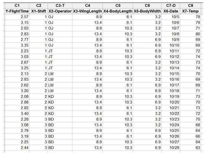
The code is given to us in data. We can collect this data in a Multi-Vari Data collection sheet like the example below:

This Multi-Vari Data collection sheet follows a core equation in Six Sigma: Y=f(X1, X2, X3 …Xn). The equation simply means that the Y (in the case of the picture above “Flight Time”) is a function of all the X’s that created each Flight Time (in the picture above, each Flight Time or Y is in a separate row of data).
The multiple rows of data tell a story in “code” about the statistically significant inputs that affect the Y. Most of us can only read the story by using statistics.
Now it is time to use the Statistical Tools that you learned in your Lean Six Sigma Course to find the Statistically Significant X’s.


