Bar charts stand as one of the most fundamental and versatile tools in data visualization. Whether you’re analyzing business metrics, presenting research findings, or tracking performance indicators, bar charts provide clear, immediate insights that audiences can quickly understand and act upon. This comprehensive guide explores everything you need to know about creating effective bar charts that communicate your data story with precision and impact.
Table of contents
What is a Bar Chart?
A bar chart, also known as a bar graph or bar diagram, is a visual representation of data using rectangular bars. Each bar’s length or height corresponds to the value it represents, making it easy to compare different categories or groups. Typically, bar charts display categorical data along one axis (usually the x-axis) and numerical values along the other (y-axis).
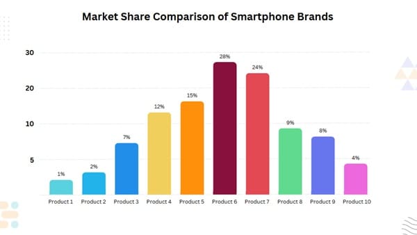
For example, a bar graph example might show monthly sales for a retail store, with each bar representing a month and its height indicating revenue. Bar charts come in two main types:
- Vertical Bar Charts: Bars extend upward, ideal for comparing values across categories.
- Horizontal Bar Charts: Bars extend sideways, useful when category names are long or numerous.
As noted by data visualization experts, bar charts excel at showing comparisons, trends, and distributions, making them a staple in business, education, and research.
Public, Onsite, Virtual, and Online Six Sigma Certification Training!
- We are accredited by the IASSC.
- Live Public Training at 52 Sites.
- Live Virtual Training.
- Onsite Training (at your organization).
- Interactive Online (self-paced) training,
Why Use Bar Charts for Data Visualization?
Bar charts are a go-to choice for data visualization because they’re:
- Easy to Understand: Their simple design makes insights accessible to everyone, from executives to students.
- Great for Comparisons: They clearly show differences between categories, like sales by region or test scores by class.
- Versatile: They work for various data types, from financial metrics to survey responses.
- Visually Appealing: With customizable colors and styles, they grab attention and enhance reports.
- Widely Supported: Tools like Excel, Google Sheets, and Canva graph maker make creation a breeze.
Whether you’re using barchart.com for stock analysis or creating a bar graph template for a presentation, these charts deliver clarity and impact.
Types and Their Applications
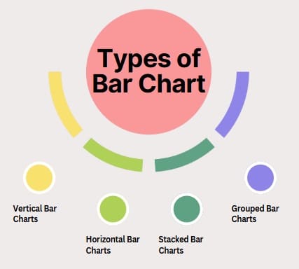
Vertical Bar Charts
Vertical bar charts, also known as column charts, display data using vertical bars extending upward from a horizontal baseline. These charts work exceptionally well for comparing values across different categories or showing changes over time periods. The vertical orientation makes them particularly effective for displaying data with longer category names, as labels can be positioned horizontally for better readability.
Horizontal Bar Charts
Horizontal bar charts present data using horizontal bars extending from a vertical baseline. This orientation proves particularly valuable when dealing with lengthy category names or when space constraints make vertical charts impractical. Additionally, horizontal bar charts work well for ranking data, as they naturally align with our left-to-right reading pattern.
Stacked Bar Charts
Stacked bar charts display multiple data series within single bars, showing both individual values and their contribution to the total. These charts enable viewers to understand part-to-whole relationships while maintaining the ability to compare totals across categories. Stacked bar charts prove particularly valuable for budget breakdowns, market share analysis, and demographic data presentation.
Additionally, stacked bar charts can be displayed as percentages, showing the relative proportion of each component rather than absolute values. This approach facilitates comparison of composition across different categories, regardless of their total values.
Grouped Bar Charts
Grouped bar charts, also called clustered bar charts, display multiple data series side by side for each category. This arrangement enables direct comparison between different series while maintaining category-based organization. Grouped bar charts excel at showing performance comparisons, time-based analysis, and multi-dimensional data relationships.
Also Read: What is Flowchart?
Key Components
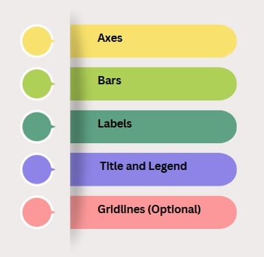
A well-crafted bar chart includes several essential elements:
1. Axes
- X-Axis: Displays categories (e.g., months, products, or regions).
- Y-Axis: Shows numerical values (e.g., sales, scores, or percentages).
2. Bars
- Represent data values with varying lengths or heights.
- Use consistent widths to avoid visual distortion.
3. Labels
- Category Labels: Identify each bar (e.g., “January,” “Product A”).
- Value Labels: Show exact numbers on or above bars for clarity.
4. Title and Legend
- A clear title describes the chart’s purpose (e.g., “2025 Sales by Region”).
- A legend explains colors or patterns if multiple datasets are shown.
5. Gridlines (Optional)
- Help viewers estimate values by providing reference lines.
These components ensure your bar chart is both informative and easy to read.
How to Make a Bar Chart: Step-by-Step Guide
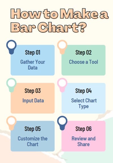
Creating a bar chart is simple with the right tools and approach. Here’s how to make one using popular platforms like Excel, Google Sheets, or an online graph maker:
Step 1: Gather Your Data
Collect and organize your data in a table. For example:
- Categories: Months (Jan, Feb, Mar).
- Values: Sales ($10,000, $15,000, $12,000).
Step 2: Choose a Tool
Select a graph maker like:
- Microsoft Excel: Great for detailed customization.
- Google Sheets: Ideal for cloud-based collaboration.
- Canva Graph Maker: Perfect for visually appealing designs.
- Barchart.com: Useful for financial data like barchart futures or barchart commodities.
Step 3: Input Data
Enter your data into the tool. In Excel or Google Sheets, create a table with categories in one column and values in another.
Step 4: Select Chart Type
Choose “Bar Chart” or “Column Chart” from the tool’s chart options. For horizontal bars, select “Horizontal Bar Chart.”
Step 5: Customize the Chart
- Add a title (e.g., “2025 Monthly Sales”).
- Label axes (e.g., “Months” for x-axis, “Revenue” for y-axis).
- Use colors to differentiate bars or datasets.
- Include value labels for clarity.
Step 6: Review and Share
Check for accuracy and clarity. Export the chart as an image or embed it in reports or presentations.
For a quick start, download our free bar graph template [internal link suggestion: /bar-graph-template-download] to streamline your process.
Also Read: What is Statistical Process Control (SPC) Chart?
How to Make a Bar Chart in Excel
Excel is a popular chart maker for creating bar charts. Here’s a quick guide:
- Enter Data: Create a table with categories (e.g., “Product A, B, C”) and values (e.g., sales figures).
- Select Data: Highlight the table.
- Insert Chart: Go to “Insert” > “Bar Chart” > Choose “Clustered Bar” or “Stacked Bar.”
- Customize: Add titles, labels, and colors via the “Chart Design” tab.
- Save or Export: Save as an Excel file or export as an image.
How to Make a Bar Chart in Google Sheets?
Google Sheets is another user-friendly graph creator. Follow these steps:
- Input Data: Enter categories and values in a spreadsheet.
- Select Data: Highlight the relevant cells.
- Insert Chart: Click “Insert” > “Chart” > Set “Chart Type” to “Column Chart” or “Bar Chart.”
- Customize: Use the “Chart Editor” to add titles, adjust colors, and enable gridlines.
- Share: Download as an image or share the sheet online.
Bar Chart Examples Across Use Cases
Here are bar graph examples to inspire your data visualization:
1. Business Sales
- Scenario: A retail chain tracks quarterly sales by store.
- Chart: A vertical bar chart shows sales for each store, with bars color-coded by quarter.
- Outcome: Identifies top-performing stores, guiding resource allocation.
2. Education
- Scenario: A teacher compares student test scores across subjects.
- Chart: A horizontal bar chart displays scores for math, science, and history.
- Outcome: Highlights areas where students need extra support.
3. Financial Analysis
- Scenario: An investor analyzes commodity prices using barchart commodities.
- Chart: A bar chart shows price changes for oil, gold, and wheat over months.
- Outcome: Informs investment decisions with clear trends.
These examples show the versatility of bar charts in various fields.
Benefits
Bar charts offer numerous advantages for data visualization:
- Clarity: They make complex data easy to compare at a’s glance.
- Flexibility: Suitable for small or large datasets, from sales to scientific studies.
- Engagement: Colorful designs capture attention in reports or presentations.
- Accessibility: Supported by free tools like free graph maker platforms.
- Precision: Value labels provide exact data points, reducing misinterpretation.
By leveraging bar charts, you can communicate insights effectively to any audience.
Tools for Creating Bar Charts
Several graph maker tools simplify bar chart creation:
- Microsoft Excel: Offers robust customization for professional charts.
- Google Sheets: Cloud-based and collaborative, perfect for teams.
- Canva Graph Maker: User-friendly with stunning design templates.
- Barchart.com: Specializes in financial data like barchart futures and stock charts free.
- Tableau: Advanced tool for interactive and complex visualizations.
- Online Graph Maker: Free platforms like Chart.js or Plotly for quick charts.
Challenges
While powerful, bar charts have limitations:
- Overcrowding: Too many bars can clutter the chart, reducing clarity.
- Misleading Scales: Inconsistent axis scales can distort perceptions.
- Limited Data Types: Best for categorical data, not continuous trends (use line graph maker for those).
- Design Errors: Poor color choices or missing labels can confuse viewers.
Overcome these by keeping designs simple, using consistent scales, and testing with your audience.
Also Read: What is Process Behaviour Chart?
Best Practices for Creating Effective Bar Charts
To make your bar chart stand out, follow these tips:
- Keep It Simple: Limit bars to 5–10 categories to avoid clutter.
- Use Clear Labels: Include titles, axis labels, and value labels for clarity.
- Choose Colors Wisely: Use contrasting colors for readability and avoid overly bright palettes.
- Ensure Accurate Scales: Start the y-axis at zero to avoid exaggerating differences.
- Test with Your Audience: Share drafts to ensure the chart communicates effectively.
Frequently Asked Questions
What is a bar chart?
A bar chart is a visual tool that uses rectangular bars to represent data, with bar length or height showing values for different categories.
Why are bar charts useful?
They simplify data comparison, highlight trends, and are easy to understand, making them ideal for presentations and reports.
How do I make a bar chart?
Gather data, choose a tool like Excel or Google Sheets, input data, select “Bar Chart,” customize, and share. Use our template [internal link suggestion: /bar-graph-template-download].
What tools can I use to create bar charts?
Popular tools include Excel, Google Sheets, Canva Graph Maker, Tableau, and barchart.com for financial data.
What’s the difference between a bar chart and a line graph?
Bar charts compare categorical data, while line graphs show trends over continuous data, like time series.
Final Words
A bar chart is a versatile and powerful tool for turning raw data into clear, actionable insights. Whether you’re tracking sales, analyzing survey results, or exploring barchart commodities, bar charts make comparisons simple and engaging. With tools like Excel, Google Sheets, and Canva graph maker, creating professional charts is easier than ever.


