A dot plot is a simple way to display data using dots. It shows how often each value appears in a data set along a number line. This helps us see patterns, clusters, and gaps in the data. Dot plots are useful for comparing different data sets and understanding the distribution of values.
Table of contents
- Definition
- Extending Dot Plots
- Example
- Basic Features of Dot Plots
- Steps to Create a Dot Plot
- Analyzing the Dot Plot
- Applications of Dot Plots
- Creating a Dot Plot: Step-by-Step
- Limitations of Dot Plots
- Additional Notes
- Advantages of Dot Plots
- Design Considerations for Dot Plots
- Applications of Dot Plots in Linguistic Analysis
- Case Studies Using Dot Plots
- Final Words
- Related Articles
Definition
A dot plot uses a number line to represent the frequency of values. Each dot represents one occurrence of a value.
What is a Dot Plot?
A dot plot displays individual values as dots along a single axis. Each dot represents a data point, and multiple dots can be stacked vertically or horizontally if they have the same value. This method is particularly effective for small to moderate-sized datasets, providing a straightforward way to compare values without the clutter of more complex graphs.
Why Use Dot Plots?
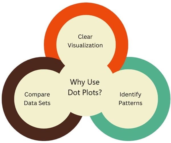
- Clear Visualization: Dot plots make it easy to see how data is distributed.
- Identify Patterns: They help in spotting clusters (groups of dots), peaks (most common values), and gaps (missing values).
- Compare Data Sets: You can easily compare two or more sets of data.
History
Dot plots are a type of graphical representation introduced by William Cleveland in 1984. They are designed to display labeled data visually.
A basic example can be seen in dot plots showing the frequency of specific nouns from the British National Corpus. In such plots, the horizontal axis represents a quantitative variable (like frequency), while the vertical axis lists categories (like nouns). Light horizontal lines may connect data points to their respective labels.
Labeled data, which includes numerical values paired with descriptive labels, is prevalent in data analysis. This type of data appears in various formats, such as raw measurements, summary statistics (like averages or spreads), and parameters from statistical models. Because of their versatility, dot plots can be utilized for both descriptive and inferential statistical analyses.
Extending Dot Plots
You can enhance dot plots by adding more features. For example, you can represent a comparison between British and American English in newspaper texts using different symbols in the same plot. In this format, the verbs are arranged according to their frequency in British English.
Additional panels can display differences directly, complete with reference lines to indicate where no difference occurs. These plots can also include error bars to represent statistical uncertainty, providing a more nuanced view of the data.
Example
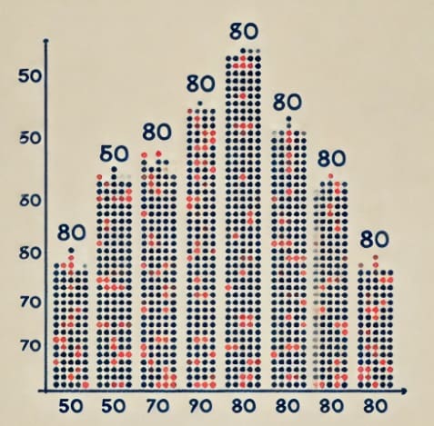
An example of a dot plot showcasing the distribution of students’ test scores.
Basic Features of Dot Plots
1. Shape of the Distribution
- Uniform Distribution: Dots are evenly spaced.
- Symmetric Distribution: The left and right sides mirror each other.
- Skewed Distribution:
- Right Skewed: More data points are on the left.
- Left Skewed: More data points are on the right.
2. Key Data Points
- Peak: The value where most dots are stacked.
- Gap: An area where no dots are present.
Steps to Create a Dot Plot
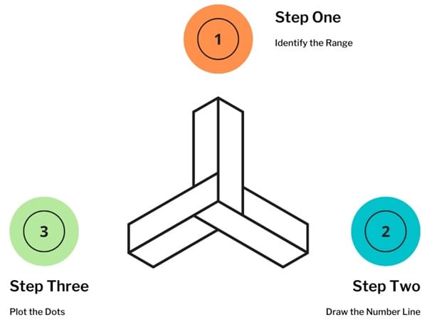
- Identify the Range: The lowest age is 14 and the highest is 21.
- Draw the Number Line: Include all ages from 14 to 21.
- Plot the Dots: Place a dot above each age.
Analyzing the Dot Plot
- Shape: The plot has a peak at age 19, indicating it is a common age among volunteers.
- Symmetry: The distribution appears roughly symmetric, suggesting balanced age representation.
- Spread: Ages range from 14 to 21, showing diversity in age.
Applications of Dot Plots
- Comparing Study Times: If we collect study times for two classes, we can create dot plots for each to see which class studied more.
Class A Study Times: 30, 30, 40, 50, 50, 60
Class B Study Times: 20, 20, 40, 40, 50, 70
- Analyzing Athletic Performance: Coaches can use dot plots to compare player heights or scores in tournaments, helping to identify strengths.
Creating a Dot Plot: Step-by-Step
- Collect Data: Gather your data set.
- Identify the Range: Find the minimum and maximum values.
- Draw a Number Line: Mark the range on a horizontal line.
- Plot the Dots: For each value in the data set, place a dot above that number.
Limitations of Dot Plots
- Familiarity: Some people may not know how to read dot plots, which can make understanding difficult.
- Cognitive Fit: Dot plots work best for specific types of data. For time series data (like trends over time), line plots may be more effective.
Additional Notes
- Mean, Median, and Mode: After creating a dot plot, you can calculate:
- Mean: The average value.
- Median: The middle value when sorted.
- Mode: The most frequent value.
- Spread: You can find the spread by calculating the range (difference between the highest and lowest values).
Advantages of Dot Plots
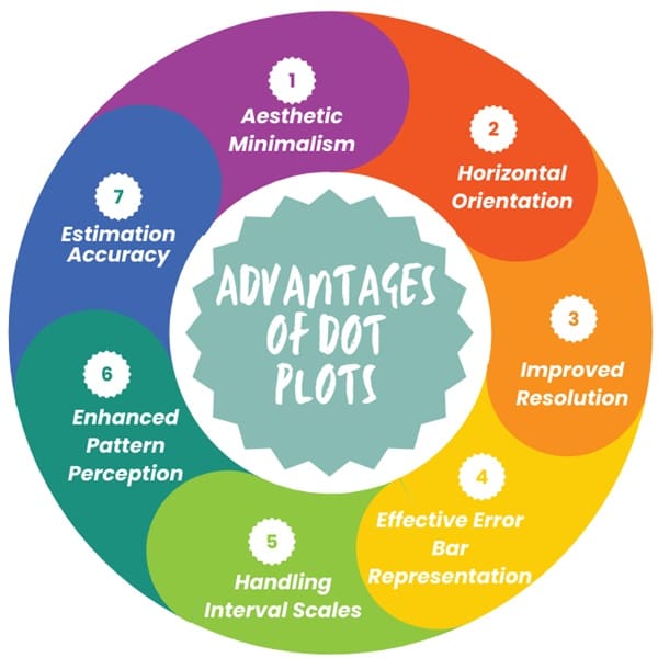
While bar charts are commonly used for visualizing data, dot plots have several advantages that make them a compelling alternative.
1. Aesthetic Minimalism
One key design principle emphasized by Edward Tufte is the reduction of unnecessary visual elements. Dot plots employ a single type of symbol to present data, minimizing visual clutter. This clean design is particularly beneficial in complex data displays, making it easier for viewers to focus on the essential information.
2. Horizontal Orientation
Dot plots are typically oriented horizontally, offering several practical benefits:
- Horizontal labels are easier to read.
- Long labels do not need to be abbreviated or rotated, reducing the risk of misinterpretation.
- The horizontal layout can accommodate more data points without sacrificing clarity.
- It requires less vertical space, enhancing the overall presentation.
3. Improved Resolution
Dot plots excel in resolution, especially when it comes to scaling. Unlike bar charts, which may mislead viewers through exaggerated lengths, dot plots only rely on position along the axis to convey values. This method avoids confusion and provides a clearer depiction of differences in the data.
4. Effective Error Bar Representation
Error bars are vital for communicating the variability of data points. Dot plots present these bars more effectively than bar charts, making it easier to differentiate between point estimates and their corresponding uncertainties. This clarity aids in visual comparisons between different data points.
5. Handling Interval Scales
Dot plots are well-suited for displaying interval data, which can include both positive and negative values. Bar charts often struggle in this area, particularly when they contain both types of values in the same plot. The simplicity of dot plots allows for a clearer understanding of such data.
6. Enhanced Pattern Perception
In cases where data categories are grouped, dot plots often outperform bar charts. The design allows for easier visual assembly of related data points, fostering better pattern recognition.
7. Estimation Accuracy
Research indicates that viewers can estimate values more accurately when using dot plots. The reliance on position judgments, as opposed to length or area judgments, leads to more precise visual interpretations.
Design Considerations for Dot Plots

When creating dot plots, certain design principles can enhance their effectiveness:
1. Ordering Data
The arrangement of categories within the plot can significantly impact data comprehension. Organizing data based on value or another logical system helps viewers quickly grasp relationships within the dataset.
2. Multipanel Displays
Dot plots can incorporate multiple categorical variables through superposition (plotting different groups on the same panel) or juxtaposition (using separate panels). Both strategies serve distinct purposes in visual comparisons.
3. Choice of Symbols
Selecting appropriate plotting symbols is crucial for clarity. Filled circles are typically recommended, while combinations of filled and empty circles can help distinguish between overlapping data points. For dense plots, different shapes, such as crosses, may improve visibility.
4. Adding Appended Panels
Appended panels can provide supplementary information without cluttering the main display. These panels can illustrate comparisons or present additional statistical measures, enhancing the viewer’s understanding.
5. Designing Error Bars
Error bars can be styled in various ways to convey different types of information, such as confidence intervals. Clear design choices, such as limiting crossbar lengths, can improve comprehension of these intervals.
6. Managing Overlap with Dodging
When multiple symbols are used, overlap may occur. Techniques like dodging, which vertically displace symbols and their corresponding error bars, can alleviate this issue while maintaining clarity.
7. Utilizing Logarithmic Scales
In cases where data spans several orders of magnitude, plotting on a logarithmic scale can be beneficial. This approach highlights relative differences rather than absolute values, making it easier to interpret variations across data points.
8. Incorporating Color and Lines
When comparing multiple groups, the use of color or connecting lines can aid in pattern detection. These visual cues help differentiate groups and enhance overall clarity.
Design Options for Dot Plots
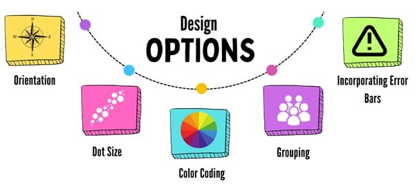
When creating dot plots, there are several design choices to consider:
- Orientation: Dot plots can be oriented horizontally or vertically. The choice often depends on the nature of the data and the preferences of the audience.
- Dot Size: Varying the size of dots can indicate the significance of the data points. Larger dots may represent more important or more frequently occurring data.
- Color Coding: Using different colors for dots can help distinguish between categories or groups within the data.
- Grouping: Dots can be grouped to show categories or classifications, making it easier to compare similar data points.
- Incorporating Error Bars: Adding error bars can provide information on the variability or uncertainty of the data points, giving viewers a more complete understanding of the results.
Applications of Dot Plots in Linguistic Analysis
1. Meta-Analysis
Meta-analysis involves synthesizing data from multiple studies to draw broader conclusions. Dot plots play a crucial role here by providing a visual summary of results.
For instance, in examining the effect of vowel duration in American English (the Preceding Vowel Duration or PVD effect), researchers can use dot plots to show estimates from various studies. This visual representation helps contextualize new findings within existing literature.
A common type of visualization used in meta-analyses is the forest plot, which resembles dot plots but includes additional features, such as varying dot sizes to represent uncertainty in estimates. This allows researchers to assess the overall effect size and the confidence intervals of the studies.
2. Corpus Data Analysis
In corpus linguistics, dot plots can be effectively used to analyze both frequency and binary data.
- Frequency Data: This type involves counting occurrences of specific events, such as word usage in written texts. Dot plots can display the frequency of verbs in academic writing, highlighting differences between non-native and native speakers. For instance, researchers might present the most underused verbs in learner writing, using a dot plot to compare their frequency against native expert writing.
- Binary Data: This data consists of two categories, such as synthetic vs. analytic forms of adjectives. A dot plot can illustrate the percentage of usage of these forms in different English varieties, allowing for a clear comparison between British and American English.
Case Studies Using Dot Plots
Study on Voice Onset Time (VOT)
One example of using dot plots in linguistics is in the analysis of Voice Onset Time (VOT) for voiced and voiceless stops in American English. Here, researchers can present VOT measurements from various studies, ordered by average VOT.
The dot plot can show the variation in VOT among different stop sounds, providing insights into how this acoustic feature varies with articulation. Researchers can also include additional panels to show average VOT for voiced and voiceless stops and the differences in frequency. This multi-faceted approach enhances the clarity and depth of the analysis.
Study on Verb Usage in Academic Writing
Another application is found in examining verb usage in academic writing. Researchers compared the frequency of certain verbs used by learner and expert writers. A dot plot effectively illustrates the relative frequency of these verbs, making it easy to identify those that are underused by learners. Error bars indicating statistical confidence can further enrich the visualization, allowing for a nuanced interpretation of the findings.
Final Words
Dot plots are an effective tool for visualizing and analyzing linguistic data. Their ability to simplify complex information into accessible visuals makes them valuable in both descriptive and inferential analyses.
From meta-analysis to corpus data studies, dot plots help researchers uncover insights, identify trends, and communicate findings clearly. As with any visualization tool, it’s important to be mindful of their limitations and to use them appropriately within the context of the data being analyzed.

About Six Sigma Development Solutions, Inc.
Six Sigma Development Solutions, Inc. offers onsite, public, and virtual Lean Six Sigma certification training. We are an Accredited Training Organization by the IASSC (International Association of Six Sigma Certification). We offer Lean Six Sigma Green Belt, Black Belt, and Yellow Belt, as well as LEAN certifications.
Book a Call and Let us know how we can help meet your training needs.

