A spider chart, also known as a radar chart or web chart, compares multiple variables or categories. It displays data in a circular format, with each variable represented by a radius extending from a central point. This type of chart is particularly useful for showing relationships, patterns, and differences across several dimensions, making it easy to visualize and analyze multivariate data.
It’s particularly helpful in analyzing and visualizing performance, tracking progress, and identifying patterns.
The chart uses a circular layout, with each axis representing a different factor, and the data points plotted along these axes. When connected, they form a web-like shape, making it easy to see strengths and weaknesses across various metrics.
A radar chart is a type of graph used to display multivariate data. It features multiple variables, each represented by a radius or axis that extends from a central point. These variables compare visually to show relationships and differences. Radar charts often take the shape of a spider web, which is why people sometimes call them spider charts.
Table of contents
What is a Spider Chart?
A spider chart is a type of graph that displays multiple data points on a two-dimensional plane. It consists of axes radiating from a central point, each representing a different variable or characteristic. Plot the data values along these axes, and when you connect them, they create a shape that resembles a spider’s web.
These charts are ideal for comparing multiple aspects or factors of different items, such as products, skills, or performance over time.
Spider charts are particularly useful for comparing performance metrics across several areas. For example, you might compare factors like design, cost, and performance when evaluating a product. The chart visually shows where each product excels or falls short.
History of Spider Charts
The concept of radar charts dates back to 1877 when a German scientist, Georg von Mayr, invented a chart similar to modern-day radar charts. He used these charts to display data in a polar coordinate system, a method that became popular in various fields for data visualization.
How Do Spider Charts Work?
The chart’s axes extend from the center and represent different variables. Each axis starts at zero in the center and extends outward, typically to a maximum value such as 10. Plot the data points along each axis based on the values for each variable. As you connect the data points, they form a web-like pattern..
This visual representation makes it easy to compare multiple aspects at once. For example, if you are comparing two products, the chart can show how each product performs on several factors like price, performance, and user satisfaction. The more points that overlap, the better the comparison.
Key Elements
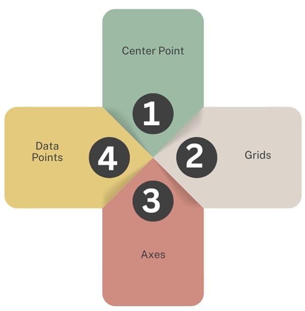
Radar charts are made up of the following key elements:
The center point serves as the origin from where all axes extend.
Grids represent the scale for each axis, dividing the space into equal sections.
Each axis is labeled with a specific variable or parameter, such as “sales,” “quality,” or “customer satisfaction.”
Data points represent the value of each variable at different intervals along the axis.
Types of Radar Charts
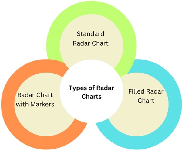
- Standard Radar Chart: This simplest form plots and connects data points, creating a polygon.
- Filled Radar Chart: This chart is similar to the standard one, but shades the area within the polygon, adding emphasis to the data.
- Radar Chart with Markers: This chart adds markers on each data point to improve visibility and pattern recognition.
Advantages of Using Spider Charts
Spider charts offer several benefits. First, they simplify complex data by displaying it in a way that’s easy to understand. The visual representation helps identify trends and patterns, making it easier to make informed decisions.
Second, spider charts allow for comparison across multiple categories simultaneously. This is especially useful when you need to evaluate several features or criteria, such as product attributes or team performance.
The charts also help track progress over time. For instance, healthcare professionals use spider charts to monitor a patient’s health across different indicators, such as blood pressure, cholesterol, and heart rate. By plotting these values over time, doctors can visually track the patient’s progress and make necessary adjustments to treatment.
Benefits
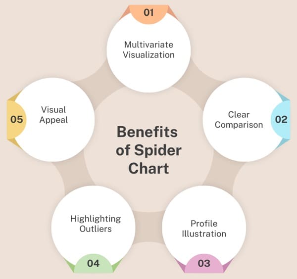
Radar charts offer several advantages:
- Multivariate Visualization: They display multiple data sets in a single, easy-to-read chart.
- Clear Comparison: They enable quick comparisons between different variables, making it easier to identify strengths and weaknesses.
- Profile Illustration: Radar charts are great for showing the profile of entities, such as a person’s skill set or a product’s features.
- Highlighting Outliers: Outliers or exceptional values stand out in radar charts, helping users identify unusual patterns.
- Visual Appeal: The unique shape of radar charts makes them eye-catching and engaging.
Using a Spider Chart Effectively
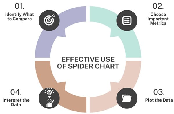
- Identify What to Compare: Begin by understanding the data you want to analyze. For example, if you’re comparing products, identify key features such as design, performance, and cost.
- Choose Important Metrics: Select the metrics that best reflect the differences you’re trying to compare. For customer satisfaction, metrics like CSAT or Net Promoter Score work well.
- Plot the Data: For each metric, create an axis and plot the corresponding data points. Ensure the values are consistent and scaled properly to reflect the differences in performance accurately.
- Interpret the Data: Once the data is plotted, analyze the chart to identify trends, strengths, and weaknesses. You can quickly see which areas need improvement or which products perform better.
Customizing Your Spider Chart
You can customize your spider chart in several ways to make it more understandable. For instance, you can adjust the axes to match the nature of your data. You can also change the chart’s colors, line styles, and transparency to highlight key insights.
- Add Annotations: Labels or annotations on the chart can provide clarity, especially when displaying specific numbers or metrics.
- Use Color Coding: Different lines or data series can be color-coded to represent different items or groups. This makes it easier to distinguish between them.
- Adjust Transparency: You can make certain data series more transparent to ensure that the most important information stands out.
Best Practices for Using Spider Charts
While spider charts are powerful tools, they should be used wisely. Avoid cluttering the chart with too many variables or groups. Too many axes or data series can make the chart difficult to interpret. It’s also important to ensure that the scales are consistent across all axes to maintain readability.
In cases where you need to compare more than two or three groups, consider splitting the chart into multiple views to keep it clear and effective. For example, in market research, you might need separate charts for each product to avoid confusion.
Common Applications of Spider Charts
Product Comparison: Spider charts are often used to compare products on various features, such as design, performance, cost, and user satisfaction.
Performance Evaluation: In business, spider charts are useful for evaluating employee performance across different skill sets. A chart could display an employee’s skills in areas like communication, technical knowledge, and leadership.
Market Research: Businesses use spider charts to compare products or services in terms of different attributes, helping them make informed marketing decisions.
Healthcare Monitoring: Spider charts can track patient health indicators like blood pressure, heart rate, and cholesterol levels, helping doctors assess overall health.
Creating a Spider Chart in Excel
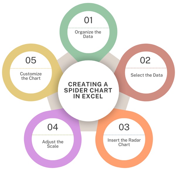
Creating a spider chart in Excel is a straightforward process. Here’s how you can do it:
- Organize the Data: Start by arranging your data in a table. Each row should represent a different item or entity, and each column should represent a variable or feature.
- Select the Data: Highlight the relevant data you want to visualize. Make sure all the necessary cells are selected.
- Insert the Radar Chart: In Excel, go to the “Insert” tab and select “Radar” under the “Charts” section. This will generate a basic spider chart.
- Adjust the Scale: Excel will automatically adjust the scale based on your data. You may need to manually adjust the axis range to ensure the chart displays the data correctly.
- Customize the Chart: Once the chart is created, you can customize it by changing the color, font size, and layout to fit your needs.
Comparing Multiple Data Sets
To compare multiple data sets in a spider chart, you simply need to add more data to your table. Each data set will be represented by a different line on the chart. You can adjust the transparency and color of each line to make it easier to distinguish between them.
This is particularly useful when tracking progress over time or comparing multiple products. For example, you might want to compare the performance of two products over several months, with each month’s data represented by a separate line on the chart.
Limitations of Radar Charts
Radar charts have some drawbacks:
- Complexity: With too many variables, radar charts can become cluttered and hard to interpret.
- Misleading scales: If the scales on different axes aren’t consistent, it can distort the data.
- Subjectivity: Without gridlines or clear references, different users may interpret the chart differently.
- Data transformation: Radar charts require data to be converted into polar coordinates, which can be time-consuming.
Alternatives to Radar Charts
If radar charts don’t work for your data, consider these alternatives:
- Bar Charts: These are simpler and more effective for comparing data points across categories.
- Parallel Coordinates Plots: These plots handle large datasets better and allow for more complex data analysis.
Final Words
Spider charts are an excellent tool for comparing multiple variables and identifying patterns. They offer a visual summary of complex data, making it easier to understand and make decisions. By using spider charts, you can compare products, track performance, and monitor progress in various fields, such as business, healthcare, and market research.
When creating a spider chart, it’s important to select relevant metrics, ensure the scales are consistent, and avoid overloading the chart with too much information. With proper customization, spider charts can be tailored to meet specific needs and provide valuable insights.

About Six Sigma Development Solutions, Inc.
Six Sigma Development Solutions, Inc. offers onsite, public, and virtual Lean Six Sigma certification training. We are an Accredited Training Organization by the IASSC (International Association of Six Sigma Certification). We offer Lean Six Sigma Green Belt, Black Belt, and Yellow Belt, as well as LEAN certifications.
Book a Call and Let us know how we can help meet your training needs.

