Table of contents
Estimated reading time: 7 minutes
What Is a Process Behavior Chart?
When discussing quality control and statistical process control (SPC), the pivotal tool that stands at the forefront is the process behavior chart. Also known as behavior graphs or process behavior charts, these analytical tools offer a comprehensive representation of a process’s behavior end. Understanding the nuances of process behavior charts is crucial to grasp the inherent variations within a system. These charts, often visualized as a behavior graph, delineate the performance and stability of a given process, enabling practitioners to discern patterns, detect deviations, and ascertain the presence of common cause and special cause variations. By delineating data points against predetermined control limits, process behavior charts act as a navigational compass for decision-making and continual improvement within an organization.
Understanding Process Behavior Charts
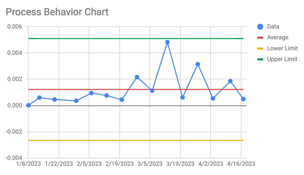
Process behavior charts are graphical tools that display data points in a time-ordered sequence, allowing practitioners to observe the stability and performance of a process. These charts plot data points against predetermined control limits, enabling the identification of patterns, trends, and deviations from expected behavior. They consist of a central line representing the process mean and upper and lower control limits, acting as boundaries within which the process should ideally operate.
The Role of Process Behavior Charts
The primary role of process behavior charts is to distinguish between common cause variations, which are inherent to the process, and special cause variations, which indicate external factors affecting the process. Common cause variations are expected fluctuations within the control limits and signify the inherent variability of the process. Special cause variations, on the other hand, fall outside these limits, indicating unusual occurrences that require investigation and corrective action.
Types of Process Behavior Charts
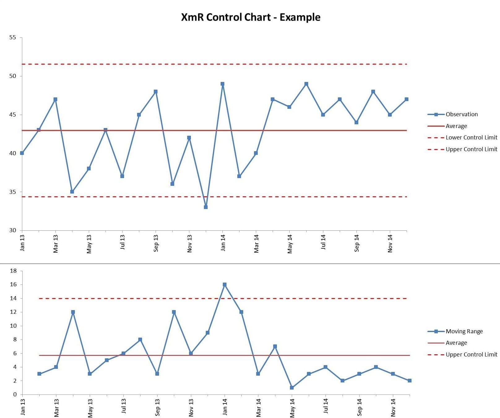
There are several types of process behavior charts, each suited for different data characteristics. Some common types include XmR charts (Individuals and Moving Range charts), X-bar, and R charts. XmR charts display individual data points over time, allowing observation of both variation within individual data and movement in the process mean. X-bar and R charts focus on subgroup data, illustrating the average (X-bar) and range (R) of subgroup measurements, respectively.
Key Components
Key components of process behavior charts include the mean, which represents the central tendency of the process, and variation, which indicates the spread or dispersion of data points at the end behavior graph. Control limits are also integral, serving as reference boundaries derived statistically to distinguish between common and special cause variations. Understanding these components is essential for effective interpretation and decision-making based on the charted data.
How to Create a Process Behavior Chart
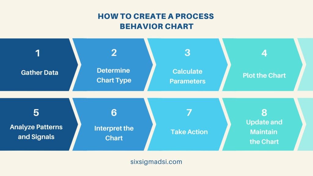
Creating a process behavior chart involves several sequential steps to accurately represent and analyze the behavior of a process. Below is a comprehensive step-by-step guide on constructing a process behavior chart:
Step 1: Gather Data
Collect relevant data points that represent the process you want to analyze. Ensure the data is accurate, reliable, and covers a consistent timeframe or sequence.
Step 2: Determine Chart Type
Select the appropriate type of it based on the nature of your data. Common types include XmR charts for individual data points and X-bar and R charts for subgroup data.
Step 3: Calculate Parameters
For XmR Charts:
- Individual Data: Calculate the moving range (MR) between consecutive data points.
- Mean (X-bar): Compute the average of the individual data points.
- Control Limits: Calculate the upper and lower control limits for both the individual data (X) and moving range (MR).
For X-bar and R Charts:
- Subgroup Data: Organize data into subgroups (typically 3-10 data points per subgroup).
- Calculate X-bar and R: Determine the average (X-bar) and range (R) for each subgroup.
- Control Limits: Compute the upper and lower control limits for X-bar and R.
Step 4: Plot the Chart
For XmR Charts:
Plot individual data points on the XmR chart along with the X-bar line, the upper and lower control limits for X, and the control limits for MR.
For X-bar and R Charts:
Plot the subgroup averages (X-bar) and ranges (R) on the X-bar and R charts, respectively. Include the central line for the process mean, along with upper and lower control limits for both X-bar and R.
Step 5: Analyze Patterns and Signals
Observe the plotted data on the chart and look for patterns or signals that indicate variations in the process behavior. Common patterns include shifts, trends, cycles, and points outside the control limits (outliers).
Step 6: Interpret the Chart
Interpret the observed patterns and signals based on the control limits and established parameters. Visualize the end behavior graph whether variations fall within common cause limits or if there are any special cause variations requiring further investigation.
Step 7: Take Action
If special cause variations are identified, investigate the root cause and take appropriate corrective actions to address the issue and improve the process. Continuously monitor the process using updated data on them.
Step 8: Update and Maintain the Chart
Regularly update the process behavior chart with new data to track ongoing performance. Adjust control limits or parameters as needed based on changes in the process or its environment.
Creating and utilizing them is an iterative process aimed at understanding and improving process performance. By following these steps, organizations can effectively analyze process behavior, identify deviations, and make informed decisions to enhance overall quality and efficiency.
Interpret Process Behavior Charts
Interpreting process behavior charts involves analyzing the patterns and signals depicted on them. Common patterns include shifts (sudden changes in process behavior), trends (gradual changes over time), and cycles (repetitive patterns). Control limits act as a guide, indicating when the process is in control (within limits) or out of control (beyond limits). Outliers, data points outside the control limits, often signal special cause variations requiring investigation.
Common Patterns in Process Behavior Charts
Shifts in process behavior may graph changes in equipment, materials, or procedures affecting the process. Trends can signal gradual improvement or deterioration in performance. Cycles may suggest seasonal effects or recurring patterns. Control limits act as thresholds for acceptable variation, helping identify when intervention is necessary to maintain or improve process quality.
Real-World Applications and Examples
Process behavior charts find applications in various industries. For instance, in manufacturing, these charts help to behavior graph production processes to ensure consistency and detect deviations.
In a hospital setting, medical professionals apply to monitor patient waiting times in the emergency department. An XmR chart tracks individual patient wait times over consecutive days. This enables healthcare providers to identify patterns, such as longer wait times during specific hours, facilitating resource allocation and process improvements to reduce patient waiting times.
A customer service center uses an XmR chart to monitor call waiting times. By recording the time each customer spends waiting in the queue, the chart displays fluctuations and trends in waiting times throughout the day. If any data points exceed the control limits, it triggers an investigation into potential issues, such as staffing shortages or technical problems, allowing prompt corrective measures.
In conclusion, process behavior charts serve as invaluable tools for understanding process performance, identifying variations, and making data-driven decisions. Their ability to distinguish between common cause and special cause variations empowers organizations to improve processes, reduce waste, and enhance overall quality. By leveraging these charts, businesses can proactively manage and optimize their operations.

