A bimodal histogram is a type of data visualization that reveals a distribution with two distinct peaks or modes. This form of histogram is instrumental in identifying and analyzing datasets that show two separate subgroups or phenomena influencing the results.
Whether analyzing the performance of two distinct groups or uncovering the influence of two different processes on a given outcome, understanding a bimodal histogram is crucial for drawing meaningful conclusions.
What is a Histogram?
A histogram is a type of graph used to display data distribution. It represents data by using vertical bars, where the height of each bar indicates the frequency or count of data points within a particular range.
Histograms are commonly used to visualize the frequency distribution of numerical data, showing how often specific ranges of values appear in a dataset. This type of graph is particularly useful when trying to understand patterns in data, identify trends, or determine how data points are spread across different intervals.
Histograms can represent different types of data distributions, such as normal distribution (where data clusters around a central value) or uniform distribution (where data is evenly spread across the range).
However, one of the more complex and interesting distributions is the bimodal distribution, where two peaks (modes) emerge, signalling that there are two significant groups within the data.
How Histograms Work?
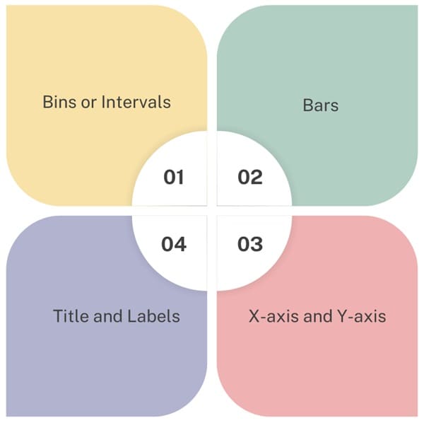
Histograms are composed of several components:
- Bins or Intervals: The data is divided into intervals or bins. Each bin represents a range of values, and the frequency of data points falling within that range is counted.
- Bars: Each bar in the histogram represents the frequency of data points that fall within a specific bin. The taller the bar, the more data points are in that range.
- X-axis and Y-axis: The x-axis represents the different bins or intervals, and the y-axis represents the frequency of data points in those bins.
- Title and Labels: A histogram should have a title that explains what data is being represented. The x-axis and y-axis should also be labelled to make the graph easy to understand.
Steps to Create a Histogram
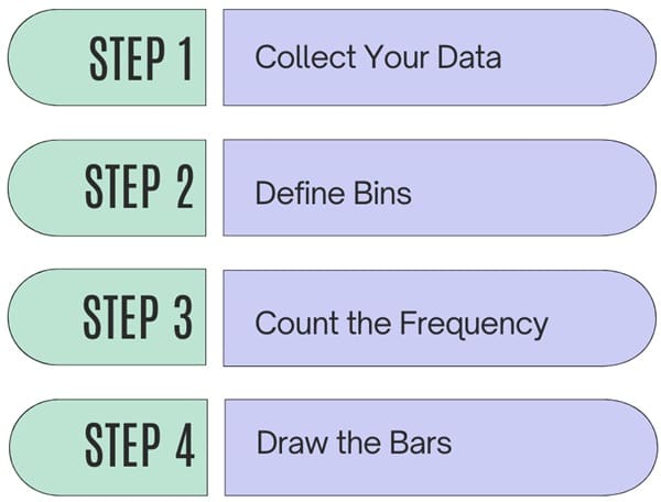
To create a histogram, follow these basic steps:
- Collect Your Data: Gather the data you want to analyze. This could be any numerical data, like exam scores, sales figures, or temperatures.
- Define Bins: Decide how you want to group the data into bins or ranges. For example, you might divide exam scores into ranges like 70-79, 80-89, and 90-99.
- Count the Frequency: Count how many data points fall into each bin.
- Draw the Bars: On the x-axis, place the bins, and on the y-axis, plot the frequency for each bin. Draw a bar for each bin, with the height corresponding to the frequency.
Types of Histograms
There are a few types of histograms, depending on how the data is grouped and represented:
- Uniform Distribution: If all the bins have roughly the same height, the data is evenly distributed.
- Normal Distribution: If the data is shaped like a bell curve, where the middle bins have the highest bars and the bins on either side have progressively lower bars, it’s called a normal distribution.
- Skewed Distribution: When the data has a long tail on one side (either left or right), it’s referred to as a skewed distribution. A right-skewed histogram has a long tail on the right side, and a left-skewed histogram has a long tail on the left side.
Example of a Basic Histogram
Let’s say you have a dataset of exam scores for a class:
- 70, 85, 92, 78, 89, 92, 95, 78, 85, 90.
To create a histogram, first group the scores into intervals, such as 70-79, 80-89, and 90-99. Then, count how many scores fall into each range: - 70-79: 3 scores (70, 78, 78)
- 80-89: 3 scores (85, 85, 89)
- 90-99: 4 scores (92, 92, 95, 90)
You can then draw bars for each range, with the height of the bars representing the number of scores in each range.
What is a Bimodal Histogram?
A bimodal histogram is a type of histogram that shows two distinct peaks or “modes.” The term “bimodal” means “two modes,” and in a bimodal distribution, the data has two areas where the frequency is significantly higher than other areas. These peaks represent two different groups or sets of data within the overall dataset.
Characteristics of a Bimodal Histogram
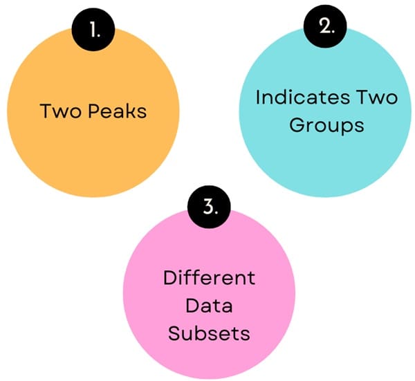
- Two Peaks: A bimodal histogram will have two bars that are taller than others, separated by a lower frequency range. These two peaks represent two different clusters of data.
- Indicates Two Groups: The presence of two distinct peaks suggests that the data might be from two different groups. For example, in a class of students, one peak could represent students who scored lower on a test, while the other peak could represent students who scored higher.
- Different Data Subsets: A bimodal histogram can also suggest that there are different factors affecting the two groups of data. For instance, in a dataset of ages, one peak could represent a younger population, and the other peak could represent an older population.
Shape of a Bimodal Histogram
The shape of a bimodal histogram is what sets it apart from other types of histograms. The two peaks in the histogram can have different heights, depending on the frequency of each subgroup. The key points to understand when analyzing a bimodal histogram are:
- Height of the Peaks: The height of each peak indicates the frequency of occurrences within that particular subgroup. A taller peak represents a more frequent occurrence of data points.
- Separation Between Peaks: The trough or valley between the two peaks signifies that the two subgroups are distinct from one another, which is essential in understanding the nature of the dataset.
- Width of the Peaks: The width of each peak can also provide insight into the spread of the data within each subgroup. A narrow peak indicates a concentrated distribution, while a wider peak shows more variability within the subgroup.
How to Create and Analyse a Bimodal Histogram?
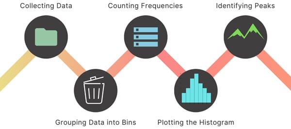
Creating a bimodal histogram is similar to creating a standard histogram. The process involves:
- Collecting Data: Gather the dataset you want to analyze.
- Grouping Data into Bins: Divide the data into appropriate intervals or bins.
- Counting Frequencies: Count how many data points fall into each bin.
- Plotting the Histogram: Plot the histogram, with bars representing the frequency of data points in each bin.
- Identifying Peaks: Look for two distinct peaks in the histogram that indicate the presence of two subgroups or processes.
When do you see Bimodal Distributions?
Bimodal distributions often occur in datasets where two distinct processes or groups influence the data. For example:
- Product Sales: A store might sell two types of products—cheap and expensive items. The sales of these two types of products might form two peaks on a histogram.
- Health Data: In a population of people, one peak might represent younger individuals, and the other peak might represent older individuals.
- Educational Data: In a class, the bimodal distribution could represent two different learning levels—one group of students might have mastered the material, while another group may still be struggling.
Why is a Bimodal Histogram Useful?
A bimodal histogram is useful because it can help you identify multiple groups or patterns within your data that might not be immediately obvious.
For example, if you’re analyzing test scores for a class and see two peaks in your histogram, you may want to investigate why some students are performing much better than others. It could indicate the need for different teaching strategies or additional support for certain students.
How to Interpret a Bimodal Histogram?
When you see a bimodal histogram, it’s important to analyze the two peaks and the valleys between them. Here are a few steps for interpreting this type of histogram:
- Identify the Two Peaks: Look at the bars with the highest frequencies. These are your two modes.
- Examine the Gap: Look at the area between the two peaks. Is it wide or narrow? A wider gap might indicate two distinct groups with little overlap, while a narrow gap might suggest that the two groups share some characteristics.
- Investigate the Causes: Try to determine what causes the two peaks. Are there different factors influencing the two groups? Are the groups different in terms of demographics, behaviors, or other characteristics?
Example
Consider a dataset representing the ages of individuals in a community. If the histogram shows two peaks—one in the 20-30 age range and another in the 60-70 age range—it indicates that the community has two distinct age groups.
Interpreting Bimodal Distributions
- Identifying Subgroups: Bimodal histograms help in identifying subgroups within a population that may have different characteristics or behaviours.
- Analysing Processes: In quality control, a bimodal histogram can reveal that two different processes are contributing to the data, each with its own distribution.
- Guiding Decisions: Recognizing a bimodal distribution can inform decisions such as targeted marketing strategies or tailored educational programs to address the needs of each subgroup.
Final Words
A bimodal histogram is a valuable tool for identifying and understanding the underlying structure of your data. It can reveal patterns that suggest the presence of two distinct groups within a dataset, allowing for better analysis and decision-making.
By recognizing the characteristics of a bimodal distribution and interpreting the two peaks, you can gain deeper insights into your data and uncover trends that may have been hidden in a simpler, unimodal dataset.

About Six Sigma Development Solutions, Inc.
Six Sigma Development Solutions, Inc. offers onsite, public, and virtual Lean Six Sigma certification training. We are an Accredited Training Organization by the IASSC (International Association of Six Sigma Certification). We offer Lean Six Sigma Green Belt, Black Belt, and Yellow Belt, as well as LEAN certifications.
Book a Call and Let us know how we can help meet your training needs.

