
Have you ever looked at a pile of data and felt like you were staring at a bowl of alphabet soup? We’ve all been there. In the world of quality improvement, we often get bogged down by complex spreadsheets. But what if you could just “see” the problem? That is where the Measles Chart comes into play.
I remember working with a car parts factory years ago. They were losing money because of scratches on door panels. They had lists of dates and times, but nothing clicked. Then, we printed a drawing of the door and started marking exactly where the scratches happened. Suddenly, a cluster appeared right where the robot arm gripped the part. It was like magic, but it was just a simple location plot.
What is a Measles Chart in Six Sigma?
The Measles Chart is a visual data collection tool used to identify the physical location of defects on a product or within a process. It is often called a location plot or a concentration diagram. Think of it as a map. Instead of just counting how many errors you have, you are looking at where they are happening.
In the Six Sigma world, we use this during the Measure and Analyze phases. It’s a low-tech but high-impact way to gather data. You take a picture, a blueprint, or a map of your product and mark it every time a defect occurs. Over time, these marks—which look like a rash of measles—reveal patterns.
Why do we care about these patterns? Because location often tells a story about the cause. If all the “measles” are in one corner, you don’t have a random problem. You have a specific issue tied to that spot.

Public, Onsite, Virtual, and Online Six Sigma Certification Training!
- We are accredited by the IASSC.
- Live Public Training at 52 Sites.
- Live Virtual Training.
- Onsite Training (at your organization).
- Interactive Online (self-paced) training,
Why Should You Use a Measles Chart?
You might wonder why we don’t just use a standard Pareto chart. While Pareto charts are great for telling you what is wrong, they don’t always tell you where it is wrong. Here is why the Measles Chart is a staple in my toolkit:
- It is incredibly simple. You don’t need fancy software. A piece of paper and a pen will do.
- It bridges the gap between data and people. Operators on the floor understand a map better than a statistical p-value.
- It highlights “hot spots.” It reveals spatial correlations that numbers alone might hide.
To be honest, I’ve seen teams spend weeks on complex regression models only to find the same answer a Measles Chart provided in two hours. It’s about working smarter, not harder.
Also Read: Matrix Chart
How to Create Your Own Measles Chart?
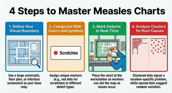
Creating a Measles Chart (sometimes called an MC) is straightforward. We can break it down into a few easy steps.
Step 1: Define the Boundary
First, you need a clear visual of what you are studying. This could be a schematic of a circuit board, a floor plan of a hospital ward, or even a screenshot of a software interface. Make sure the image is large enough for people to mark accurately.
Step 2: Identify Defect Types
What are you looking for? If you are tracking multiple types of issues, give each one a symbol or a color. For example, red dots for scratches, blue dots for dents, and green dots for stains.
Step 3: Start Collecting Data
Place the chart where the work happens. This is key. You want the people closest to the process to mark the chart in real-time. Every time they see a defect, they add a dot to the corresponding spot on the map.
Step 4: Analyze the Clusters
After a week or a month, look at the results. Are the dots spread out evenly? That usually means the cause is random or “common cause” variation. Are they clustered in one spot? That suggests a “special cause” related to that specific location.
Real-World Examples of the Measles Chart
Let’s look at how different industries use this tool. It isn’t just for manufacturing!
In Healthcare
Picture this: a hospital wants to reduce patient falls. They create a floor plan of the unit. Every time a fall happens, they mark the spot. They might find that most falls happen near the doorway of bathrooms between 10:00 PM and midnight. This specific data allows them to fix the lighting or add grab bars in those exact spots.
In Software Development
We can use a Measles Chart on a website wireframe. If users keep clicking the wrong button or getting stuck in a certain area, you mark it. This visualizes user experience (UX) “defects.”
In Traditional Manufacturing
This is the classic use case. Whether it’s paint defects on a fridge or soldering issues on a motherboard, the chart shows you if your machines are misaligned or if a specific tool is causing damage.
Also Read: What is a Run Chart?
The Link Between Measles Charts and Root Cause Analysis
In my experience, the Measles Chart is the best friend of the “5 Whys” technique. Once the chart shows you a cluster, you can start asking why.
“Why are all the marks on the left side?”
“Because the conveyor belt rubs against that rail.”
“Why does it rub?”
“Because the tensioner is loose.”
Without the chart, you might have just replaced the whole belt, wasting time and money. The MC helps you laser-focus your energy. It turns a broad “we have a quality problem” into “we have a rail problem.”
Common Pitfalls to Avoid
Even though it’s simple, you can still mess it up. Here are a few things to watch out for:
- Using messy diagrams: If the base image is confusing, the data will be too. Use clean, high-contrast drawings.
- Forgetting the timeline: If you don’t note when the data collection started and ended, the density of the “measles” won’t make sense.
- Ignoring the “No Defect” areas: Sometimes, the most important part of the chart is where there are no dots. Why is that area perfect? Can we copy that success elsewhere?
Does this mean the Measles Chart replaces all other tools? No, of course not. But it’s a fantastic starting point.
Comparing Measles Charts and Check Sheets
People often confuse these two. A check sheet is usually a tally of how many times something happens. It’s great for frequency. However, the Measles Chart adds the dimension of location.
Think of it like this: a check sheet tells you that ten people got lost in the mall today. A Measles Chart shows you that all ten people got lost at the same broken elevator. Which one helps you fix the problem faster?
| Feature | Check Sheet | Measles Chart |
| Primary Goal | Count frequency | Identify location/patterns |
| Data Type | Quantitative (Numbers) | Spatial/Visual |
| Best Used For | Knowing “How many” | Knowing “Where” |
How to Digitizing the Process
In our modern world, we don’t always use paper. Many companies now use tablets. You can use apps where operators tap a screen to drop a digital pin. This is great because the software can automatically calculate the “heat map” for you. It saves time on data entry and lets you share results with the whole team instantly.
That said, there is still something powerful about a physical chart on a wall. It acts as a visual signal that quality matters. It keeps the problem right in front of everyone’s eyes.
Key Takeaways
- Simplicity is key: The Measles Chart proves you don’t need complex math to find significant process flaws.
- Visual impact: It turns abstract data into a clear picture that anyone can understand, from the CEO to the shop floor.
- Root cause focus: By identifying where defects happen, you can narrow down the “why” much faster.
- Versatility: You can apply this tool to manufacturing, healthcare, office layouts, and digital products.
- Low Cost: It is one of the most budget-friendly Six Sigma tools available.
Frequently Asked Questions
Q: Can I use a Measles Chart for service processes?
A: Absolutely! You can use it on a map of a store to see where customers get frustrated, or on a document layout to see where people make the most errors when filling out forms.
Q: How many data points do I need?
A: There isn’t a hard number, but you need enough to see a pattern. Usually, 20 to 30 marks will start to show you if there is a “hot spot” or if the issues are random.
Q: What if the defects are all over the place?
A: If the “measles” are scattered evenly, it likely means your process has “common cause” variation. This means the problem is baked into the system itself, rather than being caused by one specific machine or location.
Q: Do I need Six Sigma certification to use this?
A: No. While it is a core Six Sigma tool, anyone interested in quality can use it. It’s a logical approach to problem-solving that works in any context.
Final Words
At the end of the day, the Measles Chart is about making the invisible visible. It takes the guesswork out of defect tracking. Instead of arguing about what might be wrong, you can look at the chart and see what is wrong.
We’ve seen how this simple tool can save thousands of dollars just by pointing a team in the right direction. It’s not about having the most expensive software; it’s about having the clearest view of your process.
At SSDSI, we believe in empowering your team with tools that actually work. We focus on practical solutions that drive real results for our clients. Are you ready to clear up the “measles” in your process? Let’s start mapping your path to perfection today.

About Six Sigma Development Solutions, Inc.
Six Sigma Development Solutions, Inc. offers onsite, public, and virtual Lean Six Sigma certification training. We are an Accredited Training Organization by the IASSC (International Association of Six Sigma Certification). We offer Lean Six Sigma Green Belt, Black Belt, and Yellow Belt, as well as LEAN certifications.
Book a Call and Let us know how we can help meet your training needs.