

Box plots, also known as box-and-whisker plots, are a powerful statistical tool for visualizing the distribution of data and summarizing its key features. They provide a clear graphical representation that highlights the central tendency, variability, and the presence of outliers in a dataset.
Table of contents
What is a Box Plot?
A box plot is a standardized way of displaying the distribution of a dataset based on a five-number summary. The five-number summary consists of:
- Minimum: The smallest data point, excluding any outliers.
- First Quartile (Q1): The median of the lower half of the dataset, marking the 25th percentile.
- Median (Q2): The middle value of the dataset, marking the 50th percentile.
- Third Quartile (Q3): The median of the upper half of the dataset, marking the 75th percentile.
- Maximum: The largest data point, excluding any outliers.
Box plots are particularly useful for comparing multiple groups of data side by side, making them valuable in various fields, including education, finance, healthcare, and scientific research.
Example
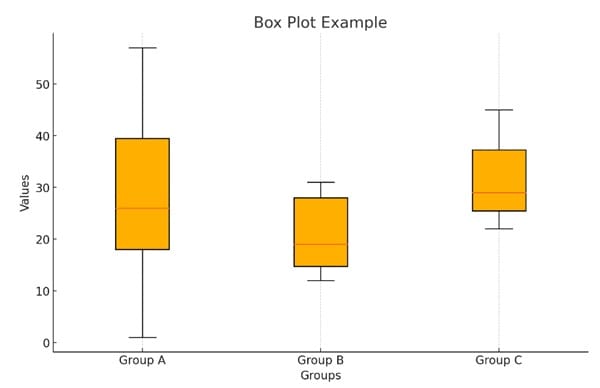
Here’s an example of a box plot displaying three groups (Group A, Group B, and Group C) with their respective values. The box plot visualizes the distribution of the data, highlighting the median, quartiles, and any potential outliers within each group.
Components of a Box Plot
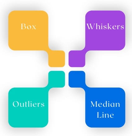
Understanding the different parts of a box plot is crucial for effective interpretation. Here’s a breakdown of its key components:
1. The Box
- Construction: The box itself represents the interquartile range (IQR), which is the distance between the first (Q1) and third (Q3) quartiles.
- Interpretation: The length of the box indicates the degree of variability within the central 50% of the data. A longer box suggests greater variability, while a shorter box indicates less variability.
2. The Whiskers
- Definition: Whiskers extend from either end of the box to the smallest and largest values within a specified range. Typically, this range is defined as 1.5 times the IQR below Q1 and above Q3.
- Interpretation: The whiskers provide insight into the spread of the data outside the central box, showing how far the data extends in both directions.
3. The Median Line
- Location: Inside the box, a line marks the median (Q2) of the dataset.
- Interpretation: The position of the median line within the box can provide insights into the skewness of the data. When the median is closer to Q1, the data may be positively skewed; when it is closer to Q3, it may be negatively skewed.
4. Outliers
- Identification: Outliers are data points that fall outside the whiskers’ range, typically defined as points that are more than 1.5 times the IQR above Q3 or below Q1.
- Representation: Outliers are usually marked with dots or asterisks on the plot. Identifying outliers is crucial, as they can significantly affect the analysis and conclusions drawn from the data.
How to Create a Box Plot?
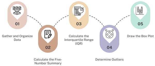
To construct a box plot, follow these steps:
Step 1: Gather and Organize Data
Collect your dataset and sort the values in ascending order. For example, consider the following dataset representing the number of caterpillars on 12 red oak trees:
34, 47, 1, 15, 57, 24, 20, 11, 19, 50, 28, 37
Step 2: Calculate the Five-Number Summary
- Arrange the data in ascending order:
1, 11, 15, 19, 20, 24, 28, 34, 37, 47, 50, 57
- Determine the Minimum and Maximum:
- Minimum: 1
- Maximum: 57
- Calculate the Median (Q2):
- Median = (24 + 28) / 2 = 26
- Calculate Q1 and Q3:
- First Quartile (Q1): The median of the first half (1, 11, 15, 19, 20, 24):
- Q1 = (15 + 19) / 2 = 17
- Third Quartile (Q3): The median of the second half (28, 34, 37, 47, 50, 57):
- Q3 = (37 + 47) / 2 = 42
- First Quartile (Q1): The median of the first half (1, 11, 15, 19, 20, 24):
Step 3: Calculate the Interquartile Range (IQR)
The IQR is calculated as:

Step 4: Determine Outliers
- Calculate 1.5 times the IQR:

- Find the Outlier Thresholds:
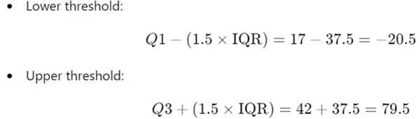
- Identify any outliers:
- In this dataset, no values fall below -20.5 or above 79.5, so there are no outliers.
Step 5: Draw the Box Plot
Using the calculated values, you can now construct a box plot with the following features:
- Draw a box from Q1 (17) to Q3 (42).
- Mark the median (26) with a line inside the box.
- Extend the whiskers to the minimum (1) and maximum (57) values.
- Mark any outliers (if present) with distinct symbols.
How to Interpret a Box Plot?
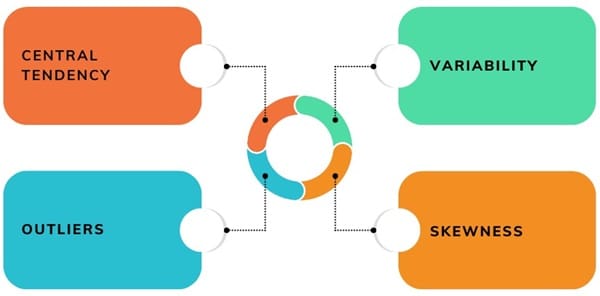
Once a box plot is constructed, interpreting it becomes easier:
- Central Tendency: The median line within the box indicates the center of the dataset. It’s a robust measure of central tendency, especially when outliers are present.
- Variability: The length of the box (IQR) shows how much data varies. A longer box indicates greater variability.
- Skewness: The position of the median within the box provides insights into the distribution shape:
- If the median is centered, the data is likely symmetrical.
- If it is closer to Q1, the data is positively skewed (more lower values).
- If it is closer to Q3, the data is negatively skewed (more higher values).
- Outliers: Outliers can highlight significant deviations from the main distribution, suggesting areas for further investigation or indicating special cases.
Advantages of Box Plots
- Simplicity: Box plots provide a concise summary of large datasets, making them easy to understand and interpret.
- Comparison: They allow for quick comparisons between multiple groups, making it easier to spot differences in distributions.
- Identification of Outliers: Box plots make it straightforward to identify outliers that may warrant further investigation.
- Robustness: They are not heavily influenced by outliers, making them a reliable tool for visualizing data.
Limitations of Box Plots
- Loss of Detail: While they summarize data well, box plots can obscure individual data points, potentially leading to oversights in the analysis.
- Assumption of Normality: They may not adequately represent data that is highly skewed or has a multi-modal distribution.
- No Information on Frequency: Box plots do not provide insight into the frequency of data points within the distribution.
Practical Applications of Box Plots
Box plots are widely used across various fields:
- Education: Educators can analyze test scores across different classes to identify disparities in performance and tailor interventions.
- Healthcare: Researchers can use box plots to compare the efficacy of different treatments based on patient outcomes.
- Finance: Analysts can assess the returns of various investment portfolios, identifying which ones exhibit higher volatility or risk.
- Environmental Studies: Scientists can compare measurements like pollutant levels across different locations, revealing areas of concern.
- Manufacturing: Quality control teams can analyze measurements of produced items to ensure they meet specifications, quickly identifying any processes that need adjustment.
Final Words
Box plots are an invaluable tool for data analysis, offering a straightforward method to summarize and visualize complex datasets. By understanding their construction and interpretation, users can gain insights into data distributions, identify outliers, and facilitate comparisons across groups.
Although they have limitations, their advantages make them a preferred choice for many data analysts, statisticians, and researchers. Whether in academic research, business analysis, or scientific investigations, box plots provide a clear window into the underlying patterns and trends in the data, guiding informed decision-making.

About Six Sigma Development Solutions, Inc.
Six Sigma Development Solutions, Inc. offers onsite, public, and virtual Lean Six Sigma certification training. We are an Accredited Training Organization by the IASSC (International Association of Six Sigma Certification). We offer Lean Six Sigma Green Belt, Black Belt, and Yellow Belt, as well as LEAN certifications.
Book a Call and Let us know how we can help meet your training needs.