A scatter plot, or scatter diagram, is a type of graph used to display the relationship between two quantitative variables. Each individual data point is represented by a dot on the graph, where the horizontal (X) axis represents one variable and the vertical (Y) axis represents the other.
This visual representation helps in identifying patterns, trends, and possible correlations between the two variables.
Table of contents
What is a Scatter Plot?
A scatter plot is a graphical tool used to show the relationship between two quantitative variables for the same set of individuals.
In a scatterplot, one variable is plotted on the horizontal (x) axis and the other on the vertical (y) axis. Each individual is represented as a point on the graph, with their respective values determining their position. Scatterplots are essential in various fields of research and data analysis, providing a visual representation of potential correlations between variables.
Constructing a Scatter Plot

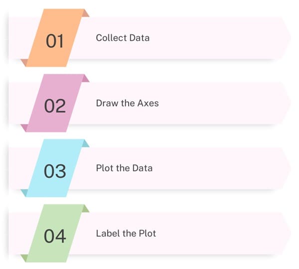
To create a scatter plot, follow these steps:
- Collect Data: Gather paired data for the two variables you want to analyze.
- Draw the Axes: Draw the horizontal (X) axis and the vertical (Y) axis. Label each axis with the variable it represents.
- Plot the Data: For each pair of data points, plot a dot on the graph where the X and Y values intersect.
- Label the Plot: Provide a title for your scatter plot and label the axes.
Example
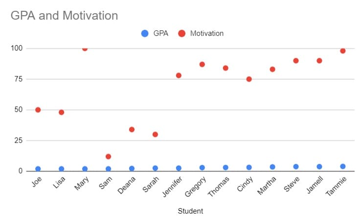
Consider a study on students’ GPAs and their motivation levels. The data might look like this:
| Student | GPA | Motivation |
| Joe | 2.0 | 50 |
| Lisa | 2.0 | 48 |
| Mary | 2.0 | 100 |
| Sam | 2.0 | 12 |
| Deana | 2.3 | 34 |
| Sarah | 2.6 | 30 |
| Jennifer | 2.6 | 78 |
| Gregory | 3.0 | 87 |
| Thomas | 3.1 | 84 |
| Cindy | 3.2 | 75 |
| Martha | 3.6 | 83 |
| Steve | 3.8 | 90 |
| Jamell | 3.8 | 90 |
| Tammie | 4.0 | 98 |
Plotting this data on a scatter plot, with GPA on the X-axis and Motivation on the Y-axis, will visually show the relationship between these two variables.

Interpretation of Scatter plots
Interpreting a scatterplot involves looking for the overall pattern and any deviations from that pattern. Key aspects to consider include direction, form, and strength of the relationship.
- Direction: This refers to whether the relationship between the variables is positive or negative. A positive relationship means that as one variable increases, the other also increases. Conversely, a negative relationship indicates that as one variable increases, the other decreases.
- Form: The form describes the shape of the relationship. Most commonly, scatter plots show linear relationships, where the points form a straight line. However, non-linear relationships can also occur, where the points form a curve.
- Strength: The strength of the relationship is determined by how closely the points fit a specific pattern. A strong relationship means the points are close to forming a line or curve, while a weak relationship means the points are more dispersed.
Adding Categorical Variables to Scatter Plots
Scatter plots can also include categorical variables by using different colours or shapes for data points representing different categories. For example, if analyzing students’ GPAs and motivation levels, you could use different colours to represent different classes or grade levels.
Outliers
Outliers are individual points that fall outside the overall pattern of the relationship. Identifying outliers is crucial because they can significantly affect the interpretation of the data. In our example, a student with a very high motivation score but a low GPA would be an outlier.
Correlation
The strength and direction of a linear relationship between two quantitative variables can be measured using the correlation coefficient, denoted as “r.” The correlation coefficient has the following properties:
- Range: The value of r ranges from -1 to 1.
- Sign:
- Positive values indicate a positive association.
- Negative values indicate a negative association.
- Magnitude:
- Values close to 0 indicate a weak linear relationship.
- Values close to 1 or -1 indicate a strong linear relationship.
Calculating the Correlation Coefficient
To calculate the Pearson correlation coefficient (r), the formula is:

Where:
- n is the number of pairs of scores
- ∑xy\sum xy∑xy is the sum of the product of each pair of scores
- ∑x\sum x∑x is the sum of the X scores
- ∑y\sum y∑y is the sum of the Y scores
- ∑x2\sum x^2∑x2 is the sum of the squared X scores
- ∑y2\sum y^2∑y2 is the sum of the squared Y scores
Interpreting the Correlation Coefficient
The strength of the relationship can be categorized as follows:
- None or Very Weak: ∣r∣<0.3|r| < 0.3∣r∣<0.3
- Weak: 0.3<∣r∣<0.50.3 < |r| < 0.50.3<∣r∣<0.5
- Moderate: 0.5<∣r∣<0.70.5 < |r| < 0.70.5<∣r∣<0.7
- Strong: ∣r∣>0.7|r| > 0.7∣r∣>0.7
Correlation Example
Consider a correlation of r=0.62 between GPA and motivation. This indicates a moderate, positive, linear relationship.
Types of Scatter Plot

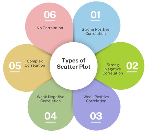
Scatter plots can show different types of relationships, such as:
- Strong Positive Correlation: Data points closely follow a line with a positive slope.
- Strong Negative Correlation: Data points closely follow a line with a negative slope.
- Weak Positive Correlation: Data points loosely follow a line with a positive slope.
- Weak Negative Correlation: Data points loosely follow a line with a negative slope.
- Complex Correlation: Data points follow a non-linear pattern.
- No Correlation: No discernible pattern between data points.
Statistical Significance of Correlation Coefficients
The p-value associated with a correlation coefficient indicates the probability that the observed relationship is due to chance. In social sciences, a p-value less than 0.05 typically indicates statistical significance.
Reporting Correlation
When reporting the relationship between two variables, include:
- Strength: Given by the correlation coefficient.
- Direction: Positive or negative.
- Shape: Must be linear to compute a Pearson correlation.
- Statistical Significance: Indicated by the p-value.
Facts About Correlation
- The order of variables is not important.
- Correlation implies association, not causation.
- The correlation coefficient (r) has no units and remains unaffected by changes in the scale of measurement.
- Positive r values indicate positive associations and negative r values indicate negative associations.
- The value of r is always between -1 and 1.
Assumptions and Cautions
- Assumptions: Both variables must be quantitative, and the relationship should be linear.
- Cautions: Correlation is sensitive to outliers, which can significantly affect the coefficient. In small data sets, outliers can have a larger impact.
Practical Use of Scatter Plots
Scatter plots are valuable tools for:
- Identifying Patterns: Recognize trends and relationships between variables.
- Hypothesis Testing: Test theories about cause-and-effect relationships.
- Root Cause Analysis: Investigate the underlying causes of identified problems.
Regression Analysis
Linear Regression
When a scatter plot shows a linear relationship, linear regression can be used to model this relationship. The regression line, also known as the line of best fit, is a straight line that best represents the data points on the scatter plot. The equation of this line is typically written as:
y=mx+b
where y is the dependent variable, xxx is the independent variable, m is the slope, and b is the y-intercept.
Interpreting the Regression Line
- Slope (m): Indicates the rate at which the dependent variable changes for a one-unit change in the independent variable.
- Y-intercept (b): Represents the value of the dependent variable when the independent variable is zero.
Strength of Linear Relationship
The strength of the linear relationship is often measured by the correlation coefficient r. A higher ∣r∣ value indicates a stronger linear relationship.
Final Words
Scatter plots are essential for visualizing relationships between two quantitative variables. They help identify patterns, trends, and potential correlations. By interpreting the direction, form, and strength of the data, and calculating the correlation coefficient, we can gain valuable insights into the relationships between variables.
Remember to consider the statistical significance of the correlation and be cautious of outliers that might affect the results. Scatter plots, combined with other statistical analyses, provide a robust foundation for data-driven decision-making.

About Six Sigma Development Solutions, Inc.
Six Sigma Development Solutions, Inc. offers onsite, public, and virtual Lean Six Sigma certification training. We are an Accredited Training Organization by the IASSC (International Association of Six Sigma Certification). We offer Lean Six Sigma Green Belt, Black Belt, and Yellow Belt, as well as LEAN certifications.
Book a Call and Let us know how we can help meet your training needs.


