
Have you ever faced a business problem that involves too many moving parts? Do you need to see how a list of requirements matches up with a set of possible solutions? You are looking for a simple, clear, and powerful tool to handle this kind of complex relationship. This tool is nothing but a matrix chart.
A matrix chart, or matrix diagram, can be understood as a planning and management tool that displays the relationships between two or more groups of items. It uses a grid to show how different elements interact and depend on one another. This tool makes it easier to analyze complex, many-to-many relationships by providing a visual structure.
But how can a simple grid reveal such deep insights? This content will clearly define the matrix chart, explore its various types, and show you exactly how professionals use it to solve quality control and management problems.
Table of contents
Defining the Matrix Chart
The matrix chart is a visual representation designed to study and present the connection points between two or more sets of data. It serves as a relationship analysis tool that determines the existence, strength, and nature of the ties between items in rows and columns.
What Does the Matrix Chart Mean?
The matrix chart signifies a table-based approach to data relationship analysis.
- It consists of rows and columns, with the items or groups of data you want to compare placed along the axes.
- The intersection point, or cell, is nothing but where a row and a column meet. This cell holds a symbol or a number that indicates the relationship strength or degree of connection between the two corresponding items.
In simple terms, the matrix chart allows you to see complex connections at a glance. What is the fundamental purpose of this diagram? This chart aims to organize vast amounts of information in a compact, readable format.

Public, Onsite, Virtual, and Online Six Sigma Certification Training!
- We are accredited by the IASSC.
- Live Public Training at 52 Sites.
- Live Virtual Training.
- Onsite Training (at your organization).
- Interactive Online (self-paced) training,
Core Characteristics of a Matrix Chart
Every matrix diagram shares a few essential characteristics. Understanding these characteristics helps you use the tool effectively.
- Systematic Structure: The chart maintains an organized grid. It uses a two-dimensional or multi-dimensional layout to present data.
- Relationship Symbols: It provides a visual language through symbols to denote the relationship. For example, a solid circle might denote a strong relationship, a hollow circle a medium relationship, and a triangle a weak relationship.
- Data Sets: The chart requires at least two data sets or lists of items for comparison. These are plotted on the axes.
- Clear Focus: The entire matrix chart focuses on showing how one set of items is related to another set.
Understanding Different Matrix Chart Types
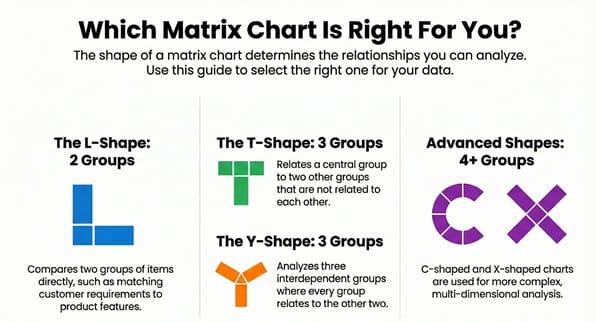
The shape of the matrix chart determines the number of data sets it compares. Using the right shape for your data ensures you capture all the necessary relationships.
The L-Shaped Matrix Diagram
The L-shaped matrix chart is the simplest and most common form. It relates two groups of items.
- Group A occupies the rows (left-hand side).
- Group B occupies the columns (top side).
The intersection in the chart provides the relationship between one item from Group A and one item from Group B. For example, the L-shape helps match customer requirements (Group A) with design features (Group B).
The T-Shaped Matrix Diagram
The T-shaped matrix relates three groups of items. Group A relates to Group B, and Group A also relates to Group C.
- Group A forms the central axis.
- Group B and Group C connect to the sides of Group A’s axis.
It is important to note that Group B and Group C do not directly relate to each other in this setup. This structure is typically used when you need to understand two separate impacts on a primary element.
The Y-Shaped Matrix Diagram
The Y-shaped matrix chart also relates three groups of items, but in a circular fashion. Each group relates to the other two.
- Group A relates to B and C.
- Group B relates to A and C.
- Group C relates to A and B.
This shape is suitable for analyzing systems where all three factors are interdependent. For instance, it shows the relationships between user needs, internal processes, and key metrics.
The C-Shaped and X-Shaped Matrix Charts
These are more complex matrix diagram types used for advanced analysis.
- C-Shaped Matrix: The C-shaped chart relates three groups of items simultaneously in a three-dimensional form. Because it is challenging to draw, professionals often use computer software to create a clear visual image.
- X-Shaped Matrix: The X-shaped chart relates four groups of items. Each group relates to the two groups next to it in a circular manner, but it does not relate to the group across from it. This shape extends the T-shaped logic to include a fourth, related element.
Key Matrix Chart Applications: Why Use Matrix Diagrams?
Matrix charts play a vital role in quality management, project management, and system design. They ensure that all requirements and solutions are logically connected and understood.
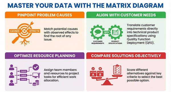
1. Matrix Chart for Problem Analysis
Matrix charts help in finding the underlying causes of a problem.
- By listing potential causes on one axis and observed effects on the other, you can quickly determine which causes have the strongest correlation with which effects.
- This approach is key for conducting a systematic root cause analysis.
Now, the question arises: How can we use the chart to prioritize solutions? This diagram allows you to match problem causes with potential solutions, ensuring you focus on the most effective remedy.
2. Quality Function Deployment (QFD)
The most famous application of the matrix diagram is in the Quality Function Deployment (QFD) method, often called the House of Quality.
- This process converts customer requirements (the “Voice of the Customer”) into technical specifications for product design.
- The central part of QFD is a large matrix that links customer needs (rows) with design requirements (columns). The cells show the strength of these relationships.
Matrix charts ensure that every design decision directly addresses an actual customer need.
3. Resource Allocation and Project Planning
A matrix chart ensures effective resource allocation for any project.
- One axis lists project tasks (e.g., coding, testing, documentation).
- The other axis lists team members or available resources (e.g., John, Sarah, Test Equipment 1).
- The cells use symbols to show the skill level or assignment status, which helps in efficient work planning.
This system allows a project manager to easily see which resources are over-utilized or which tasks lack a necessary skill set.
4. Comparison of Alternatives
When facing multiple options, a matrix diagram provides an objective way to compare them.
- The alternatives (e.g., Solution A, Solution B, Solution C) form the columns.
- The evaluation criteria (e.g., cost, implementation time, system reliability) form the rows.
- The cell content is a score or a symbol indicating how well each alternative meets each criterion.
This method helps stakeholders determine the optimal solution based on clear, weighted factors.
Also Read: What is Run Chart?
Comparison Chart: Matrix Diagram vs. Other Quality Tools
While a matrix chart is a powerful tool, it is not the only option for relationship analysis. It is important to compare it with other diagrams.
| Basis for Comparison | Matrix Chart / Diagram | Affinity Diagram | Tree Diagram | Relations Diagram |
| Primary Goal | Shows the relationships between two or more distinct groups of items. | Organizes a large number of ideas or issues into natural, related groupings (themes). | Breaks down a broad objective into detailed, manageable steps or sub-tasks (hierarchy). | Maps the causal relationships (cause-and-effect) between many related factors. |
| Structure/Flow | Grid, typically 2D (L, T, Y, X shapes). Items on axes, symbols in cells. | Groupings of ideas on a large surface. No fixed geometric flow. | Branching, top-down structure (like an organizational chart). | Web of boxes and arrows. Arrows denote the direction of influence. |
| Output | A quantified or symbolized relationship strength. | A set of logical groupings or themes from brainstorming. | A detailed, sequential plan or a fully broken-down system. | A clear visual of the most critical factor (most outgoing arrows). |
| Typical Use | Matching requirements to features, resource allocation. | Organizing disorganized thoughts from a brainstorming session. | Developing an action plan, breaking down quality goals. | Identifying the root causes when a problem is complex and multi-faceted. |
How to Create an Effective Matrix Chart?
Creating a successful matrix chart follows a systematic and straightforward process. This sequential pattern ensures that the final diagram is both accurate and useful for decision-making.
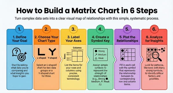
Step 1: Define the Purpose of Your Matrix Diagram
First, you must determine the objective. Why are you creating this matrix chart?
- What data sets are you comparing?
- What insights do you expect to gain?
A clear purpose, such as “Identify the relationship between user complaints and our product’s software modules,” guides the entire process.
Step 2: Select the Appropriate Matrix Chart Type
Considering the groups you want to relate, choose the best matrix diagram shape.
- If you relate two groups, choose the L-shaped chart.
- If you relate three interdependent groups, select the Y-shaped chart.
The selected type must ensure that the chart can fully capture all the necessary data relationships.
Step 3: Collect and Label the Data Sets
The data you use forms the axes of the matrix chart.
- List the items for the rows (e.g., specific tasks).
- List the items for the columns (e.g., responsible employees).
Use precise, consistent terminology. Label the axes clearly so every reader understands what each list represents.
Step 4: Define the Relationship Symbols
You must create a simple key for the symbols that will occupy the cells. These symbols denote the strength of the relationship.
- Strong Relationship: ⦿ (e.g., Direct Cause, Primary Responsibility)
- Medium Relationship: ⭡ (e.g., Secondary Impact, Needs Support)
- Weak/Minor Relationship: $\Delta$ (e.g., Minimal Influence, Backup Role)
- No Relationship: Leave the cell blank.
Clearly document the meaning of each symbol.
Step 5: Fill in the Matrix Chart
Working systematically, fill in the symbol in each cell.
- Compare the item in the row with the item in the column.
- Ask: How strong is the relationship between these two?
- Enter the corresponding symbol into the intersection cell.
This step requires input from subject matter experts to ensure accuracy.
Step 6: Analyze the Matrix Diagram
Once you complete the chart, you must analyze the pattern of the symbols.
- Look for rows or columns with many strong relationship symbols. These are your critical factors or most impacted items.
- Look for rows or columns with no symbols. These items might be missing, irrelevant, or have no dependencies.
Matrix charts help in determining the key priorities for action.
Also Read: How to Select the Right Team Members for Six Sigma Charters?
Key Differences: How to Distinguish Complex Matrix Charts
When you use more complex charts, like the X and Y shapes, understanding the key differences is essential for correct interpretation.
- Relationship Pattern: The L-shaped chart only analyzes A to B. In contrast, the Y-shaped chart analyzes A to B, B to C, and C to A, creating a closed-loop dependency. This signifies a more interconnected system.
- Number of Groups: The fundamental difference is the number of data sets being compared. The L-shape handles two, the T and Y shapes handle three, and the X-shape handles four. You select the shape that matches the complexity of your business problem.
- Visual Complexity: While the L-shaped matrix is simple and easy to draw by hand, the C- and X-shaped charts involve multiple connections, which makes them much more complex to visualize without specialized quality control software.
Understanding these distinctions ensures you pick the right tool for the job.
Advantages and Limitations of the Matrix Diagram
Every analytical tool offers specific benefits but also carries certain limitations. We must consider both sides when deciding to use a matrix chart.
Advantages of Using a Matrix Chart
- Clarity in Complexity: The chart provides a clear and direct visual representation of complex relationships that might be difficult to see in a long text report.
- Systematic Thinking: It forces the team to consider the connection between every single item in one list and every single item in the other list. This approach ensures a comprehensive analysis.
- Facilitates Team Consensus: The process of filling in the cells requires a team discussion, which leads to a shared understanding and team consensus on the relationship strengths.
- High Flexibility: You can adapt the fundamental matrix diagram structure (L-shape) to create more complex, multi-dimensional views (Y, X, C shapes).
Limitations of the Matrix Diagram
- Does Not Show Causation: The chart shows a relationship’s strength but does not show the direction of influence. You cannot tell if A causes B or B causes A. For this, you should use a Relations Diagram.
- Can Become Overly Large: If you use too many items on the axes, the matrix chart can become extremely large and difficult to read or print. This complexity minimizes the chart’s effectiveness.
- Time-Consuming to Create: Filling in every cell for a large matrix requires a significant effort and time commitment from the team, especially when establishing an initial consensus on relationship strength.
Frequently Asked Questions About the Matrix Chart
Q: What is the main purpose of a matrix chart in quality control?
The main purpose of a matrix chart in quality control is to systematically show the relationship between requirements and solutions, often within a Quality Function Deployment (QFD) process. It helps to ensure product design directly addresses customer requirements.
Q: Does the matrix chart show cause and effect?
No, the matrix chart does not show cause and effect. It only shows the existence and the strength of a relationship or correlation between two items. To show clear causation, you should use a Relations Diagram.
Q: What is the difference between an L-type and a T-type matrix diagram?
The L-type matrix diagram compares only two groups of items. The T-type matrix diagram compares three groups of items, where the central group (A) relates to the other two groups (B and C), but groups B and C have no direct relationship shown in the diagram.
Q: Why is the matrix chart considered a planning tool?
The matrix chart is considered a planning tool because it helps in structuring and preparing for a project or quality initiative. For example, it helps in matching tasks to resources or requirements to specifications before you start the main work.
Final Words
The matrix chart is nothing short of an essential analytical tool for any professional who deals with complex data relationships. By visually mapping the connections between different data sets—whether they are customer needs, design features, project tasks, or potential solutions—you gain immediate clarity. This systematic approach, especially in applications like Quality Function Deployment (QFD), ensures that you focus your efforts on the factors that matter most.
We use the matrix diagram to turn chaos into a structured grid, allowing you to move from simply observing relationships to actively managing them. We commit to providing you with the technical clarity and systematic tools you need to make optimal decisions in your work.
Are you ready to transform your complex project data into a clear, actionable matrix chart? Use this structured approach to bring clarity to your next big challenge and achieve a successful outcome.