
A main effects plot is a graphical representation that displays how different levels of an independent variable affect the dependent variable while averaging across all other factors. Specifically, this visualization tool shows the average response value for each level of a factor, connected by straight lines to illustrate trends and patterns.
The fundamental purpose of a main effects plot revolves around identifying significant factors in experimental design. Moreover, it helps researchers understand whether changes in factor levels produce meaningful differences in response variables. The main effects are the effects of one independent variable on the dependent variable, making this visualization essential for factorial experiments.
Table of contents
What is a Main Effect?
A main effect refers to the direct influence of an independent variable on a dependent variable in an experiment, ignoring the effects of other variables. For example, in a study examining how temperature and pressure affect plant growth, the main effect of temperature would show how temperature alone impacts growth, independent of pressure.
Main effects are foundational in experimental design, especially in fields like manufacturing, agriculture, and social sciences. They help researchers identify which factors have the most significant impact on outcomes, paving the way for deeper analysis, such as exploring interactions between variables.

Public, Onsite, Virtual, and Online Six Sigma Certification Training!
- We are accredited by the IASSC.
- Live Public Training at 52 Sites.
- Live Virtual Training.
- Onsite Training (at your organization).
- Interactive Online (self-paced) training,
Key Components of a Main Effects Plot

Every main effects plot contains several essential elements that work together to convey statistical information:
X-axis representation: The horizontal axis displays the different levels of the factor being analyzed. For instance, if examining temperature effects, the x-axis might show “Low,” “Medium,” and “High” temperature settings.
Y-axis measurement: The vertical axis represents the average response variable values. This could be anything from product quality scores to reaction times, depending on your experimental context.
Data points and connections: Individual points mark the mean response at each factor level, while connecting lines reveal trends and patterns across different conditions.
Visual interpretation cues: The slope and direction of connecting lines provide immediate insights into factor effects. Steep slopes indicate strong effects, while horizontal lines suggest minimal impact.
Main Effects vs. Interaction Effects
While main effects focus on individual factor contributions, interaction effects examine how factors work together. Understanding this distinction proves critical for proper experimental interpretation. Main effects plots show individual factor impacts, while interaction plots reveal combined effects between multiple variables.
Interaction effects become particularly important when factors don’t behave independently. For example, temperature might have different effects on product quality depending on pressure levels. Because the interaction effects are statistically significant, the main effects plot can be misleading. Consequently, you cannot interpret the main effects without considering the interaction effects.
Why Use a Main Effects Plot?
A main effects plot, also known as a main effect graph, visually represents the main effects of one or more factors. It displays the average response for each level of a factor, making it easier to compare how different levels affect the outcome. Here’s why main effects plots are valuable:
- Clarity: They simplify complex data into an easy-to-read visual format.
- Comparison: They allow quick comparison of factor levels.
- Decision-Making: They highlight significant main effects, guiding researchers to focus on key variables.
- Versatility: They’re used in various fields, from engineering to psychology.
For instance, a main effects plot in a manufacturing study might show how different machine settings affect product quality, helping engineers optimize processes.
Also Read: What is a Time Series Plot?
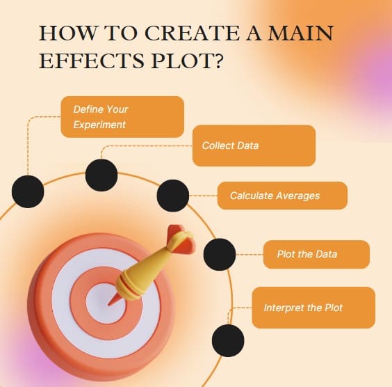
How to Create a Main Effects Plot?
Creating a main effects plot involves a few straightforward steps. Whether you’re using software like R, Python, or Minitab, the process generally follows this structure:
Step 1: Define Your Experiment
Start by identifying the independent variables (factors) and the dependent variable (response). For example, in a baking experiment, your factors might be oven temperature and baking time, with the response being cake quality.
Step 2: Collect Data
Run your experiment, ensuring you collect data across different levels of each factor. For instance, test cakes at 300°F, 350°F, and 400°F, and for 20, 30, and 40 minutes.
Step 3: Calculate Averages
For each level of a factor, compute the average response. In the baking example, calculate the average cake quality score for each temperature level.
Step 4: Plot the Data
Using a statistical tool, create a line or dot plot where:
- The x-axis represents the levels of the factor (e.g., temperature: 300°F, 350°F, 400°F).
- The y-axis represents the average response (e.g., cake quality score).
- Each point or line shows the mean response for a specific factor level.
Step 5: Interpret the Plot
Analyze the plot to identify trends. A steep slope in the plot indicates a significant main effect, meaning the factor strongly influences the response. A flat line suggests little to no effect.
Tools for Creating Main Effects Plots
Several tools can help you create a main effects plot:
- R: Use packages like ggplot2 for customizable plots.
- Python: Libraries like matplotlib or seaborn are excellent for visualization.
- Minitab: A user-friendly option for beginners.
- Excel: Suitable for simple plots but less robust for complex designs.
For example, to create an effect plot in R, you might use the following code:
library(ggplot2) # Sample data data <- data.frame( Factor = c(“Low”, “Medium”, “High”), Response = c(10, 15, 20) ) # Create main effects plot ggplot(data, aes(x = Factor, y = Response)) + geom_point() + geom_line(group = 1) + labs(title = “Main Effects Plot”, x = “Factor Level”, y = “Average Response”)
Understanding Significant Main Effects
A significant main effect occurs when a factor has a statistically meaningful impact on the response variable. This is often determined through statistical tests like ANOVA (Analysis of Variance). For example, if a main effects plot shows a steep incline in product quality as temperature increases, and ANOVA confirms statistical significance, you can conclude that temperature has a significant main effect.
However, be cautious: a significant main effect doesn’t account for interactions between factors. For instance, temperature’s effect on cake quality might depend on baking time. This leads us to the question: How does this interaction affect the plot?
How Interactions Affect Main Effects Plots?
While main effects plots focus on individual factors, interactions between factors can complicate interpretations. An interaction effect occurs when the effect of one factor on the response depends on the level of another factor. For example, high temperature might improve cake quality at short baking times but cause burning at longer times.
To explore interactions, you’d need an interaction plot, which shows how factor combinations affect the response. If interactions are significant, a main effects plot alone might be misleading, as it averages out interaction effects. Always complement main effects plots with interaction plots or statistical tests to ensure accurate conclusions.
Also Read: What is a Box and Whiskers Plot?
Applications of Main Effects Plots
Main effects plots are widely used across industries and disciplines. Here are some examples:
- Manufacturing: Optimize machine settings to improve product quality.
- Healthcare: Analyze how dosage levels affect patient outcomes.
- Marketing: Study how pricing or advertising strategies impact sales.
- Agriculture: Determine how fertilizer types affect crop yield.
For instance, a researcher studying fertilizer might use a main effects plot to compare the average crop yield for different fertilizer brands, quickly identifying which brand performs best.
Best Practices for Creating and Interpreting Main Effects Plots
To maximize the effectiveness of your main effects plot, follow these tips:
- Use Clear Labels: Ensure axes and titles clearly describe the factors and response.
- Check for Interactions: Always verify whether interactions might influence your findings.
- Validate with Statistics: Use ANOVA or similar tests to confirm significant main effects.
- Keep It Simple: Avoid cluttering the plot with too many factors or levels.
- Choose the Right Tool: Select software that suits your expertise and data complexity.
By following these practices, you’ll create plots that are both visually appealing and statistically sound.
Common Mistakes to Avoid
When working with main effects plots, watch out for these pitfalls:
- Ignoring Interactions: Focusing solely on main effects can lead to incomplete conclusions.
- Overinterpreting Small Differences: Small changes in the plot might not be statistically significant.
- Poor Data Quality: Ensure your data is reliable and collected systematically.
- Mislabeling Axes: Unclear labels can confuse readers and obscure insights.
Final Words
Main effects plots serve as essential tools for understanding factorial experimental results and guiding data-driven decisions. Throughout this comprehensive guide, we’ve explored fundamental concepts, creation methods, interpretation techniques, and practical applications across diverse fields.
Remember that effective main effects analysis requires combining visual insights with statistical rigor. Moreover, consider interactions and practical significance alongside main effects when drawing conclusions. This balanced approach ensures reliable and actionable research findings.
Frequently Asked Questions on Main Effects Plot
What is the difference between main effects and interaction effects?
Main effects show how individual factors influence the response variable averaged across all other factors. Interaction effects reveal how factors work together to influence the response. Main effects focus on individual factor contributions, while interactions examine combined effects.
When should I use a main effects plot instead of other visualization methods?
Use main effects plots when you need to visualize individual factor effects in factorial experiments. They’re particularly useful for identifying significant factors, comparing effect sizes across multiple variables, and communicating results to stakeholders who need clear visual summaries.
How do I determine if main effects are statistically significant?
Statistical significance requires formal testing through ANOVA or similar methods. While main effects plots provide visual insights, you need p-values from statistical tests to confirm significance. Combine visual interpretation with statistical validation for comprehensive analysis.
Can main effects plots be misleading?
Yes, main effects plots can be misleading when significant interactions exist between factors. Interaction effects can mask or alter main effects interpretation. Always examine interaction plots alongside main effects plots for complete understanding.
What sample size do I need for reliable main effects analysis?
Sample size requirements depend on effect size, desired statistical power, and significance level. Generally, larger samples provide more reliable results, but power analysis helps determine appropriate sample sizes for detecting meaningful effects in your specific context.