The Impact Effort Chart (also known as the Impact Effort Matrix or Action Priority Matrix) is a decision-making tool. It helps prioritize tasks, projects, or initiatives based on two critical factors: the impact they deliver and the effort required to execute them.
This matrix aids individuals and organizations in managing their time and resources more effectively by guiding them to focus on high-impact tasks with low effort.
The Impact Effort Chart provides clarity in a world of competing priorities. It allows people to make strategic decisions and take action based on clear, objective criteria. Using the chart, you can distinguish between tasks that offer substantial rewards for minimal investment and those requiring extensive effort for little payoff.
Table of contents
What is an Impact Effort Chart?
An Impact Effort Chart is essentially a grid, dividing tasks based on their potential impact and the effort needed to accomplish them. The grid is split into four quadrants, each representing a different type of task.
- Vertical axis (Y-axis): This represents the impact of a task, ranging from low to high. High-impact tasks bring significant benefits to a project or goal.
- Horizontal axis (X-axis): This represents the effort or resources needed to complete a task, ranging from low to high. Low-effort tasks are quick to complete and require fewer resources.
By plotting tasks on this grid, individuals can easily determine where to focus their time and efforts for maximum efficiency.
Four Quadrants of the Impact Effort Chart
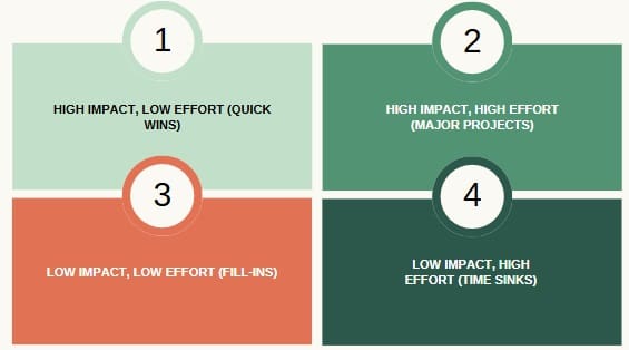
The chart divides the matrix into four quadrants based on two key factors: impact and effort. The tasks are categorized as follows:
High Impact, Low Effort (Quick Wins)
Tasks in this quadrant are highly valuable but require minimal effort. They offer great returns with little investment of time, energy, or resources. These are typically the tasks you want to prioritize because they help achieve significant progress without much cost.
Examples of tasks in this category could include:
- Small tweaks that improve efficiency in a process.
- Low-cost marketing strategies that drive engagement.
- Implementing a minor change that results in customer satisfaction.
Quick wins are the “low-hanging fruit” that can deliver immediate, tangible results with minimal resources.
High Impact, High Effort (Major Projects)
These tasks bring substantial value but require a lot of time, resources, and planning to complete. Major projects often need careful consideration and proper resource allocation. While they can have a significant impact, they are not always the easiest or quickest tasks to undertake.
Examples of major projects include:
- Developing a new product or service.
- Launching a large-scale marketing campaign.
- Overhauling an existing business process to improve efficiency.
Tasks in this quadrant are high priority but should be approached with a detailed plan, ensuring that sufficient resources are available to meet the demand.
Low Impact, Low Effort (Fill-Ins)
Tasks in this category are easy to accomplish but provide little value in return. These tasks are quick to complete and require minimal resources, but their contribution to the overall goal is minimal. They might be suitable for filling gaps in time or delegated to others if needed.
Examples include:
- Sending thank-you emails after a meeting.
- Filing documents or organizing files.
- Making small administrative updates.
These tasks can often be scheduled during periods of low productivity or delegated to others to keep operations running smoothly without consuming major resources.
Low Impact, High Effort (Time Sinks)
Tasks in this quadrant require significant effort but yield minimal results. These tasks are often seen as time sinks—activities that consume resources without offering proportional benefits. In many cases, these tasks should be minimized, restructured, or even eliminated from the workflow altogether.
Examples of time sinks might include:
- Completing overly detailed reports that do not influence decisions.
- Performing repetitive tasks that don’t contribute to long-term goals.
- Engaging in activities that do not align with strategic priorities.
These tasks should be approached with caution. Before investing significant resources, consider whether they can be optimized, automated, or altogether avoided.
Why Use an Impact Effort Chart?
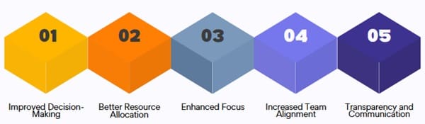
The Impact Effort Matrix is not just a theoretical tool—it has several practical advantages. Below are some key benefits of using this matrix in both personal and organizational decision-making.
- Improved Decision-Making
The chart provides a visual representation of tasks, helping individuals and teams make objective decisions. Instead of relying on subjective judgment, the chart forces you to assess each task based on two key factors: the potential impact and the effort required. This helps to prioritize tasks that provide the most value for the least investment. - Better Resource Allocation
By using the Impact Effort Matrix, you can allocate resources more effectively. High-impact, low-effort tasks should be prioritized, while time sinks should be minimized. This leads to better resource utilization, ensuring that efforts are focused on tasks that contribute the most to your goals. - Enhanced Focus
With so many tasks vying for attention, it’s easy to lose focus. The Impact Effort Matrix helps to cut through the noise by identifying which tasks to focus on. High-impact tasks get the priority, which drives progress toward strategic goals, reducing distractions. - Increased Team Alignment
For teams, the Impact Effort Matrix helps align efforts by providing a clear framework for decision-making. When everyone is on the same page about which tasks to prioritize, it fosters better collaboration and reduces confusion. Teams can work together efficiently toward shared goals, focusing on tasks that truly matter. - Transparency and Communication
The visual nature of the Impact Effort Matrix makes it easy to communicate priorities to stakeholders. Whether you are explaining the roadmap to a team, presenting project plans to executives, or discussing strategic initiatives with clients, the matrix provides clear and concise information. This leads to better buy-in and understanding from all parties involved.
Steps to Create and Use an Impact Effort Chart
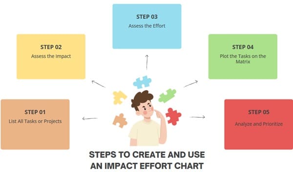
Creating an Impact Effort Chart is a simple process. Here’s how you can use the matrix effectively.
- List All Tasks or Projects
Start by listing all the tasks, projects, or initiatives you need to evaluate. This could include everything from small administrative duties to major organizational projects. The key is to have a comprehensive list of activities that need prioritization. - Assess the Impact
For each task, assess its potential impact on your overall goals. Impact refers to how much benefit or progress the task will create. This could include improving efficiency, boosting revenue, increasing customer satisfaction, or achieving other critical outcomes. Rate each task on a scale from low to high impact. - Assess the Effort
Next, assess the effort required to complete each task. Consider factors like the time it will take, the resources needed (personnel, tools, budget), and the complexity of execution. Rate each task on a scale from low to high effort. - Plot the Tasks on the Matrix
Once you have assessed both impact and effort, plot each task on the matrix. Place each task in the appropriate quadrant based on its impact and effort ratings. This provides a clear visual representation of your priorities. - Analyze and Prioritize
Finally, analyze the matrix and prioritize your tasks. Focus on high-impact, low-effort tasks first, as they will yield the greatest results with the least amount of work. Next, plan out the high-impact, high-effort tasks. These major projects may require more planning and resource allocation, but their potential return is significant.
Examples of Impact Effort Charts in Action
In a Business Context
Imagine a business that is launching a new product. Using an Impact Effort Matrix, the team might evaluate various marketing strategies, product development tasks, and customer feedback collection efforts. High-impact, low-effort tasks such as creating social media posts or reaching out to influencers may be prioritized first.
High-impact, high-effort tasks like creating detailed promotional videos or conducting market research could follow. Time sinks like overanalyzing customer surveys or unnecessary paperwork might be pushed down the list.
In Personal Productivity
Individuals can use the Impact Effort Matrix to prioritize their daily tasks. A person working from home might list tasks like answering emails, creating presentations, or attending meetings.
Quick wins like responding to urgent emails would be tackled first. High-effort tasks like preparing reports or presentations could follow, while low-impact activities like filing or organizing might be left for the end of the day.
Limitations of the Impact Effort Chart
While the Impact Effort Matrix is a useful tool, there are limitations to its application:
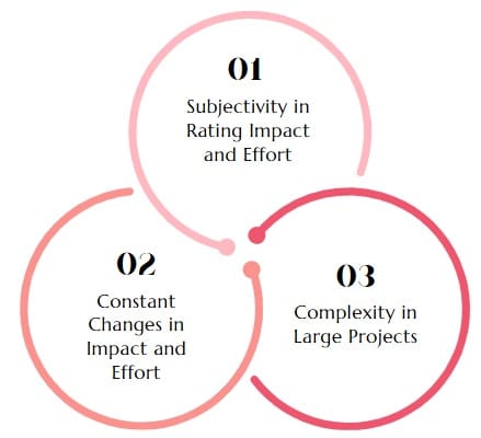
- Subjectivity in Rating Impact and Effort
The impact and effort ratings are based on subjective assessments, which may vary between individuals. What one person perceives as a high-impact task, another might consider low impact. - Constant Changes in Impact and Effort
Impact and effort can change over time. What initially seems like a low-effort task might evolve into something more demanding, or vice versa. This dynamic nature requires regular reassessment. - Complexity in Large Projects
For large projects with multiple moving parts, it may be challenging to assess the collective impact and effort of the entire project. Individual tasks might need to be prioritized within the larger project scope.
Final Words
The Impact Effort Chart is an invaluable tool for anyone looking to prioritize tasks and projects effectively. Categorizing tasks based on their impact and effort, it helps teams and individuals focus on what matters most. The matrix fosters better decision-making, resource allocation, and alignment, ultimately leading to more productive and goal-oriented outcomes.
However, its effectiveness relies on accurate assessments and regular updates to ensure the chart remains relevant as circumstances evolve.
The Impact Effort Chart is a simple yet powerful tool that drives smarter decision-making and improved outcomes, helping you manage your time, effort, and resources more efficiently.