
A contour plot is a two-dimensional graph that shows how two input variables (X1 and X2) affect one output (Y), using curved lines to connect every combination of inputs that produces the same output value, similar to elevation lines on a topographic map. It is the standard way to visualize results from a response surface methodology (RSM) experiment, letting a Six Sigma team see an entire process response at a glance instead of testing one factor at a time. What most explanations stop at is a single output.
The technique that actually earns a contour plot its place in an Improve phase toolkit is overlaying multiple contour plots together, one per response, to find the narrow region where every requirement is satisfied simultaneously, the process “sweet spot.” This guide covers how to read a contour plot, the overlay technique, and where it fits inside a real DOE project.
| Aspect | Contour Plot | 3D Surface Plot |
| Dimensions shown | 2D (X1, X2), with Y represented by line/color | 3D (X1, X2, Y) rendered as a physical surface |
| Best for | Precisely reading exact input combinations for a target output | Intuitively visualizing the overall shape of the response |
| Multiple responses | Can be overlaid to find a shared optimal region | Difficult to combine more than one surface clearly |
| Typical use | Final optimization and operator-facing documentation | Initial exploration and presentation |
| Software output | Minitab, JMP, SigmaXL, Design-Expert | Same tools, alternate view of the same model |
Key Takeaways
- A contour plot shows the relationship between two input variables and one output, using iso-response lines, curves connecting points where the output is equal, much like elevation lines on a topographic map.
- Contour plots are the primary visualization tool for response surface methodology (RSM), the DOE technique used specifically to optimize a process once screening experiments have already identified the significant factors.
- The single most valuable and most overlooked technique is the overlaid contour plot: stacking a separate contour plot for each response variable to find the region where every constraint is satisfied at once.
- Widely spaced, flat contour lines in a region indicate process robustness, small changes in the inputs barely move the output, while tightly packed contours indicate a sensitive region where small input changes swing the output sharply.
- A contour plot is only as good as the underlying model. It requires data collected across a regular grid, typically from a central composite or Box-Behnken design, and data that doesn’t fit that structure needs interpolation before a contour plot can be built.
What Is a Contour Plot?
A contour plot is a graphical technique for representing a three-dimensional relationship, two inputs and one output, on a two-dimensional surface. Instead of plotting the output on a vertical axis the way a 3D surface plot does, a contour plot represents the output using curved lines called iso-response lines, each one connecting every combination of the two input variables that produces the same output value.
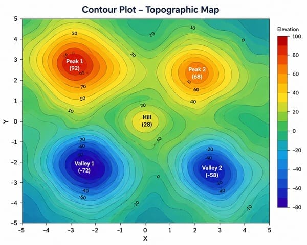
The analogy that makes this click fastest: a topographic map. Elevation is a third dimension that a flat paper map can’t show directly, so cartographers draw contour lines instead, each line connecting every point at the same elevation. A contour plot does exactly the same thing with a process output instead of elevation. Where the lines sit close together, the output is changing rapidly across a small input range, a steep slope. Where lines are spread far apart, the output barely changes, a flat plateau.
The plot’s two axes represent the two input variables under study (X1 on the horizontal axis, X2 on the vertical axis), while the contour lines themselves represent constant values of the output, Y. According to the Engineering Statistics Handbook, a contour plot answers a specific, practical question: how does Z change as a function of X and Y?

Public, Onsite, Virtual, and Online Six Sigma Certification Training!
- We are accredited by the IASSC.
- Live Public Training at 52 Sites.
- Live Virtual Training.
- Onsite Training (at your organization).
- Interactive Online (self-paced) training,
Where Contour Plots Actually Fit: Response Surface Methodology
This is the context most basic glossary explanations skip, and it’s the detail that actually matters for a Six Sigma practitioner. Contour plots don’t typically appear in isolation; they are the standard output of response surface methodology (RSM), a more advanced stage of Design of Experiments used specifically for process optimization.
The typical DOE progression moves through three stages. First, fractional factorial designs screen a large list of potential factors down to the few that actually matter.
Second, a higher-resolution factorial design examines interactions among the significant factors, often adding center points to test for curvature in the response. Third, once curvature is confirmed, response surface methodology, typically a central composite or Box-Behnken design, models that curved relationship precisely enough to identify an optimal operating point, and a contour plot is the primary way that optimal point gets visualized and communicated.
According to guidance from Lean 6 Sigma Hub, contour plots are especially valuable during the Improve phase specifically because they let a team visualize an entire response surface at once and identify the combination of factors that produces the best result, rather than analyzing one factor at a time and missing interaction effects between them.
Also Read: How to Update & Refine Box Plots in Six Sigma?
The Technique Most Explanations Miss: Overlaid Contour Plots
A single contour plot answers a useful but limited question: what input combination optimizes one output. Real Six Sigma projects almost never have only one output that matters. A plastic injection molding process needs to hit a target dimension and minimize cycle time.
A pharmaceutical formulation needs to hit a dissolution target while staying within a safety margin. A single-response contour plot cannot answer either of those questions on its own.
The solution, and the technique that separates a genuinely advanced DOE practitioner from someone who only knows the basics, is the overlaid contour plot. This method takes a separate contour plot for each response variable and layers them on top of each other in the same input-variable space, then identifies the region where every response falls within its acceptable range simultaneously.

According to Penn State’s statistics coursework on response surface methods, the overlaid contour plot approach works well with two or three controllable factors, though it loses efficiency in higher dimensions, and the resulting shared region is often referred to as the process’s “sweet spot.”
In regulated industries like pharmaceutical manufacturing, this same overlaid region is formally called the design space, a term the FDA defines as the multidimensional combination of material attributes and process parameters demonstrated to provide assurance of quality, a core concept in Quality by Design (QbD) initiatives.
A worked example: An engineering team optimizing a cutting tool process needs to keep tool wear below a maximum threshold while also keeping material removal rate above a minimum threshold.
Plotting tool wear as one contour plot and material removal rate as a second, then overlaying them in the same feed-rate-versus-voltage space, reveals a specific, bounded region where both conditions are satisfied at once, the only zone worth targeting for the final process settings.
How to Read a Contour Plot Correctly
- Identify the axes first. The horizontal and vertical axes represent your two input variables, not the output, which trips up newcomers expecting the output to appear on an axis the way it would on a standard scatter plot.
- Read the output from the contour lines or shading, not an axis. Software like Minitab typically uses color bands or labeled contour lines to represent output value; shading indicates higher or lower output depending on the legend.
- Look for closed loops versus open bands. A closed, roughly circular set of contour lines usually indicates a true optimum sitting inside the studied region. Open, parallel bands running off the plot’s edge suggest the true optimum lies outside the tested range.
- Check line spacing for sensitivity. Tightly packed contour lines mean the output is highly sensitive to small input changes in that region, useful for understanding how tightly a process needs to be controlled.
- Treat the model, not just the picture, as the real output. A contour plot visualizes an underlying statistical model, and its accuracy depends entirely on how well that model fits the actual data.
Contour Plot vs. 3D Surface Plot: When to Use Each
These two visualizations come from the identical underlying model and are frequently generated side by side in the same software output, but they serve different purposes.
A 3D surface plot renders the response as a physical, tilting surface, which is often more intuitive for a first look at the overall shape of a relationship, is there a peak, a valley, a saddle point. A contour plot sacrifices that intuitive 3D shape in exchange for precision: it lets a viewer read exact input values corresponding to a specific output level far more accurately than trying to judge a point’s height on a rotated 3D surface.
In practice, many Six Sigma practitioners use both together: the 3D surface plot to build initial intuition about the shape of the response, and the contour plot, especially the overlaid version, to pin down the precise operating window the team will actually recommend.
Also Read: Time Series Plot
Real Examples of Contour Plots in Practice
Manufacturing: Injection Molding Cycle Time and Part Strength
A team overlays a contour plot for cycle time against one for part tensile strength, mapping both across barrel temperature and injection pressure, to find the combination that keeps cycle time low without compromising strength below spec.
Pharmaceuticals: Formulation Design Space
A formulation team overlays dissolution rate and hardness contour plots across compression force and binder concentration, defining a design space the FDA can review as evidence the process reliably produces quality product across a validated operating range.
Food Science: Taste and Shelf Stability
A food scientist overlays a taste-score contour plot with a shelf-stability contour plot across baking time and temperature, identifying the region where the product both tastes best and meets a minimum shelf-life requirement.
Chemical Processing: Yield and Byproduct Formation
A process engineer overlays a yield contour plot with a byproduct-formation contour plot across reaction temperature and catalyst concentration, avoiding a naive optimization that maximizes yield while accidentally producing unacceptable byproduct levels.
Common Mistakes When Working With Contour Plots
- Optimizing a single response in isolation. Chasing the peak of one contour plot without checking other responses often lands a team in a region that fails a different, unmeasured requirement.
- Ignoring line spacing. Focusing only on where the “best” value sits, without noting how tightly packed the surrounding contour lines are, misses valuable information about how robust that operating point actually is.
- Building a contour plot on irregular data. Contour plots require a regular grid of input combinations; data that doesn’t fit that structure needs interpolation first, or the resulting plot will misrepresent the true relationship.
- Trusting extrapolation beyond the tested range. A contour plot only reflects the region actually studied in the DOE; reading an “optimum” near the edge of the plot risks extrapolating into untested, unreliable territory.
- Skipping the overlay step entirely. Treating each response’s contour plot as a standalone answer, rather than combining them, is the single most common way teams recommend settings that later fail a requirement nobody checked against the others.
Frequently Asked Questions (FAQs) on Contour Plot
What is the difference between a contour plot and a surface plot?
Both represent the same underlying model. A surface plot renders the output as a 3D tilted surface, better for an intuitive first look. A contour plot uses 2D iso-response lines, better for precisely reading exact input values that produce a target output.
What is an overlaid contour plot used for?
An overlaid contour plot stacks separate contour plots for multiple response variables on top of each other in the same input space, identifying the region, often called the “sweet spot” or design space, where every response falls within its acceptable range simultaneously.
When should I use response surface methodology instead of a standard factorial design?
Use RSM once screening experiments have already narrowed down the significant factors and center points have confirmed curvature in the response. RSM and its contour plot output are built specifically for fine-tuning an optimal operating point, not for initial factor screening.
What does tightly spaced contour lines mean on a contour plot?
Tightly packed lines indicate the output is highly sensitive to small changes in the input variables in that region, meaning the process will require tighter control if operated there.
Can a contour plot be built from any dataset?
No. Contour plots require input data across a regular grid, typically generated from a central composite or Box-Behnken design. Data that doesn’t naturally form a regular grid needs 2D interpolation before an accurate contour plot can be constructed.
Final Words
A single contour plot answers a narrow question well. The overlaid contour plot, layering multiple responses together to find a shared sweet spot, is what turns the tool into something capable of solving the real, multi-constraint optimization problems Six Sigma teams actually face in the Improve phase.
Six Sigma Development Solutions Inc. teaches response surface methodology, contour plot interpretation, and the full DOE toolkit through onsite, live virtual, public, and online formats. Our Black Belt certification course works through real Minitab output and overlaid optimization exercises, not just theory. View our upcoming training schedule and get $500 off your next class.
About Six Sigma Development Solutions, Inc.
Six Sigma Development Solutions, Inc. offers onsite, public, and virtual Lean Six Sigma certification training. We are an Accredited Training Organization by the IASSC (International Association of Six Sigma Certification). We offer Lean Six Sigma Green Belt, Black Belt, and Yellow Belt, as well as LEAN certifications.
Book a Call and Let us know how we can help meet your training needs.


