
Your process is running. Data is coming in. But is the process actually capable of meeting your customer’s requirements — consistently, not just on a good day?
That is the question a capability chart answers.
It is one of the most practical tools in Lean Six Sigma. A capability chart takes your process data, overlays your specification limits, and shows you at a glance whether your process fits inside those limits or spills outside them. More importantly, it tells you by how much — so you know whether to improve, monitor, or leave it alone.
This guide explains what a capability chart is, the key numbers it displays, how to read it correctly, and when organizations use it to drive real quality decisions.
Table of contents
What Is a Capability Chart?
A capability chart (also called a capability plot or capability analysis chart) is a statistical graphic used in quality management and statistical process control (SPC). It combines a histogram of your process data with your specification limits and a set of capability indices to produce a single, clear picture of process performance.
The chart does two things at once. It shows the shape and spread of your process distribution (the histogram). And it shows where your customer’s acceptable range sits (the specification limits). Where those two things overlap — or fail to overlap — tells the story.
Capability charts are a standard output of tools like Minitab, JMP, and other statistical software packages used in Six Sigma projects. They typically appear in the Measure and Analyze phases of a DMAIC project, when a team is establishing how well a process currently performs before making improvements.

Public, Onsite, Virtual, and Online Six Sigma Certification Training!
- We are accredited by the IASSC.
- Live Public Training at 52 Sites.
- Live Virtual Training.
- Onsite Training (at your organization).
- Interactive Online (self-paced) training,
The Key Components of a Capability Chart
Understanding a capability chart means understanding its five core elements.
1. Specification Limits
Specification limits define the acceptable range for your product or process output. There are usually two:
- USL (Upper Specification Limit): The maximum acceptable value
- LSL (Lower Specification Limit): The minimum acceptable value
These come from the customer, from engineering requirements, or from regulatory standards. They are not calculated from your data — they are given to you externally. This distinction matters, and it is one of the most common points of confusion for people new to capability analysis.
2. The Process Data Histogram
The histogram shows how your process data is actually distributed — where most values fall, how spread out they are, and whether the distribution is roughly bell-shaped or skewed. A normal (bell-curve) distribution is assumed for standard capability indices, though other distributions can be used when data does not follow a normal pattern.
3. Process Mean (μ) and Standard Deviation (σ)
The process mean is the average of your data. The standard deviation measures how spread out the data is around that average. Together, these two numbers define the shape and position of your process distribution on the chart.
4. Cp — Potential Process Capability
Cp compares the width of your specification range to the natural spread of your process. It is calculated as:
Cp = (USL − LSL) ÷ (6σ)
A Cp of 1.0 means the process spread exactly equals the specification range — no margin for error. A Cp above 1.33 is generally considered capable. A Cp below 1.0 means the process is producing output wider than the specification allows, and defects are inevitable regardless of centering.
Cp answers the question: Could this process be capable if it were perfectly centered?
5. Cpk — Actual Process Capability
Cpk adjusts for where the process mean sits relative to the specification limits. A process can have a good Cp (plenty of room) but still produce defects if the mean is shifted too close to one of the limits.
Cpk is calculated as the minimum of:
- (USL − μ) ÷ 3σ
- (μ − LSL) ÷ 3σ
By taking only the worse side — the side where the mean is closest to a limit — Cpk reflects the actual risk of producing out-of-spec output.
Cpk answers the question: How is this process actually performing right now, including any off-center shift?
Also Read: Capability Maturity Model Integration (CMMI)
How to Read Capability Index Values
Here is a practical guide to interpreting what you see:
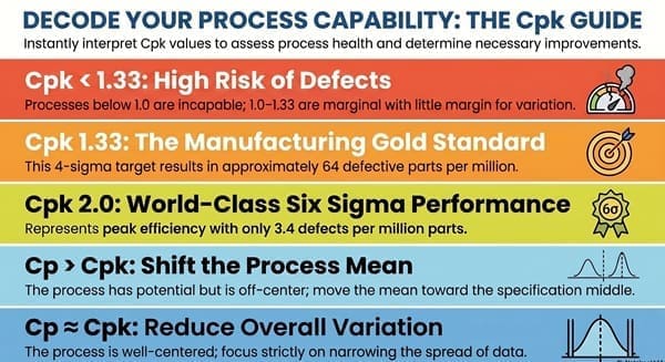
Cpk below 1.0: The process is not capable. It is producing defects. Improvement is needed before this process can reliably meet specifications.
Cpk between 1.0 and 1.33: The process is marginally capable. It may be acceptable in some industries, but it has little margin for variation. Monitor closely and look for improvement opportunities.
Cpk of 1.33: A commonly used minimum target in manufacturing. This corresponds to roughly 4-sigma performance and a defect rate of approximately 64 parts per million.
Cpk of 1.67: Considered highly capable. This is the target many Six Sigma practitioners aim for in critical processes.
Cpk of 2.0: Corresponds to Six Sigma performance (when accounting for a 1.5-sigma process shift). At this level, defect rates are in the range of 3.4 parts per million.
When Cp is much higher than Cpk: This tells you the process has potential but is off-center. The spread is fine — the mean just needs to be moved toward the middle of the specification range. This is often a faster fix than reducing variation.
When Cp and Cpk are close in value: The process is well-centered. Improvement efforts should focus on reducing overall variation.
Capability Chart vs. Control Chart: An Important Distinction
People frequently confuse capability charts with control charts. They are different tools that answer different questions.
A control chart monitors process stability over time. It plots data points sequentially and uses control limits (calculated from the data itself) to detect unusual variation. It answers: Is this process stable and predictable?
A capability chart compares the process to customer specifications. It uses specification limits (set by the customer or design requirements) to assess whether the process output fits within what is required. It answers: Does this process produce acceptable output?
A critical rule in Six Sigma: you should always confirm a process is stable (using a control chart) before running a capability analysis. Capability indices calculated on an unstable process are misleading. An unstable process has unpredictable variation, which means any Cp or Cpk you calculate today may not hold tomorrow.
When Organizations Use Capability Charts
Capability analysis is applied at multiple points in a business or manufacturing context.
During DMAIC Measure phase: Before improving a process, you need to know how it performs currently. A capability chart establishes the baseline. It tells you whether you are dealing with a capability problem (the process cannot fit within specifications) or a stability problem (the process is erratic), which determines what kind of improvement is needed.
Setting realistic specifications: When specifications are being defined for a new product or process, capability charts from similar existing processes help set achievable limits. Specifications set tighter than what the process can naturally achieve create chronic quality problems.
Supplier qualification: Organizations use capability analysis to evaluate whether a supplier’s process can reliably meet their requirements. A supplier with a Cpk above 1.33 on a critical dimension is a different conversation from one with a Cpk of 0.9.
Post-improvement validation: After a DMAIC project makes changes to a process, a new capability chart confirms whether the improvement actually worked and by how much.
Compliance and certification: In regulated industries — aerospace, medical devices, automotive — demonstrating process capability is often a requirement for customer approvals or industry certifications. Documented capability charts are part of the evidence package.
Ongoing quality monitoring: Some teams run capability reports on a routine schedule (weekly, monthly) for critical process parameters, catching drift before it becomes a defect problem.
A Common Mistake: Confusing Process Spread With Specification Range
One of the most frequent errors in reading capability charts is treating control limits as if they were specification limits, or vice versa.
Control limits are calculated from your process data. They describe natural variation. They have nothing to do with what the customer wants.
Specification limits come from the customer or design requirements. They describe what is acceptable. They have nothing to do with how the process naturally behaves.
A process can be in statistical control (all points within control limits, stable behavior) and still be completely incapable of meeting specifications if the natural process variation is wider than the spec range. Both conditions need to be true: stable and capable.
Improving Capability: Where to Start
If your capability chart shows a Cpk below your target, there are two general paths to improvement.
When Cp is acceptable but Cpk is low (off-center process): Focus on centering the process. Investigate why the mean has drifted toward one specification limit. Equipment settings, raw material variation, operator adjustments, or tool wear are common causes. Centering is often the faster and cheaper fix.
When Cp itself is low (too much variation): You need to reduce the spread of the process. This requires identifying and addressing the sources of variation: raw material inconsistency, equipment condition, environmental factors, or measurement system error. This type of improvement typically takes more time and a structured DMAIC approach.
In both cases, a capability chart gives you the starting point — a clear, data-based picture of where you are before you begin.
Also Read: Why Capability? We have No Go Gauges.
Learn Capability Analysis in Our Lean Six Sigma Training
A capability chart is not complicated once you have seen a few of them and worked through the calculations with real data. That practical experience is exactly what our training programs provide.
At Six Sigma Development Solutions, we teach capability analysis as part of our Lean Six Sigma Green Belt and Black Belt programs, in formats that fit how you learn:
- Onsite training at your facility, using your actual processes and data
- Live virtual classroom with a live instructor and real-time problem-solving
- Online self-paced certification you can complete on your schedule
Our Green Belt program covers the full Measure and Analyze toolset, including capability analysis, control charts, measurement system analysis, and hypothesis testing — everything you need to run a real improvement project.
About Six Sigma Development Solutions, Inc.
Six Sigma Development Solutions, Inc. offers onsite, public, and virtual Lean Six Sigma certification training. We are an Accredited Training Organization by the IASSC (International Association of Six Sigma Certification). We offer Lean Six Sigma Green Belt, Black Belt, and Yellow Belt, as well as LEAN certifications.
Book a Call and Let us know how we can help meet your training needs.


