Table of Contents
What are Radar Graphs?
Radar graphs, also known as radar charts or spider charts, are a type of data visualization that displays multivariate data in a two-dimensional graph with a circular or polygonal shape. They are often used to compare the performance or characteristics of multiple entities or categories across multiple variables. Here’s a basic explanation of radar graphs and their typical use cases:
Graphical Structure:
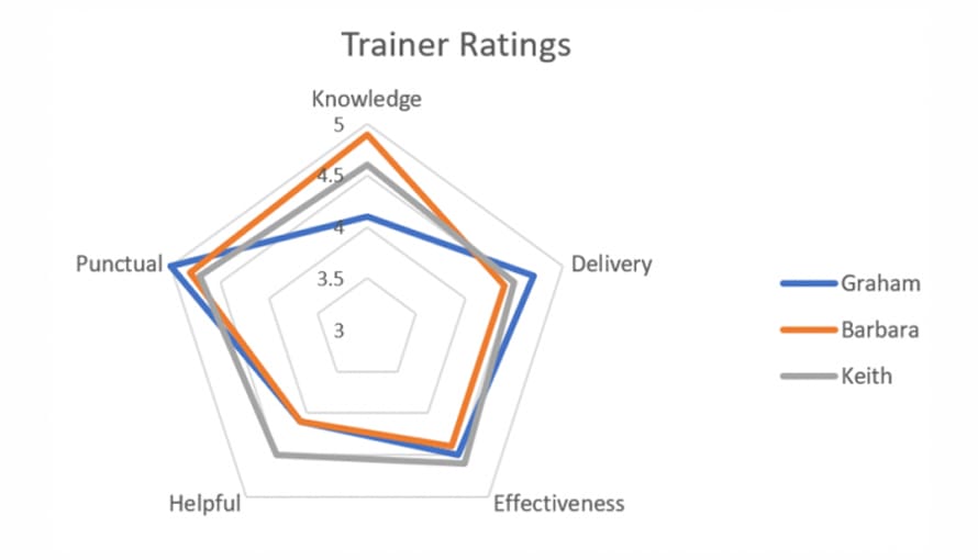
Radar graphs consist of a series of radiating spokes or axes emanating from a central point. These spokes represent different variables or attributes. The data points for each entity are plotted along each axis, and the values are connected to form a shape or polygon. The area enclosed by the shape is often filled or shaded to make comparisons easier.
Variable Comparison:
Radar graphs are useful when you want to compare how different entities perform across multiple variables. Each entity’s shape on the graph provides a visual representation of its strengths and weaknesses in relation to the chosen variables.
Use Cases:
Radar graphs find applications in various fields, including business, sports, and scientific research. Some common use cases include:
- Performance Evaluation: Assessing the performance of individuals or teams in different areas, such as a company’s departments or athletes in various sports disciplines.
- Product Comparison: Comparing products or services based on various attributes like price, quality, and features.
- Market Research: Analyzing customer preferences and opinions on multiple product or service features.
- Risk Assessment: Evaluating risks and vulnerabilities in different aspects of a project or system.
- Scientific Data Visualization: Visualizing data in fields like meteorology, where multiple variables like temperature, humidity, and wind speed are analyzed for a specific location.
Advantages:
Radar graphs provide a clear visual representation of the strengths and weaknesses of entities across multiple variables, making them useful for quick comparisons. They can help identify patterns and trends in data.
Limitations:
Radar graphs can become cluttered and hard to interpret when there are many variables or entities. They are best suited for comparing a small to moderate number of entities across a limited set of variables. Interpretation can be subjective, and it’s essential to choose appropriate scales and legends for accurate assessment.
Alternative Visualization Methods:
Depending on the data and the context, alternative visualizations like bar charts, scatter plots, or parallel coordinate plots might be more suitable for presenting and comparing data.
In summary, radar graphs are a valuable tool for visually comparing entities across multiple variables, offering insights into their relative performance or characteristics. They are most effective when used for a focused comparison of a limited number of entities and variables.

What are the Key Functions?
Here are some of the key functions and uses of radar graphs in business:
- Performance Evaluation: Radar graphs are commonly used to evaluate and compare the performance of different business units, teams, or individuals across various key performance indicators (KPIs). Each radar graph represents the performance of a specific entity, making it easy to identify strengths and weaknesses in different areas.
- Competitive Analysis: Businesses use radar graphs to compare their products or services with those of competitors. This allows them to assess how well they stack up in terms of features, quality, pricing, and other attributes.
- Market Research: Radar graphs can be used in market research to analyze customer feedback and preferences. Each radar chart represents a product or service’s attributes, making it easier to understand what aspects customers value most.
- Risk Assessment: In risk management, radar graphs can be employed to assess and prioritize risks. Each risk factor, such as financial risk, operational risk, or regulatory risk, can be represented on a radar chart, helping businesses make informed decisions about risk mitigation strategies.
- Product Development: When developing new products or features, businesses can use radar graphs to define and compare the desired attributes. This can serve as a guide to ensure that the final product aligns with the company’s objectives and customer expectations.
- Project Management: Radar graphs are useful in project management to monitor and assess project progress. Each chart can represent different aspects of the project, such as schedule adherence, budget management, and quality control.
- Balanced Scorecard Analysis: Radar charts are well-suited for representing the balanced scorecard, a performance measurement framework that includes financial, customer, internal process, and learning and growth perspectives. Each perspective can be visualized on the radar graph to assess overall business performance.
- Employee Performance Evaluation: Businesses can use radar graphs to evaluate and compare employee performance by considering various attributes like sales targets, customer satisfaction, and task completion. This can help in performance appraisals and resource allocation.
- Strategic Planning: Radar graphs can be employed in strategic planning to visualize a business’s strategic goals and objectives across different dimensions, such as innovation, market share, and customer satisfaction. This aids in aligning the organization with its strategic direction.
- Customer Feedback Analysis: Businesses can create radar graphs to analyze customer feedback or survey responses. Each axis can represent different customer satisfaction metrics, allowing organizations to identify areas for improvement.
While radar graphs can be a valuable tool in business for the purposes mentioned above, it’s essential to use them judiciously. They are most effective when used to compare a limited number of entities or attributes. Additionally, it’s important to ensure that the data and scales used on the graph are appropriately chosen to provide accurate and meaningful insights.
How to Make a Radar Chart?
You can make a radar chart using various software tools, including spreadsheet programs like Microsoft Excel, data visualization tools, or even programming languages like Python. Here’s a general guide on how to create a radar chart:
Using Microsoft Excel:
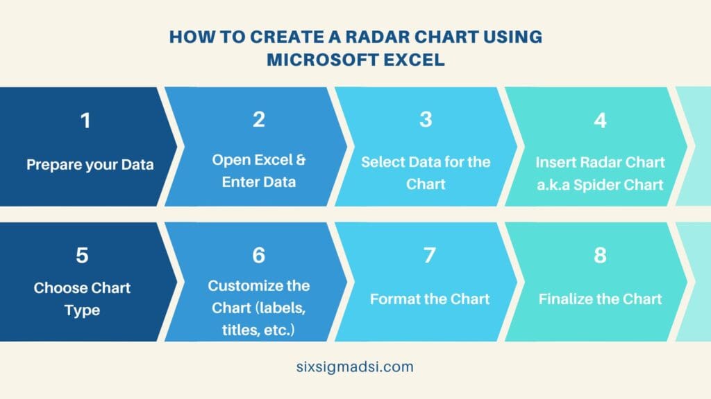
- Data Preparation:
- Organize your data. You’ll typically have a set of entities (e.g., products, teams, or individuals) and a list of variables (attributes or metrics) for each entity. Each variable should be assigned a value for each entity.
2. Open Excel:
- Launch Microsoft Excel and open a new or existing worksheet.
3. Data Entry:
- Enter your data into the spreadsheet. Place the entities in one column and the variable values in separate columns, with each variable having its own column.
4. Select Data:
- Highlight the data you want to use for the radar chart, including entity names and variable values.
5. Insert Radar Chart:
- Go to the “Insert” tab on the Excel ribbon.
- Click on the “Radar Chart” option (sometimes it’s labeled as a “Spider Chart” or “Web Chart”).
6. Choose Chart Type:
- Select the radar chart type you want to create. Excel offers different subtypes, such as filled radar charts, line radar charts, and more.
7. Customize the Chart:
- You can further customize the chart by adding titles, labels, and legends.
8. Format the Chart:
- Adjust formatting options like colors, gridlines, and data point markers to enhance the chart’s clarity and aesthetics.
9. Finalize the Chart:
- Make any additional adjustments as needed, and your radar chart is ready.

Using Data Visualization Tools:
Many data visualization tools like Tableau, Power BI, and Google Sheets offer radar chart creation options. The process is typically similar to Excel, involving data preparation, selection, and chart customization within the tool’s interface.
Using Python (Matplotlib):
If you prefer to create radar charts using Python, you can use libraries like Matplotlib. Here’s a basic example of how to create a radar chart using Matplotlib:
import matplotlib.pyplot as plt
import numpy as np

# Define the attributes (variables)
attributes = ['Attribute 1', 'Attribute 2', 'Attribute 3', 'Attribute 4']

# Define entity data
entity_names = ['Entity 1', 'Entity 2', 'Entity 3']
data = np.array([[0.6, 0.8, 0.7, 0.9], [0.5, 0.7, 0.6, 0.8], [0.4, 0.6, 0.5, 0.7]])

# Create the radar chart
fig, ax = plt.subplots(subplot_kw={'polar': True})
for i in range(len(entity_names)):
    ax.fill(np.radians(attributes), data[i], alpha=0.25, label=entity_names[i])

# Add attributes labels
ax.set_xticks(np.radians(attributes))
ax.set_xticklabels(attributes)

# Add a legend
ax.legend(loc='upper right', bbox_to_anchor=(1.3, 1.1))

# Show the chart
plt.show()
This Python code uses the Matplotlib library to create a radar chart. You can customize it further by changing attributes, entity data, and chart appearance to suit your specific requirements.
Whether you’re using Excel, data visualization tools, or programming languages, creating a radar chart involves structuring your data and then applying the appropriate chart creation method for your chosen tool or platform.
Have you tried creating radar charts for your own projects or data analysis?
We’d love to hear about your experiences and any tips you have to share. Leave a comment below to join the conversation, and let’s learn from each other’s insights.


