Table of contents
What Are Trending Graphs, and How to Interpret Them?
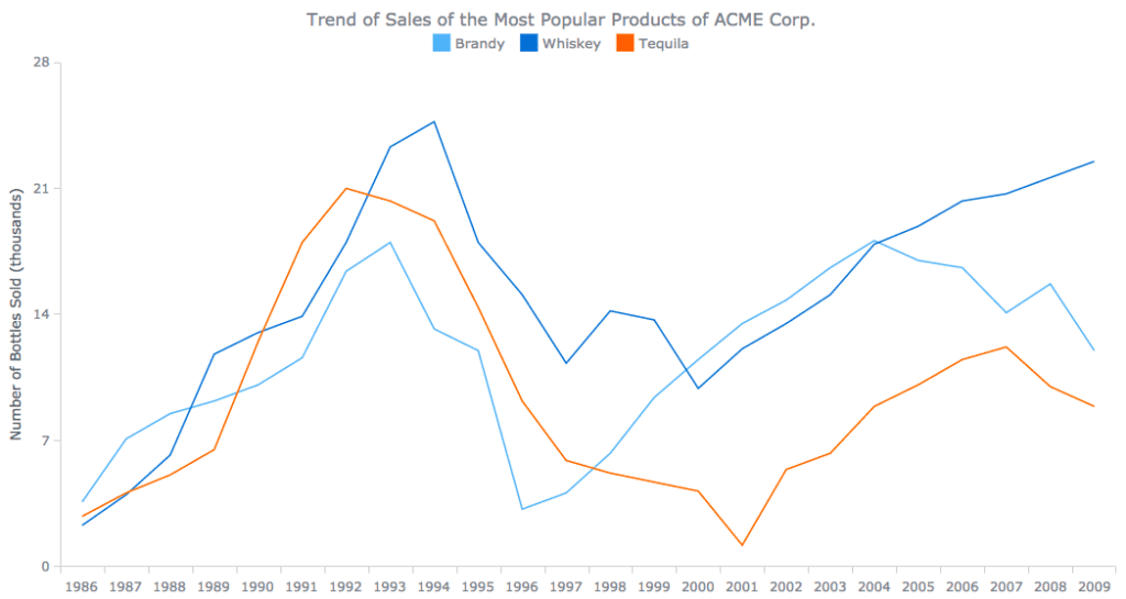
Trend analysis charts, also known as run charts, are used to display trends over time. Single-point measurements are misleading because all processes vary. Data displayed over time can help to understand the actual performance of a particular process, especially in relation to a target or goal. On the state measure pages or the county snapshot pages (under the “data tab”), you can find trend graphs that can be used to track progress over time. Here are some trend graphs illustrating various relationships between data at the county, state, and national levels. The interpretations of each county trend are based upon linear regressions involving all the years included in the graph.
What are Trend Charts and How Do They Work?
The run chart, the control chart, and the time series chart are some of the most common trend charts. The run chart is simply the plotted data on the X-axis. You can also examine the sequence or pattern of points. Control charts add the upper- and lower-control limits to help you determine whether the data pattern is due to a common cause or a special one. Time series is based upon the idea of finding patterns in data and extrapolating them into the future.

Types of Trends You Can Analyze in Charts
Graphs are visual representations of data that help us understand relationships and trends in the data. There are several types of trends that can be observed in graphs, and interpreting these trends correctly is crucial for making informed decisions. Here are some common types of trends in graphs and how to interpret them:
Linear Trend
A linear trend is a straight line that shows a constant rate of change between two variables. In a linear trend, the relationship between the variables is constant. This means that for every unit increase in one variable, there is a constant increase or decrease in the other variable. The slope of the line indicates the strength and direction of the relationship.
Linear Trend
An exponential trend is a curve that starts slowly and then accelerates rapidly as the values increase or decrease. Exponential trends indicate rapid growth or decay. Small changes in the independent variable result in large changes in the dependent variable. Exponential growth often signifies compound interest or population growth, while exponential decay could represent decreasing resources or decay processes.

Logarithmic Trend
A logarithmic trend is a curve that increases quickly at first and then levels off over time. Logarithmic trends show diminishing returns or saturation. Initially, there is rapid growth, but as the values increase, the rate of increase slows down. This trend suggests that the relationship between the variables is strong initially, but as the values approach a certain limit, the effect becomes less significant.
Quadratic Trend
A quadratic trend is a U-shaped or inverted U-shaped curve that indicates a nonlinear relationship between variables. Quadratic trends show a curved relationship between variables. The curve can be upward (indicating positive correlation) or downward (indicating negative correlation). Quadratic trends suggest that the rate of change in the dependent variable is not constant but instead depends on the level of the independent variable.
Sinusoidal Trend
A sinusoidal trend is a periodic wave-like pattern that repeats at regular intervals. Sinusoidal trends indicate cyclic or seasonal patterns in the data. These trends often occur in time-series data and show regular fluctuations over time. Understanding the periodicity and amplitude of the wave helps in predicting future values based on historical patterns.
Step Trend
A step trend shows abrupt changes in the data, usually representing discrete events or interventions. Step trends indicate sudden shifts in the data due to external factors. These shifts can be caused by policy changes, technological advancements, or other significant events. Identifying the cause of these steps is essential for understanding the data and making appropriate decisions.
Seasonal Trend
A seasonal trend shows regular, repeating patterns in the data over specific time intervals. Seasonal trends occur due to regular and predictable fluctuations in the data based on seasons, months, or other fixed time periods. Understanding these patterns is crucial for industries such as retail and agriculture, where demand and supply are affected by seasonal variations.
Cyclical Trend
A cyclical trend shows long-term waves or cycles in the data, indicating economic or business cycles. Cyclical trends represent recurring patterns in the data that are not necessarily tied to fixed time intervals. These trends often reflect economic cycles, with periods of growth followed by periods of contraction. Understanding cyclical patterns helps in predicting economic trends and making a long-term strategic decision
When interpreting trends in graphs, it’s essential to consider the context of the data, the scale of the variables, and any external factors that might influence the trends. Visualizing data in graphical form provides valuable insights, but accurate interpretation requires a combination of domain knowledge, statistical analysis, and an understanding of the specific type of trend being observed.
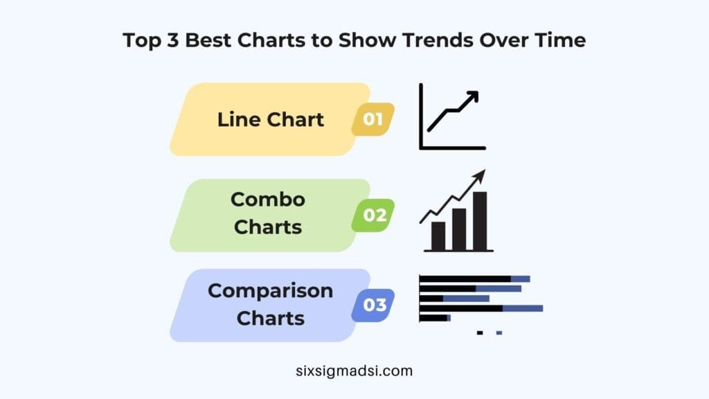
3 Best Charts to Show Trends Over Time

1. Line Chart
This visualization is the best chart to show trends over time.
As a business person, you can use this visualization to emphasize a difference in your business over time.
Line charts contain two variables. One is on the vertical axis, and the other is on the horizontal axis. When analyzing your data, the vertical axis variable is always constant, while the horizontal axis variable changes with time.
You can use a line chart to show that change is taking place in your enterprise. The line on the chart will move from left to right. When changes take place, the slope can either move up or down.
The variables in your business that change with time will be on the horizontal axis. This is essential so that it helps you measure your business trend with time.
In your data analysis, you can determine the interval size depending on the data you have. On the other hand, the vertical axis will comprise a statistical summary, such as the average value of variables in the horizontal axis.
2. Combo Charts
A combo graph can be a visualization that combines two line graphs or one graph. It can also combine a column graph and a graph. This is the best way to display trends over time.
Combo charts provide answers to your data question: What are the trends in categorical information?
Combo charts contain information relevant to your analysis. These charts can double or triple the insights you provide to your audience. These charts are one of your best tools for identifying trends over time.
3. Comparison Charts
A chart of comparison shows the relationship and differences between certain quantities.
A Comparison Chart can be used to compare the key data points of your data story. This is the best graph to analyze trends.
You can, for example, compare the sales revenue with profits over a certain period. You will be able to identify the factors in your business which are driving growth.
You can compare products using a chart before you buy them. You can, for example, compare the prices of different brands before making a purchase.
Digital marketing can also make use of comparison charts. You can, for example, compare the attribution sources in order to determine the primary source of traffic.
Which is your favorite trend chart to use and why?
Share your thoughts and experience in the comments below!


