
A time plot helps you see trends, patterns, or changes in data collected at regular time intervals—like daily, monthly, or yearly. Time plots are one of the most valuable tools in data analysis, particularly when working with data that unfolds over time.
Whether you’re a financial analyst, a scientist, an engineer, or a student, learning to create and interpret time plots opens up a powerful way to see patterns that numbers alone can’t reveal.
By using simple tools and a thoughtful approach to layout and customization, you can turn raw time series data into insightful visual stories that drive action and understanding.
In the world of data analysis, one of the most common challenges is understanding how things change over time. Whether it’s stock prices, temperature readings, population growth, or machine performance, we often collect data at different points in time. These types of data are called time series.
Table of contents
Definition of Time Series Plot
A time plot, also known as a time series plot, is a simple but powerful visualization tool that helps us understand how a variable changes over time. It’s one of the most widely used methods to explore patterns, detect trends, and analyze fluctuations in time-based data.
Time plots are essential in fields like finance, economics, meteorology, medicine, environmental science, and many others. They are especially useful when you want to answer questions like:
- Has this variable increased or decreased over time?
- Are there any repeating patterns (seasonality)?
- Are there any unusual spikes or drops (anomalies)?
- How predictable is this behavior?
Let’s dive deeper into the various aspects of time plots and how they are used.
What is Time Series?
A time series is a set of data points collected or recorded at regular intervals over time. These observations typically come from monitoring the same variable—like daily temperatures, monthly sales, or annual rainfall. The key feature of time series data is that time plays a critical role in the analysis.
To visualize how a variable changes over time, we use a time plot, also known as a time series plot or line plot. In these plots, the horizontal axis (X-axis) represents time, while the vertical axis (Y-axis) shows the values of the variable being observed.
Why Use a Time Plot?
A time plot gives you a clear picture of how data evolves. By plotting the values in chronological order, we can spot patterns, trends, outliers, and seasonality. It transforms raw data into a visual form, making it easier to:
- Understand long-term movement or direction (trend)
- Recognize repeating patterns (seasonality or cycles)
- Detect short-term changes (fluctuations or anomalies)
- Identify unusual events (outliers)
- Explore potential relationships between multiple series
Constructing a Time Series Plot
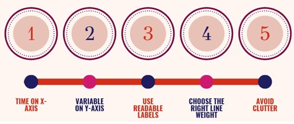
When making a time plot, clarity is key. Here’s how to build a readable and effective one:
- Time on X-axis: Label time in consistent units (days, months, years, etc.).
- Variable on Y-axis: Use a scale that covers the full range of values.
- Use readable labels: Place tick marks clearly on both axes.
- Choose the right line weight: Not too thick to hide details, and not too thin to vanish.
- Avoid clutter: Limit use of gridlines or colored backgrounds unless necessary.
By following these steps, your plot will highlight the important features of the time series without overwhelming the viewer.
Purpose of Time Plots
Time plots are used to visualize time series data. They allow analysts to:
- Observe trends (upward or downward)
- Detect seasonality or cyclical patterns
- Spot sudden changes or anomalies
- Compare multiple series
- Prepare for further statistical modeling or forecasting
Types of Time Plots
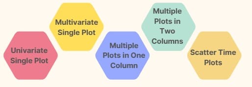
Depending on the structure of your data and the kind of analysis you want to perform, time plots can be created in different layouts. These different formats help to display data in a clearer and more meaningful way.
Here are the main types of time plots:
Univariate Single Plot
This is the most basic type of time plot. It displays the movement of one variable over time in a single graph.
Use Case:
Perfect for showing trends or fluctuations in a single data series — like the temperature of a city over one year.
Key Features:
- One line representing one variable
- Time on the x-axis and value on the y-axis
- Simple and easy to read
Customization Options:
- Add colors to the line
- Change axis labels
- Add a title
- Control date format and gridlines
Multivariate Single Plot
In this type, multiple time series are plotted in the same frame. Each line represents a different variable, allowing direct comparison on the same graph.
Use Case:
Ideal for comparing the performance of different stocks, sensors, or indicators over time.
Key Features:
- Multiple lines with different colors
- All variables share the same x-axis (time)
- Useful for spotting relationships or divergence between variables
Multiple Plots in One Column
Here, each time series is shown in its own subplot, stacked vertically. This is useful when the series have different scales, or if combining them in a single plot would make it hard to read.
Use Case:
When comparing three or four variables and you want a clean visual separation.
Key Features:
- Each plot gets its own space
- All aligned by time
- Easy to compare general trends without clutter
Multiple Plots in Two Columns
When the number of series exceeds four, a two-column layout helps use the space more efficiently. Each column has its own set of plots, making it easier to review more series at once.
Use Case:
Best suited for visualizing five or more time series in an organized manner.
Customization:
- Adjust margins and spacing
- Label each plot clearly
- Add legends or annotations if necessary
Scatter Time Plots
Scatter plots are not as common for time series but can be used to look at relationships between two variables over time. Sometimes they are used to compare one variable at time t against its lagged version (like t-1).
Understanding Patterns in Time Series
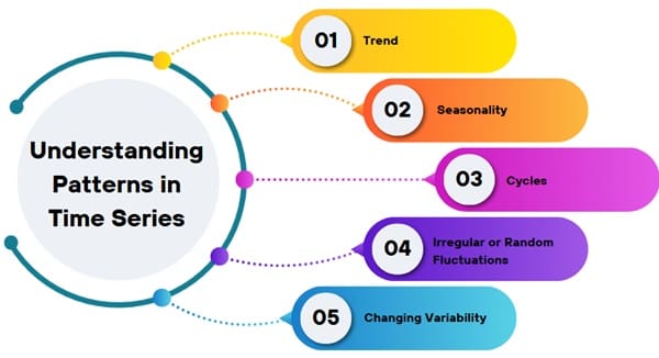
Once we’ve created a time plot, we can begin interpreting the patterns. These include:
1. Trend
A trend shows the general direction in which the data moves over a long period. It could be:
- Upward (e.g., increasing population)
- Downward (e.g., declining birth rates)
- Curvilinear (e.g., up then down, or vice versa)
The presence of a trend often reflects long-term changes like technological progress, social behavior shifts, or environmental changes.
2. Seasonality
Seasonal patterns repeat at regular intervals due to calendar-related effects:
- Weather (e.g., higher ice cream sales in summer)
- Holidays (e.g., more shopping in December)
This kind of variation is predictable and often repeats yearly, quarterly, or monthly.
3. Cycles
Unlike seasonality, cycles don’t follow a fixed calendar schedule. They tend to be longer and less predictable. Economic cycles (booms and recessions) are a common example. We look for rising and falling phases that stretch over years.
4. Irregular or Random Fluctuations
These are short-term, unexpected changes. They might result from one-off events like natural disasters, political upheaval, or sudden market shifts. While trends and seasonality follow patterns, these fluctuations are more chaotic.
5. Changing Variability
Over time, the spread or volatility of the data might change. For example, the difference between the highest and lowest temperatures in a day could increase during certain seasons. This variation might signal instability or increased sensitivity to external factors.
Smoothing a Time Series
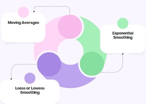
When a time series has too many small ups and downs, it becomes hard to see the bigger picture. That’s where smoothing comes in.
Smoothing helps reduce noise or random variation so we can better understand the underlying trend and seasonal components. Common smoothing methods include:
1. Moving Averages
This technique takes the average of a fixed number of past observations. As we move through the data, the window “slides,” giving us a smoother line.
2. Exponential Smoothing
This method gives more weight to recent values while still considering past data. It’s useful for forecasting and highlights recent trends more clearly than moving averages.
3. Loess or Lowess Smoothing
This flexible approach fits smooth curves to data by performing local regressions. It’s great for uncovering non-linear trends.
Smoothing doesn’t remove the actual data—it simply helps reveal meaningful patterns that could be lost in the noise.
Stationary vs. Non-Stationary Time Series
A stationary time series maintains a consistent pattern over time. Its mean and variance stay roughly the same, and it doesn’t show strong trends or seasonal effects.
Key features of stationary series:
- No obvious upward or downward trend
- Constant variability
- Repeating structure (if any)
On the other hand, a non-stationary series shows systematic changes in its behavior over time—such as increasing trends or growing fluctuations. In many real-world datasets, non-stationarity is common, and it usually requires transformation before analysis or forecasting.
Multiple Time Series Plots
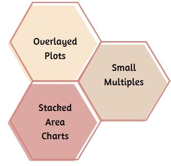
Sometimes, we want to compare two or more time series side by side. We can do this in one of three ways:
1. Overlayed Plots
Plotting multiple series on the same graph allows for direct comparison. We use different line styles or colors to distinguish them.
2. Small Multiples
These are separate mini-plots with the same axis scales, making it easy to compare trends across different variables or groups.
3. Stacked Area Charts
Useful when the different time series are parts of a whole. We can see how each part contributes to the total over time.
Aspect Ratio in Time Plots
The aspect ratio (height vs. width) of a time plot can influence how we perceive patterns. A narrow plot can exaggerate small variations, while a wider one may hide them. Adjusting this ratio helps in:
- Revealing cycles more clearly
- Showing the slope or rate of change
- Enhancing readability of long series
Sometimes, breaking a long time series into shorter segments (a “slice plot”) is a better way to display dense information.
Adding Reference Lines
To emphasize key values or thresholds, we can use reference lines. For example:
- A horizontal line to mark an average
- A vertical line to indicate a significant date
These subtle markers guide the viewer’s attention without distracting from the data.
Detecting Anomalies
Time plots are useful for spotting outliers or suspicious behavior. For instance, if daily revenue suddenly drops or spikes, a time plot can help investigate what happened. Comparing two time periods or groups on the same graph often reveals unusual patterns or inconsistencies.
A famous example includes city parking meter revenue, where a change in collection contractors led to a visible increase in daily collections—uncovering theft by the previous team.
Using Semi-Logarithmic Plots
A semi-log plot uses a logarithmic scale on one axis, usually the Y-axis. This is helpful when the data changes exponentially—like in technology growth or population expansion.
Key benefits:
- Straight lines in these plots suggest consistent percentage changes.
- Easy to interpret growth or decay rates over time.
If the data grows faster or slower than a constant rate, the curve will bend—revealing acceleration or deceleration.
Sparklines for Compact Time Series
Sparklines are tiny time plots placed within tables or next to text. They pack a lot of insight into a small space and are useful for:
- Comparing several time series at once
- Adding visual cues to reports or dashboards
- Highlighting trends without taking up much room
Despite their small size, they can effectively show trends, peaks, and drops.
Time Series and Forecasting
Ultimately, one of the major goals of time series analysis is to forecast future values. By understanding trends, seasonality, and cycles in a time plot, we can make educated predictions. Accurate forecasting helps in fields like:
- Finance (e.g., stock prices)
- Retail (e.g., demand planning)
- Health (e.g., disease outbreaks)
- Weather prediction
Time plots serve as the first, essential step in building effective forecasting models.
Final Words
Time plots are a foundational tool in analyzing and understanding time series data. By plotting values across time, they help reveal hidden stories behind numbers—be it a trend toward growth, the rhythm of seasonal behavior, or unexpected disruptions.
We can interpret time plots by focusing on key features like trends, cycles, variability, and outliers. With smoothing methods, we peel back random noise to uncover deeper insights. And by using variations like multi-series plots, reference lines, and sparklines, we can tailor time plots to fit a wide range of purposes.
Whether you’re analyzing sales trends, tracking website traffic, or monitoring global temperatures, time plots provide a simple yet powerful way to bring time series data to life.